Tell Me :
Talk
Talk about your favorite band.
![]()
![]()
![]()
![]()
For information about how to use this forum please check out forum help and policies.
Re: The official IORR T-shirt
Posted by:
The Sicilian
()
Date: January 21, 2007 19:08
Its fine to have one identifiable color. When at a show wear that color. But if I want to wear blue or maroon or pink whats the big deal. I'm not locked into a specific color.
Are we IORR or are we trying to be shidoobee's? A big IORR says it all.
Are we IORR or are we trying to be shidoobee's? A big IORR says it all.
Re: The official IORR T-shirt
Posted by:
schillid
()
Date: January 21, 2007 19:09
If my design is chosen, does that mean I get ticket to see the Stones in Europe? (BTW, I live in New Jersey, USA.)
Re: The official IORR T-shirt
Posted by:
schillid
()
Date: January 21, 2007 19:10
The Sicilian Wrote:
-------------------------------------------------------
> A big IORR says it all.
yes
-------------------------------------------------------
> A big IORR says it all.
yes
Re: The official IORR T-shirt
Posted by:
stonesfrk
()
Date: January 21, 2007 19:12
NICOS Wrote:
-------------------------------------------------------
> BTW I love a black basic shirt
So do i. The original,even with bv putting rs fan club is killer imo. The black with the IORR color's is a killer shirt i'd were that in a heart beat. That color cotrast to me is great the original by schillid. I understand the heat issues,but i dealt with them last year and it was f****** hot i had black the New Zealand silver fern shirt and the one with all the tongues all black. I survrved and i think Milano was 47 c before i went in.
Re: The official IORR T-shirt
Posted by:
stonesfrk
()
Date: January 21, 2007 19:23
schillid Wrote:
-------------------------------------------------------
> [mysite.verizon.net]
> ent/sitebuilderpictures/shirt4.jpg
>
> If this design is chosen, I suggest that we start
> a new thread for the photos... people can upload a
> few chpices
>
> (1) Mick
> (2) Keith & ronnie
> (3) Charlie
>
> In reality, a single band shot would work. But
> the forced perspective... Jagger bigger, Keith &
> Ronnie mid-size, Charlie smaller seems to work for
> this.
As to stuff on the back of the shirt i agree especially waiting in those 8 hour lines,to get front row.Don't forget the beer lines too.
Re: The official IORR T-shirt
Posted by:
KWhinos
()
Date: January 21, 2007 19:30
I say we put Abletts 2007 design on the back. I like haveing a front and Back
Re: The official IORR T-shirt
Posted by:
Stargroves
()
Date: January 21, 2007 19:38
Make it over schillid and I'll buy you a drink - will that do? 
schillid Wrote:
-------------------------------------------------------
> If my design is chosen, does that mean I get
> ticket to see the Stones in Europe? (BTW, I live
> in New Jersey, USA.)
schillid Wrote:
-------------------------------------------------------
> If my design is chosen, does that mean I get
> ticket to see the Stones in Europe? (BTW, I live
> in New Jersey, USA.)
Re: The official IORR T-shirt
Posted by:
schillid
()
Date: January 21, 2007 19:39
Best is no design on back... it's not desirable to have 2 different, competing designs/ graphics on the shirt IMO...
Except if you have the web address on back on 1 line.
---> BV, it isn't only about everyone being tech-savvy in this day and age... you still can let people know your address... it simply gives the domain name and address... re-iterates the message: I-O-R-R.
Except if you have the web address on back on 1 line.
---> BV, it isn't only about everyone being tech-savvy in this day and age... you still can let people know your address... it simply gives the domain name and address... re-iterates the message: I-O-R-R.
Re: The official IORR T-shirt
Posted by:
GrievousAngel
()
Date: January 21, 2007 19:48
schillid Wrote:
-------------------------------------------------------
> [mysite.verizon.net]
> ent/sitebuilderpictures/shirt4.jpg
>
> (Logo = 4 letters: IORR) = (Four bold colors) =
> (Red/Blue/Yellow/Green)
>
> Don't worry about
> [pics.ebaystatic.com]
> ay_150x70.gifor
> [www.google.de].
> They have no claim to primary colors. Or secondary
> colors.
> (Do I need to write colurs here, because this site
> is European?
>
>
> **************************************************
> ***********
> T-shirt= Rock n Roll T-shirt ... Rock n Roll
> T-shirt= Black
>
> **************************************************
> ***********
As much as I like your design, but favoring black as R'n'r is just nonsens.
Look at the clothes they wear, i.e. Keiths shirts, Ronnies jackets, and everything Mick wears.
So I think in terms of colours we should think in another direction.
Maybe try some blue like the google "G" as a compromise?
Edited 1 time(s). Last edit at 2007-01-21 19:49 by GrievousAngel.
Re: The official IORR T-shirt
Posted by:
Bingo
()
Date: January 21, 2007 19:52
This is my opinion:
DRAB

Not my cup of tea...a little boring.

The CLEAR winner...with or w/o the web addy

This works on ALL levels.

DRAB
Not my cup of tea...a little boring.
The CLEAR winner...with or w/o the web addy
This works on ALL levels.
Re: The official IORR T-shirt
Posted by:
phd
()
Date: January 21, 2007 20:00
Nice summary. The 4th one is probably the nicest, but certainly hard to handle on the production side. I will thus vote # 3 in Bordeaux color.
Re: The official IORR T-shirt
Posted by:
with sssoul
()
Date: January 21, 2007 20:21
i vote for black, red or grey (in that order), with nothing on the back,
and either "www.iorr.org" under the logo, or no text. the logo looks *great* but it's legible mainly because
we know what it says, and repeating it underneath as part of the domain name will clarify it nicely
for uninitiated onlookers. to me the version of the domain name with www looks better
than the version without www - so it's a little retro! so are a lot of us. :E
and the domain name is more intriguing than the "fan club" statement, and closer to the way
many of us probably feel about iorr: not a "club" but a primo site to hang out on with other Stoned types.
Re: The official IORR T-shirt
Posted by:
open-g
()
Date: January 21, 2007 20:22
schillid Wrote:
-------------------------------------------------------
>
> (Logo = 4 letters: IORR) = (Four bold colors) =
> (Red/Blue/Yellow/Green)
>
> Don't worry about
> [pics.ebaystatic.com]
> ay_150x70.gifor
> [www.google.de].
> They have no claim to primary colors. Or secondary
> colors.
> (Do I need to write colurs here, because this site
> is European?
>
>
> **************************************************
> ***********
> T-shirt= Rock n Roll T-shirt ... Rock n Roll
> T-shirt= Black
>
> **************************************************
> ***********
I'm not worried about google or ebay copyrights - they don't own 'em.
but the colour mix reminds more of a kids pyjama^^.
and while this is a European site you don't have to spell anything wrong.
colors, AE - or colours, BE.
...never heard of colurs
Re: The official IORR T-shirt
Posted by:
sluissie
()
Date: January 21, 2007 20:31
Schillid: the only thing I did is finding an answer to the question: can we do your design single-colour, as BV asked. For me the answer is: it will be difficult, because I think it is technically nearly impossible to keep it readable.
So bingo: don't judge the shirts I posted on their qualities as designs, because the writing that accompanies these posts make clear that they are only meant to investigate possibilities. To find a way of preparing images for transfer.
Jelle
So bingo: don't judge the shirts I posted on their qualities as designs, because the writing that accompanies these posts make clear that they are only meant to investigate possibilities. To find a way of preparing images for transfer.
Jelle
Re: The official IORR T-shirt
Posted by:
stonesfrk
()
Date: January 21, 2007 20:33
with sssoul Wrote:
-------------------------------------------------------
> i vote for black, red or grey (in that order),
> with nothing on the back,
> and either "www.iorr.org" under the logo, or no
> text. the logo looks *great* but it's legible
> mainly because
> we know what it says, and repeating it underneath
> as part of the domain name will clarify it nicely
>
> for uninitiated onlookers. to me the version of
> the domain name with www looks better
> than the version without www - so it's a little
> retro! so are a lot of us. :E
> and the domain name is more intriguing than the
> "fan club" statement, and closer to the way
> many of us probably feel about iorr: not a "club"
> but a primo site to hang out on with other Stoned
> types.
I agree 100% with everything sssoul,except Red. Black and grey are cool for me especially for the original logo color scheme. I think the iorr.com underneath the main logo look's good and better then fan club, like you said people that don't know the site will then understand what it is.
Re: The official IORR T-shirt
Posted by:
Beast
()
Date: January 21, 2007 20:43
Bingo Wrote:
-------------------------------------------------------
> I love this, just how it is. The colours work
> great on the black backround!
>
> BV, besides have a short sleeve Tshirt, lets not
> forget about people wear tshirts year round. I
> highly suggest the buyer have the oppertunity to
> purchase a long sleeve Tshirt as well.
>
> I want at least 2 long sleeve shirts in this
> design, should it be the winner.
>
> [mysite.verizon.net]
> ent/sitebuilderpictures/shirt4.jpg
Bingo - what can I say but....BINGO! You got it right down to a tee(-shirt)!
I agree 100% that those colours work best on a black background and about the long-sleeved version. Let's not also forget the women's sizes.
If the background is not to be black, I'd go for something a little different altogether, like dark green or burgundy. Except the current logo colours wouldn't look good on either.
Edited 1 time(s). Last edit at 2007-01-21 20:57 by Beast.
Re: The official IORR T-shirt
Posted by:
rrronnie
()
Date: January 21, 2007 20:58
I'd also go for the black shirt because the colours work just perfect on black. Another colour than black would mean the colours of the big IORR had to be changed, too as bv has mentioned before.
Re: The official IORR T-shirt
Posted by:
little queenie
()
Date: January 21, 2007 21:14
I won't wear grey t-shirts - they show sweat stains way too clearly.
I like the blue that sluissie posted earlier - it's somewhat of an unusual but tasteful color, so we could pick each other out from the crowds (from the back) without a logo on the back to help.
I like the blue that sluissie posted earlier - it's somewhat of an unusual but tasteful color, so we could pick each other out from the crowds (from the back) without a logo on the back to help.
Re: The official IORR T-shirt
Posted by:
with sssoul
()
Date: January 21, 2007 21:28
>> it's somewhat of an unusual but tasteful color <<
don't we have to find the particular shade we want at a tshirt supply place?
i mean: we can't tell them "here, match this screenshot" for the basic tshirt colour, can we?
maybe we can. i don't know beans about it.
don't we have to find the particular shade we want at a tshirt supply place?
i mean: we can't tell them "here, match this screenshot" for the basic tshirt colour, can we?
maybe we can. i don't know beans about it.
Re: The official IORR T-shirt
Posted by:
bv
()
Date: January 21, 2007 21:28
OK. Black is fine for everybody? How about the text "The Rolling Stones Fan Club" under IORR? Should not be white. Some color easy to read on black? Or shades of the four colors of the IORR logo above? Any suggestions?
Bjornulf
Bjornulf
Re: The official IORR T-shirt
Posted by:
sweetcharmedlife
()
Date: January 21, 2007 21:31
bv Wrote:
-------------------------------------------------------
> OK. Black is fine for everybody? How about the
> text "The Rolling Stones Fan Club" under IORR?
> Should not be white. Some color easy to read on
> black? Or shades of the four colors of the IORR
> logo above? Any suggestions?
I like the shades of the colors. I think that's a good look.
Re: The official IORR T-shirt
Posted by:
KWhinos
()
Date: January 21, 2007 21:33
I still think there should be logo on back. Any one else?
Re: The official IORR T-shirt
Posted by:
JumpingKentFlash
()
Date: January 21, 2007 21:36
I once took a copy of a page in According to... (Mick and Keith on each their half from the early seventies in b/w) and took it to the shop. The guy said that if he had to put it on a black t-shirt he would have to use different copying paper (The regular iron-on paper doesn't work when the shirt is black). I had a black t-shirt I bought for 100Kr. The ironing on cost 100Kr too. All in all I got a very nice t-shirt for around 15.50$. Kindda cheap really. The reason we shouldn't choose black is that when you get a logo (Or whatever) printed on it will start to crackle at some point. The t-shirt should be able to last more than a few washes (The Mick 'n Keef shirt I got started to crackle after 3 washes). Either way: If you choose black it will start to crackle quick, but choose another colour and it will last as long as the colour isn't very dark. It doesn't matter what colour the logo is. It can be copied on in high quality anyway.
JumpingKentFlash
JumpingKentFlash
Re: The official IORR T-shirt
Posted by:
JumpingKentFlash
()
Date: January 21, 2007 21:40
BV: Will you use the chosen logo on the website front too? Would add nice flow to the shirts and the site.
JumpingKentFlash
JumpingKentFlash
Re: The official IORR T-shirt
Posted by:
with sssoul
()
Date: January 21, 2007 21:53
if the text is going to be other than what Schillid posted for us already,
can we see some different versions of how it could look before we vote?
can we see some different versions of how it could look before we vote?
Re: The official IORR T-shirt
Posted by:
little queenie
()
Date: January 21, 2007 21:55
with sssoul Wrote:
-------------------------------------------------------
> >> it's somewhat of an unusual but tasteful color
> <<
>
> don't we have to find the particular shade we want
> at a tshirt supply place?
> i mean: we can't tell them "here, match this
> screenshot" for the basic tshirt colour, can we?
> maybe we can. i don't know beans about it.
i found that blue on a couple of sites for t-shirt printing companies. here's one that also allows a quote according what you want printed:
[www.brokenarrowwear.com]
that blue shade is called "aquatic blue" and is the top left color on the palette
Edited 1 time(s). Last edit at 2007-01-21 21:57 by little queenie.
Re: The official IORR T-shirt
Posted by:
The Sicilian
()
Date: January 21, 2007 21:59
open-g Wrote:
-------------------------------------------------------
> The colours of the letters aren't a good choice,
> IMO.
> why? - have a look at google and ebay
Those letters are thinner and of a different style. One thing to consider is that those color schemes happen to be two of the most successful companies on the internet. Both are big winners.
Again to press a point:
One thought, if the logo can be made to glow in the dark. On a black shirt only the logo would be seen when the lights go down. A pretty cool effect.
If you want people to see the shirt you should put something on the back. People will tend to stare at your back longer rather than to stare at your front, especially if you are a female. Lettering on the back can be more effective and less intrusive to look at. Definitely keep the logo on front.
It is hard to distinguish people in a crowd of 70000. Once the lights go down who cares. Many times all you see of a person is their back. To leave it completely blank is a lost opportunity for exposure.
How about capes and hats?
Edited 1 time(s). Last edit at 2007-01-21 22:01 by The Sicilian.
Re: The official IORR T-shirt
Posted by:
paulywaul
()
Date: January 21, 2007 22:42
KWhinos Wrote:
-------------------------------------------------------
> I still think there should be logo on back. Any
> one else?
Yes, I think there should be SOMETHING on the back. On the shirt page [www.iorr.org] it looks great I think, great colours against the black background. But are are there any plans or ideas to have something on the back of the shirt, or only the front ?
Re: The official IORR T-shirt
Posted by:
Green Lady
()
Date: January 21, 2007 22:44
Design: Schillid's is great.
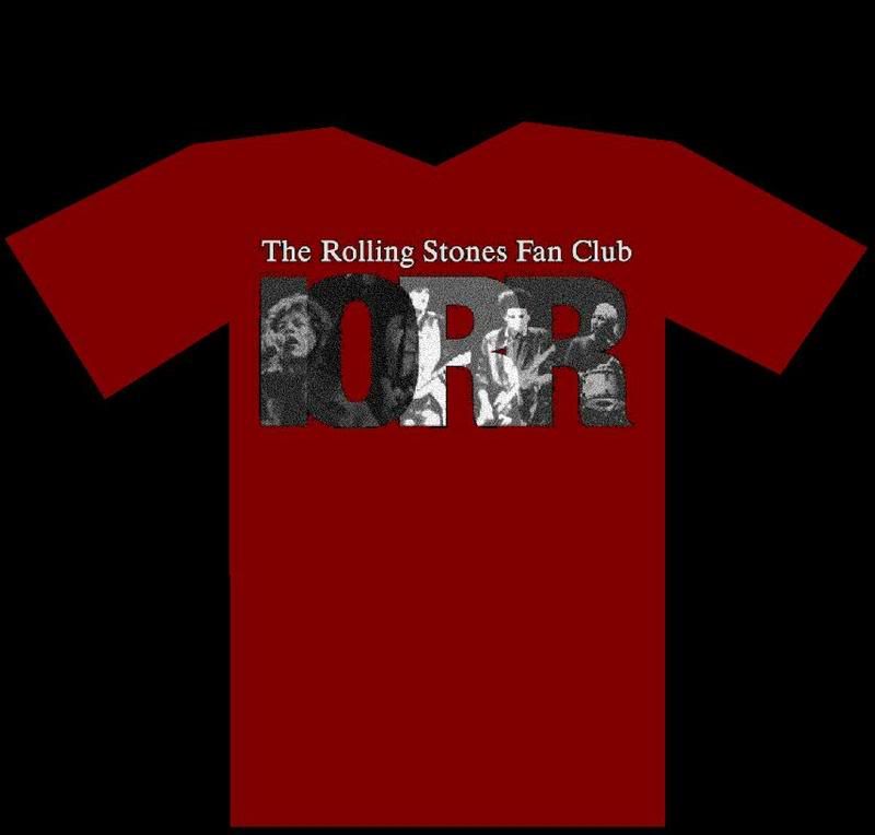
Colour: Plain, bright, unusual if possible but PLEASE not either pink, yellow or anything fluorescent! If you pick something that lots of people hate, they just won't wear it and the whole object of the exercise will be lost. Sluissie's bright blue, Cherry Red or (if unavoidable) black.
Back: I'd like something on it.
Wording: One very small question. Not all visitors to this site actually are members of (The) Rolling Stones Fan Club... Maybe they ought to be, but... Does that mean they can't have a T-shirt?
Sorry, only registered users may post in this forum.
Online Users
Guests:
1410
Record Number of Users:
206
on June 1, 2022 23:50
Record Number of Guests:
9627
on January 2, 2024 23:10