Tell Me :
Talk

If this design is chosen, I suggest that we start a new thread for the photos... people can upload a few chpices
(1) Mick
(2) Keith & ronnie
(3) Charlie
In reality, a single band shot would work. But the forced perspective... Jagger bigger, Keith & Ronnie mid-size, Charlie smaller seems to work for this.
(Logo = 4 letters: IORR) = (Four bold colors) = (Red/Blue/Yellow/Green)
Don't worry about or
or  .
.
They have no claim to primary colors. Or secondary colors.
(Do I need to write colours here, because this site is European?
*************************************************************
T-shirt= Rock n Roll T-shirt ... Rock n Roll T-shirt= Black
*************************************************************
Edited 4 time(s). Last edit at 2007-01-21 20:33 by schillid.
Talk about your favorite band.
![]()
![]()
![]()
![]()
For information about how to use this forum please check out forum help and policies.
Re: The official IORR T-shirt
Posted by:
sluissie
()
Date: January 21, 2007 16:45
The problem of resolution vs multicolour: here you can see the same shirt as posted above, but single colour. This one exists of only white dots: resolution is 300 dpi: almost impossible to get a quality like this printed, I suppose!
The shirt is black, because I do not have the original image: making this one blue in photoshop is almost undoable.
I'll make another one, quality 150 dpi.

The shirt is black, because I do not have the original image: making this one blue in photoshop is almost undoable.
I'll make another one, quality 150 dpi.
Re: The official IORR T-shirt
Posted by:
Steven
()
Date: January 21, 2007 16:46
"The" Rolling Stones Fan Club is very prententious, as if there is one one. If one were to buy that line of thinking it would be RS.com, "THE" "OFFICIAL" fan website. The website from 1980 is very pretentious as well.
Re: The official IORR T-shirt
Posted by:
JumpingKentFlash
()
Date: January 21, 2007 16:49
sluissie Wrote:
-------------------------------------------------------
> The problem of resolution vs multicolour: here you
> can see the same shirt as posted above, but single
> colour. This one exists of only white dots:
> resolution is 300 dpi: almost impossible to get a
> quality like this printed, I suppose!
>
> The shirt is black, because I do not have the
> original image: making this one blue in photoshop
> is almost undoable.
>
> I'll make another one, quality 150 dpi.
>
> [i144.photobucket.com]
> tones%20shirts/SchillidB-W300.jpg
You can get every image you want on a t-shirt. They copy it to a different type of paper when you want it on black (At the shop at least). Also, you should put the IORR logo a little higher up on the chest. It's almost in the middle and it doesn't look as cool.
JumpingKentFlash
Re: The official IORR T-shirt
Posted by:
NICOS
()
Date: January 21, 2007 16:52
BTW I love a black basic shirt
__________________________

__________________________
Re: The official IORR T-shirt
Posted by:
ohnonotyouagain
()
Date: January 21, 2007 16:58
I agree with no additional messages, no date, no url, nothing on the back.
I prefer a black shirt but I may be in the minority there. Navy blue or cherry red would be my other choices. White would be ok but I think it's a bit boring. Please no grey or yellow - ugh. Grey is too drab, yellow would make me feel like a giant bannana.
The logo should definitely be one color. I think red logo on black shirt would look great. I'm not sure what color logo(s) would look best on navy blue or cherry red, maybe somebody can play around with that and post some different variations.
Re: The official IORR T-shirt
Posted by:
ohnonotyouagain
()
Date: January 21, 2007 17:02
Steven Wrote:
-------------------------------------------------------
> "The" Rolling Stones Fan Club is very
> prententious, as if there is one one. If one were
> to buy that line of thinking it would be RS.com,
> "THE" "OFFICIAL" fan website. The website from
> 1980 is very pretentious as well.
I don't consider it pretentious, but I suppose it wouldn't hurt anything if it said "Rolling Stones Fan Club" instead of "The Rolling Stones Fan Club." Either way works for me.
Re: The official IORR T-shirt
Posted by:
JumpingKentFlash
()
Date: January 21, 2007 17:06
I think something like this would be perfect. Great colour, great logo, simple and to the point. (Sorry for the bad looking shape of the t-shirt. I made it myself). Only has to be more clean (Remove all the black dots that wouldn't go away when I made this in Paint). I should mention that it's still Schillid's image that's been used.
JumpingKentFlash
JumpingKentFlash
Re: The official IORR T-shirt
Posted by:
ohnonotyouagain
()
Date: January 21, 2007 17:10
JumpingKentFlash Wrote:
-------------------------------------------------------
> I think something like this would be perfect.
> Great colour, great logo, simple and to the point.
> (Sorry for the bad looking shape of the t-shirt. I
> made it myself). Only has to be more clean (Remove
> all the black dots that wouldn't go away when I
> made this in Paint). I should mention that it's
> still Schillid's image that's been used.
> [img.photobucket.com]
> lash/T-shirtStones.jpg
Pretty good, tho I like the text under the image. And I think the logo should be in color (not sure which one) instead of greyscale.
Re: The official IORR T-shirt
Posted by:
NICOS
()
Date: January 21, 2007 17:12
I'm not shure about the colors on this one it look's like It's Only Phee & Poops
__________________________
__________________________
Re: The official IORR T-shirt
Posted by:
JumpingKentFlash
()
Date: January 21, 2007 17:12
The text can go over or under the logo. Whichever way it will be put it will look good. I like the grey tones though.
JumpingKentFlash
JumpingKentFlash
Re: The official IORR T-shirt
Posted by:
JumpingKentFlash
()
Date: January 21, 2007 17:13
NICOS Wrote:
-------------------------------------------------------
> I'm not shure about the colors on this one it
> look's like It's Only Phee & Poops
Sounds funny. Explain....
JumpingKentFlash
-------------------------------------------------------
> I'm not shure about the colors on this one it
> look's like It's Only Phee & Poops
Sounds funny. Explain....
JumpingKentFlash
Re: The official IORR T-shirt
Posted by:
sluissie
()
Date: January 21, 2007 17:14
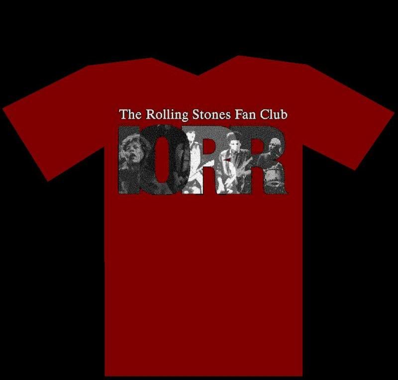
This is the one in 150 dpi, on a red shirt. I worked a bit more on this one, making all the black dots in Mick and Charlie red, so you can judge the quality from these guys.

My doubt is: is this clear enough: do you recognize the guys? So, can we print at double quality: 300 dpi, or is that impossible? I invite anyone to releave me of my doubts on this matter, otherwise I'm afraid that single-colour is almost impossible fot this picture.
Kent: there IS an issue of resolution. It has to do with the way things are transferred. High quality material is not tranferred on a paper. I suppose it is printed one way or the other, which means it is transparant: each and every island is printed as an island. So dots are printed as dots, which means that resolution IS a matter of concern. But I hope someone can tell us the details about this.
Jelle
Edited 2 time(s). Last edit at 2007-01-21 17:24 by sluissie.
Re: The official IORR T-shirt
Posted by:
Manofwealthandtaste
()
Date: January 21, 2007 17:31
I think the text looks better below the image. If the 'born 1980' information was also to be included, why not say "Rolling since 1980" rather than 'established'? Just a thought - great progress guys!
Re: The official IORR T-shirt
Posted by:
schillid
()
Date: January 21, 2007 17:37
Good morning...
I am flattered that while I was sleeping you have been admiring, discussing, etc.
The group image I used is really a composite from three photos which I combined. One shot of Mick, one of Ronnie and Keith, and one of Charlie. There is not a single recognizable image. The combining of imagery in a "new work" sidesteps copyright issues usually. But any of these shots can be swapped out, if needed. In fact, I would definitely change the one with KR & RW, because the original is a bit blurry. You'd need hi-res images for a finished design, as large as possible.
I happen to like black best for a T-shirt... as it's very R 'n R looking, whatever the air temperature. It's just got more R'nR look.
This design might not look good on other color shirts... Because you need color separation for each of the four letter colors, which could be a problem. It can be on a white shirt, I suppose... as long as the type underneath was changed to black.
Another solution if you needed it on another color shirt, is simply to place logo on a black rectangle.
Re: The official IORR T-shirt
Posted by:
sluissie
()
Date: January 21, 2007 17:46
Personally, I'd like something fresh, as in: we know black, time for a change? The red, (not RED red, but for example more dark, closer to bordeaux or maroon) or the blue like the colour I used. A light grey/white on the blue or red shirt could work very well.
But still, I'm curious about the printing process...
But still, I'm curious about the printing process...
Re: The official IORR T-shirt
Posted by:
open-g
()
Date: January 21, 2007 17:56
>>I happen to like black best for a T-shirt... as it's very R 'n R looking, whatever the air temperature. It's just got more R'nR look. <<
yep, indeed very R'n'R looking
+1
yep, indeed very R'n'R looking
+1
Re: The official IORR T-shirt
Posted by:
with sssoul
()
Date: January 21, 2007 18:03
thanks for all that, Schillid! do you want other shots of Keith and Ron to consider,
or do you have enough? (they should all be from the current tour, right?)
Sluissie, that dark-red rendition looks pretty good - thanks for all the work!
i still love the multi-colour design best, though ... would that one work on a grey shirt,
if folks don't want black? (i renew my plea for non-yellow shirts - it's really not a good colour for most people)
i liked www.iorr.org as the text under the photo better than "the Rolling Stones fan club"
(now that someone mentioned it: that does indeed sound like it means the rs.com fan club -
i don't know if the Stones lawyers would care, though!)
Re: The official IORR T-shirt
Posted by:
schillid
()
Date: January 21, 2007 18:10
I'm glad you've tried variations using the concept....
But I don't think that the design holds up well as one-color. I just think that with only one color, the imagery of the four guys doesn't work as well within the letterform shapes. And the letterform shapes do not flow and separate well or uniformly ... i.e. "I to O", "O to R", and "R to R"
Which isn't to say that it can't work...
I can't believe that i've been discussing graphic design on a stones forum.
Re: The official IORR T-shirt
Posted by:
schillid
()
Date: January 21, 2007 18:11
I like
"www.iorr.org" better than "Fan Club"
A little more mystery, a lot less babyish.
"www.iorr.org" better than "Fan Club"
A little more mystery, a lot less babyish.
Re: The official IORR T-shirt
Posted by:
Bingo
()
Date: January 21, 2007 18:21
I love this, just how it is. The colours work great on the black backround!
BV, besides have a short sleeve Tshirt, lets not forget about people wear tshirts year round. I highly suggest the buyer have the oppertunity to purchase a long sleeve Tshirt as well.
I want at least 2 long sleeve shirts in this design, should it be the winner.

BV, besides have a short sleeve Tshirt, lets not forget about people wear tshirts year round. I highly suggest the buyer have the oppertunity to purchase a long sleeve Tshirt as well.
I want at least 2 long sleeve shirts in this design, should it be the winner.
Re: The official IORR T-shirt
Posted by:
The Sicilian
()
Date: January 21, 2007 18:22
Personally I think you should have it available in about 6 different colors. BV you hate black, but a lot of people like it. The object is the logo and design. That should be your final choice. Availability of colors for us to choose should be ours.
Tee shirts are cheap and colors are usually no extra expense. If they are, so what you just pay a little more. If I wanted to buy some for my kids they want colors that they like or they won't wear it. Some like pink, others like white etc... That should not be an issue.
One thought, if the logo can be made to glow in the dark. On a black shirt only the logo would be seen when the lights go down. A pretty cool effect.
If you want people to see the shirt you should put something on the back. People will tend to stare at your back longer rather than to stare at your front, especially if you are a female. Lettering on the back can be more effective and less intrusive to look at. Definitely keep the logo on front.
Re: The official IORR T-shirt
Posted by:
schillid
()
Date: January 21, 2007 18:29
If this design is chosen, I suggest that we start a new thread for the photos... people can upload a few chpices
(1) Mick
(2) Keith & ronnie
(3) Charlie
In reality, a single band shot would work. But the forced perspective... Jagger bigger, Keith & Ronnie mid-size, Charlie smaller seems to work for this.
Re: The official IORR T-shirt
Posted by:
bv
()
Date: January 21, 2007 18:34
IORR was a fan club approx 20 years before the business "fan club" RS.com, so I would not worry about that. I like the color design as you see on the T-shirt page, and I have made a draft of both versions so that people can see it will work also in small print. The scaling is bad but the images give you an adiea. I think it is important that you understand why this T-shirt is made. These are my main reasons:
1. To tell other people you are on IORR
2. To show people you are an RS fan
3. To help people find IORR on the net
See the drafts here: [iorr.org]
Bjornulf
1. To tell other people you are on IORR
2. To show people you are an RS fan
3. To help people find IORR on the net
See the drafts here: [iorr.org]
Bjornulf
Re: The official IORR T-shirt
Posted by:
bv
()
Date: January 21, 2007 18:39
Forget about the URL i.e. www.iorr.org thing. It is a technicallity. Most people don't care about internet URL's. Most people use search engines to find stuff. Or they subscripe to the IORR magazine and don't care about IORR URL's at all. Having the domain name on the T-shirt is history for me. t will not happen. I work with internet useage and I know it does not have any value on a T-shirt. Unless you are turned on URL's. Just so that you don't waste time on it now. I would need a very good reason for using it, except for personal reasons that is. Same with the tongue. Also, this image needs color print. It will not work in mono-color print. But I think most people may afford the little extra cost. This is not about making a K-mart T-shirt at 5 dollars (which I normally use). It will probably cost a couple dollars more...
Bjornulf
Bjornulf
Re: The official IORR T-shirt
Posted by:
Stargroves
()
Date: January 21, 2007 18:43
Sicilian I understand that it gives us all a choice if the shirt is available in lots of colours - as well as the choice to order in ALL the colours  . But I thought we all wanted an easily identifiable shirt a la Shidoobees? In which case, surely we all need the same colour?
Black is the obviuos "safe" choice for one colour, but like BV I dislike it for this shirt. The black T-shirt is such a cliche with a rock logo on, let's stand out from the crowd! Ah, by stand out I mean in a good way, not flourescent anything...
The Sicilian Wrote:
-------------------------------------------------------
> Personally I think you should have it available in
> about 6 different colors. BV you hate black, but a
> lot of people like it. The object is the logo and
> design. That should be your final choice.
> Availability of colors for us to choose should be
> ours.
>
> Tee shirts are cheap and colors are usually no
> extra expense. If they are, so what you just pay a
> little more. If I wanted to buy some for my kids
> they want colors that they like or they won't wear
> it. Some like pink, others like white etc... That
> should not be an issue.
>
> One thought, if the logo can be made to glow in
> the dark. On a black shirt only the logo would be
> seen when the lights go down. A pretty cool
> effect.
>
> If you want people to see the shirt you should put
> something on the back. People will tend to stare
> at your back longer rather than to stare at your
> front, especially if you are a female. Lettering
> on the back can be more effective and less
> intrusive to look at. Definitely keep the logo on
> front.
. But I thought we all wanted an easily identifiable shirt a la Shidoobees? In which case, surely we all need the same colour?Black is the obviuos "safe" choice for one colour, but like BV I dislike it for this shirt. The black T-shirt is such a cliche with a rock logo on, let's stand out from the crowd! Ah, by stand out I mean in a good way, not flourescent anything...
The Sicilian Wrote:
-------------------------------------------------------
> Personally I think you should have it available in
> about 6 different colors. BV you hate black, but a
> lot of people like it. The object is the logo and
> design. That should be your final choice.
> Availability of colors for us to choose should be
> ours.
>
> Tee shirts are cheap and colors are usually no
> extra expense. If they are, so what you just pay a
> little more. If I wanted to buy some for my kids
> they want colors that they like or they won't wear
> it. Some like pink, others like white etc... That
> should not be an issue.
>
> One thought, if the logo can be made to glow in
> the dark. On a black shirt only the logo would be
> seen when the lights go down. A pretty cool
> effect.
>
> If you want people to see the shirt you should put
> something on the back. People will tend to stare
> at your back longer rather than to stare at your
> front, especially if you are a female. Lettering
> on the back can be more effective and less
> intrusive to look at. Definitely keep the logo on
> front.
Re: The official IORR T-shirt
Posted by:
bv
()
Date: January 21, 2007 18:49
There will be only one color. It is supposed to identify. I am not sure which color, but there will only be one. Absolutely 100% for sure. Suggestions welcome. PS. Personally I would not wear black unless there was a funeral or a Metallica warmup act or something. Most other colors are neutral. But that is just a personal opinion. If I am the only one not liking black it might be black. If you are pro or con a certain color then please say so. I was thinking about grey or red or yellow. Not white.
Bjornulf
Bjornulf
Re: The official IORR T-shirt
Posted by:
open-g
()
Date: January 21, 2007 18:50
The colours of the letters aren't a good choice, IMO.
why? - have a look at google and ebay
Edited 1 time(s). Last edit at 2007-01-21 19:11 by open-g.
why? - have a look at google and ebay
Edited 1 time(s). Last edit at 2007-01-21 19:11 by open-g.
Re: The official IORR T-shirt
Posted by:
bv
()
Date: January 21, 2007 18:51
The colors of the letters will be changed when the color of the T-shirt is defined.
Bjornulf
Bjornulf
Re: The official IORR T-shirt
Posted by:
schillid
()
Date: January 21, 2007 19:06
(Logo = 4 letters: IORR) = (Four bold colors) = (Red/Blue/Yellow/Green)
Don't worry about
or They have no claim to primary colors. Or secondary colors.
(Do I need to write colours here, because this site is European?
*************************************************************
T-shirt= Rock n Roll T-shirt ... Rock n Roll T-shirt= Black
*************************************************************
Edited 4 time(s). Last edit at 2007-01-21 20:33 by schillid.
Sorry, only registered users may post in this forum.
Online Users
ChrisL , cyclist , eduardoacdc , Handova , loochie , mick64 , MonkeyMan2000 , More Hot Rocks , Nankstone , perkmo , slew , spikenyc , spunky , Stilllife09 , Stoneage
Guests:
1679
Record Number of Users:
206
on June 1, 2022 23:50
Record Number of Guests:
9627
on January 2, 2024 23:10