Tell Me :
Talk
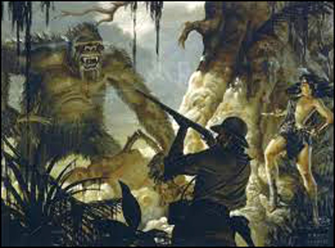
Earliest known concept of King Kong ---------- Art work by Willis O'Brien and Byron.L.Crabbe

ROCKMAN
I guess so, there are a lot of Rolling Stones fans he grouped together like we are a stereotype. Openly states his hatred. The Douche thinks he's like the Equalizer and is going to even the score of the nasty Stones fans on behalf of the band.
Drake, the Harlem Shuffle video was old-fashioned already when it was released. But I liked it. The funniest thing, though, is Keith's over-posing
Although "meaningful" may not be the just word, the fact is that the "Grrr cover" is just a cheap packaging when it is compared to their best album covers. Probably Mick didn't care but that Ford dude shouldn't kid himself; what he came up with is crap, in my humble opinion.
Rock and roll,
Mops
The inflatable penis was of course self-mockery by Mick, hinting at his tiny todger. The man has certainly sense of humour!
how about some more educational language
I was at a work function recently and one of the girls hosting the event, upon hearing I was a Stones fan, excitedly announced "my mum featured on a Rolling Stones record cover"! Oh yes, do tell me more I said, "it was her foot on the Start Me Up cover". The hair was added later I was relieved to hear!
Good taste is art enemy.
Its McDonald's enemy too...
'Good taste is the enemy of art' - I love that.
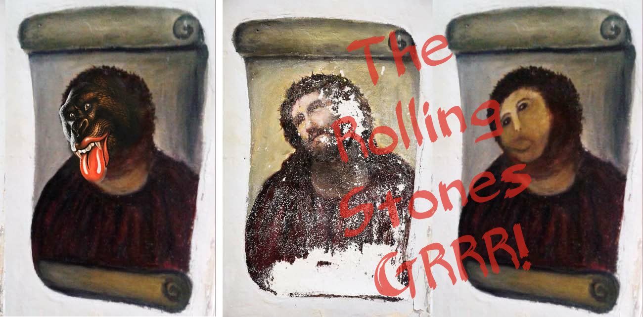
The fact that no one wanted to buy a tour t-shirt with the gorilla on it says it all, though.
It reminds me an interview where Charlie was asked why tour t-shirt sold to the public weren't as nice that the t-shirts Jagger wore on stage, Charlie answered "because they are done for people who wear t-shirt."
sounds like he has the same attitue about Stones fans that the Stones do.
Correct BUT when the band looked for "tastelesness" they went for Warhol and R. Frank.
Now they knock at the door of this Audubon wannabe... Yuck!
I don't think they wanted tastelesness for Exile. This is even one of the more elaborate artwork they ever did.
And they called Franck because they couldn't afford Man Ray.
Talk about your favorite band.
![]()
![]()
![]()
![]()
For information about how to use this forum please check out forum help and policies.
Re: GRRRegory creator Walton Ford on Stones fans - "I was glad that they didn’t like it "
Posted by:
Rockman
()
Date: August 6, 2013 09:05

Earliest known concept of King Kong ---------- Art work by Willis O'Brien and Byron.L.Crabbe
ROCKMAN
Re: GRRRegory creator Walton Ford on Stones fans - "I was glad that they didn’t like it "
Posted by:
dcba
()
Date: August 6, 2013 09:12
"It’s just this is going to be an elitist, kind of expensive thing because the processes are expensive"
I don't know if this guy's got talent but he certainly knows the blah-blah-blah of most contemporary "artists"!
I don't know if this guy's got talent but he certainly knows the blah-blah-blah of most contemporary "artists"!Re: GRRRegory creator Walton Ford on Stones fans - "I was glad that they didn’t like it "
Posted by:
nick
()
Date: August 6, 2013 09:32
Quote
Glam DescendantQuote
nick
GRRRegory is becoming off topic here. This Douche wanted to stick it to us.
‘How cool that I get an opportunity to piss their fans off?'
That's the line, remember it.
So, mission accomplished then, right?
I guess so, there are a lot of Rolling Stones fans he grouped together like we are a stereotype. Openly states his hatred. The Douche thinks he's like the Equalizer and is going to even the score of the nasty Stones fans on behalf of the band.
Re: GRRRegory creator Walton Ford on Stones fans - "I was glad that they didn’t like it "
Posted by:
treaclefingers
()
Date: August 6, 2013 10:33
I guess if I painted an ugly cover that almost no one liked I might also say, "I don't care".
Not the best defense mind you, but something in his tool kit anyway.
If had been remotely clever I might have cut him a bit of slack, but King Kong with a Stones tongue is a bit of a lazy effort.
Not the best defense mind you, but something in his tool kit anyway.
If had been remotely clever I might have cut him a bit of slack, but King Kong with a Stones tongue is a bit of a lazy effort.
Re: GRRRegory creator Walton Ford on Stones fans - "I was glad that they didn’t like it "
Posted by:
Limbostone
()
Date: August 6, 2013 11:25
I loved it the minute I saw it.
Re: GRRRegory creator Walton Ford on Stones fans - "I was glad that they didn’t like it "
Posted by:
with sssoul
()
Date: August 6, 2013 11:41
LoFL! I'm so glad someone gets it :E
The Rolling Stones get everyone's goat, sooner or later. Everyone's. It's a gift they've always had.
As long as it's someone else's goat we think it's great :E
GRRBITW strikes again - I love the Rolling Stones
The Rolling Stones get everyone's goat, sooner or later. Everyone's. It's a gift they've always had.
As long as it's someone else's goat we think it's great :E
GRRBITW strikes again - I love the Rolling Stones
Re: GRRRegory creator Walton Ford on Stones fans - "I was glad that they didn’t like it "
Posted by:
DandelionPowderman
()
Date: August 6, 2013 11:47
Quote
drake
GRRRegory is a terrible, horrible, no good, very bad gimmic. Most of the people I know in daily life strongly disliked the cover. The reaction was not one of 'oh thats funny, very tongue n cheek.. punny, etc..', instead it was one of 'Did the Stones really think I would like this??' Dignified offense is how I would describe it.
Most of us are not 12 year old kids. I'm 30, most dedicated Stones fans I know are 45+, and honestly, none of us are too pleased by the cartoon crap...
Someone who was around, tell me how the Harlem Shuffle music video went over back in the day...
1. As a concept is it just very demeaning. That is the bottom line. I remember the reveal and seeing the cartoon eyes and my heart sank. Really guys... Do you need a mascot on this tour? Do you plan on selling plush toys for the kiddos? It reminds me of baseball games and how it was all about the game when I was a kid, but now it is all about the mascot going through the audience for the kids. Is it still about the music?
2. Happy to piss off fans? Seriously? That is certainly a very punk way to look at criticism... Maybe Walton Ford just did a terrible job on this one? The best artists in the world can take criticism with a grain of salt. If most people strongly dislike your work, you might want to re-think it.
3. I feel the same way about GRRRegory as I do about the previous animation attempts...
I am not 'angry' but certainly disappointed that the Stones would pick something so childish as a logo/artwork/mascot/promotional design. They are better than this. If they ever do a final album I hope they put more thought into the artwork than Walton Ford did.


Drake, the Harlem Shuffle video was old-fashioned already when it was released. But I liked it. The funniest thing, though, is Keith's over-posing
Re: GRRRegory creator Walton Ford on Stones fans - "I was glad that they didn’t like it "
Posted by:
Bliss
()
Date: August 6, 2013 11:50
It's boring, ugly and tasteless. A missed opportunity to create something elegant and timeless.
But one doesn't argue over matters of taste. I am someone who loves the white Beggars Banquet cover with the banquet scene inside, and detests the alternative filthy toilet cover.
But one doesn't argue over matters of taste. I am someone who loves the white Beggars Banquet cover with the banquet scene inside, and detests the alternative filthy toilet cover.
Re: GRRRegory creator Walton Ford on Stones fans - "I was glad that they didn’t like it "
Posted by:
open-g
()
Date: August 6, 2013 14:01
Slaggin' the fans sounds like a pretty lame excuse, afterwards. not like a concept before starting work.
"Officer, yes I know I was driving too fast - but I was in a hurry and already late to my appointment.
oh, and this is also in protest against the speed limit around here! it's rediculous and totally unnecessary!
btw, the folks at my appointment were very glad I made it in time"
I guess you can get used to anything
Re: GRRRegory creator Walton Ford on Stones fans - "I was glad that they didn’t like it "
Posted by:
crumbling_mice
()
Date: August 6, 2013 14:08
It was by far the worst theme they have had to date. Just plain silly and I didn't buy anything with the Grrr stuff on it. Ruined the classic design, but he is a average designer anyway so it was to be expected.


Re: GRRRegory creator Walton Ford on Stones fans - "I was glad that they didn’t like it "
Posted by:
Papo
()
Date: August 6, 2013 14:12
Normally, I would have bought a lot more merchandise at Hyde Park. I love mugs with motives of my favourite artists or their logos.
This time around I avoided anything with 'Grrregory' on it and this included mugs, t-shirts and more.
And I noticed that many people around me at the Hyde Park merchandise stand discussed it and were looking for anything without "that ugly thing" on it.
Makes me think that "Grrregory" did not work well as a selling point.
Re: GRRRegory creator Walton Ford on Stones fans - "I was glad that they didn’t like it "
Posted by:
rollmops
()
Date: August 6, 2013 15:25
Yes Stonehearted.Quote
stoneheartedQuote
SKILLSQuote
rollmops
I still don't like it. I believe it was easier and quicker to come up with something silly(wellcome to the 21th century!) than something meaningful
With respect what would you define as "meaningful"
If I may jump in here, the GRRR! set (such an unoriginal, overused title) should have been called 50 & Counting--that's what they named their tour right? For the first time ever--at least in recent memory--a Rolling Stones tour has been named something other than what their current album or compilation release is. Even the tour accompanying Forty Licks was called the "Licks" tour. Yes, you may be saying that No Security was part of the Bridges To Babylon tour, but it was actually a separate arenas-only tour supporting the No Security live album which developed from the B2B tour.
Both the title of GRRR! and the cover concept suggest that not a lot of thought went into the initial planning of the 50th anniversary celebration, especially not the title and cover concept of the recent compilation. In fact, we now know that Mick was not on board with the idea of touring until the last minute, and even into the spring of 2012 it looked like even to the band--as Charlie Watts revealed in an interview later that year--that a tour might not even happen at all. It seems that GRRR! was hastily conceived and compiled, and the art work is uninventive and third rate--a grammar school student with a box of fingerpaint could come up with similar results.
If given a bit more time on conceptualization, they (or Mick) might have come up with something better, like 50 & Counting. If Mick can't even be bothered to come up with an original title for a compilation album, or a dull, amateurish King Kong rip-off for a cover concept, then it doesn't bode well for a prospective new and original album down the road.
Although "meaningful" may not be the just word, the fact is that the "Grrr cover" is just a cheap packaging when it is compared to their best album covers. Probably Mick didn't care but that Ford dude shouldn't kid himself; what he came up with is crap, in my humble opinion.
Rock and roll,
Mops
Re: GRRRegory creator Walton Ford on Stones fans - "I was glad that they didn’t like it "
Posted by:
ZantiMisfit
()
Date: August 6, 2013 17:49
NEVER understood the criticism of this cover artwork and album title!!! The second I saw it I said--Yep--that's the Stones all right. It is very Stonesy...and I've been a fan since '68.
Anyone remember the print ad for 'Black & Blue'? The one for 'Monkey Grip' (how about THAT for an album title?!)? And the one for 'It's Only Rock 'N Roll'? The 'Devil's High-Heel' for 'Tattoo You'? The 'goat's head soup' picture in 'Goats Head Soup'?
It is very iconic and eye-catching--like 'Forty Licks,' 'Flashpoint,' 'Voodoo Lounge,' etc. Album covers can't be 'subtle and classy' these days--they HAVE to stand out in the crowd. The criticism is absurd.
Edited 1 time(s). Last edit at 2013-08-06 17:51 by ZantiMisfit.
Re: GRRRegory creator Walton Ford on Stones fans - "I was glad that they didn’t like it "
Posted by:
DoomandGloom
()
Date: August 6, 2013 18:11
This guy's trying to pretend his crap is great art and it's simply over our heads... The oldest trick in the book. The ape only became significant when someone here named him Grrregory. That;s a fact, a lame idea saved by IORR.
Re: GRRRegory creator Walton Ford on Stones fans - "I was glad that they didn’t like it "
Posted by:
Elmo Lewis
()
Date: August 6, 2013 18:17
Continues the Stones tradition of (mostly) crappy album covers.
Re: GRRRegory creator Walton Ford on Stones fans - "I was glad that they didn’t like it "
Posted by:
runaway
()
Date: August 6, 2013 18:25
The RS have always been controversial and as well this time. I myself liked the Gorilla albumcover straight away and Walton knows how to paint these big paintings. Last year I was in the Zoo in Berlin and one gorilla was posing for me, probably knew I liked the cover and gorillas.
Re: GRRRegory creator Walton Ford on Stones fans - "I was glad that they didn’t like it "
Posted by:
kleermaker
()
Date: August 6, 2013 18:31
Quote
Rip This
...for all the nay sayers...I wonder where you were when the inflatable penis came around...or the inflatable wolf...or honkey tonk women.....
The inflatable penis was of course self-mockery by Mick, hinting at his tiny todger. The man has certainly sense of humour!
Re: GRRRegory creator Walton Ford on Stones fans - "I was glad that they didn’t like it "
Posted by:
runaway
()
Date: August 6, 2013 18:35
Quote
kleermakerQuote
Rip This
...for all the nay sayers...I wonder where you were when the inflatable penis came around...or the inflatable wolf...or honkey tonk women.....
The inflatable penis was of course self-mockery by Mick, hinting at his tiny todger. The man has certainly sense of humour!
how about some more educational language
Re: GRRRegory creator Walton Ford on Stones fans - "I was glad that they didn’t like it "
Posted by:
Manofwealthandtaste
()
Date: August 6, 2013 19:10
Quote
TimeIs

I was at a work function recently and one of the girls hosting the event, upon hearing I was a Stones fan, excitedly announced "my mum featured on a Rolling Stones record cover"! Oh yes, do tell me more I said, "it was her foot on the Start Me Up cover". The hair was added later I was relieved to hear!
Re: GRRRegory creator Walton Ford on Stones fans - "I was glad that they didn’t like it "
Posted by:
drbryant
()
Date: August 6, 2013 19:45
I think that the Grrregory art follows in the fine tradition of Dirty Work, Steel Wheels, Voodoo Lounge and Bridges to Babylon, not to mention the wonderful artwork for Flashpoint, Live Licks and No Security.
Can I get a $5000 litho of that couple on No Security?
Can I get a $5000 litho of that couple on No Security?
Re: GRRRegory creator Walton Ford on Stones fans - "I was glad that they didn’t like it "
Posted by:
mitch
()
Date: August 6, 2013 19:48
Quote
Bliss
It's boring, ugly and tasteless. A missed opportunity to create something elegant and timeless.
Good taste is art enemy.
Re: GRRRegory creator Walton Ford on Stones fans - "I was glad that they didn’t like it "
Posted by:
latebloomer
()
Date: August 6, 2013 19:57
I think it's an attempt to say, let's not take the whole iconic 50 years...blah, blah, blah too seriously. I would say that the gorilla succeeds brillantly at that and maybe some here ought to try the same.
My guess is that in 50 more years, fans of the long gone Rolling Stones will be clamoring for anything with Gregory on it, declaring it the highest form of art. If there is a heaven, Mick and Keith and the rest of the band will be laughing their asses off.
My guess is that in 50 more years, fans of the long gone Rolling Stones will be clamoring for anything with Gregory on it, declaring it the highest form of art. If there is a heaven, Mick and Keith and the rest of the band will be laughing their asses off.
Re: GRRRegory creator Walton Ford on Stones fans - "I was glad that they didn’t like it "
Posted by:
Munichhilton
()
Date: August 6, 2013 20:00
Quote
mitchQuote
Bliss
It's boring, ugly and tasteless. A missed opportunity to create something elegant and timeless.
Good taste is art enemy.
Its McDonald's enemy too...
Re: GRRRegory creator Walton Ford on Stones fans - "I was glad that they didn’t like it "
Posted by:
Bliss
()
Date: August 6, 2013 20:21
Quote
mitchQuote
Bliss
It's boring, ugly and tasteless. A missed opportunity to create something elegant and timeless.
Good taste is art enemy.
'Good taste is the enemy of art' - I love that.
The fact that no one wanted to buy a tour t-shirt with the gorilla on it says it all, though.
Re: GRRRegory creator Walton Ford on Stones fans - "I was glad that they didn’t like it "
Posted by:
schillid
()
Date: August 6, 2013 20:28
Re: GRRRegory creator Walton Ford on Stones fans - "I was glad that they didn’t like it "
Posted by:
schillid
()
Date: August 6, 2013 20:28
(duplicate post deleted)
Edited 2 time(s). Last edit at 2013-08-06 20:31 by schillid.
Edited 2 time(s). Last edit at 2013-08-06 20:31 by schillid.
Re: GRRRegory creator Walton Ford on Stones fans - "I was glad that they didn’t like it "
Posted by:
mitch
()
Date: August 6, 2013 20:44
Quote
BlissQuote
mitchQuote
Bliss
It's boring, ugly and tasteless. A missed opportunity to create something elegant and timeless.
Good taste is art enemy.
'Good taste is the enemy of art' - I love that.
The fact that no one wanted to buy a tour t-shirt with the gorilla on it says it all, though.
It reminds me an interview where Charlie was asked why tour t-shirt sold to the public weren't as nice that the t-shirts Jagger wore on stage, Charlie answered "because they are done for people who wear t-shirt."
Re: GRRRegory creator Walton Ford on Stones fans - "I was glad that they didn’t like it "
Posted by:
sonomastone
()
Date: August 6, 2013 20:47
Quote
bye bye johnny
Rolling Stones Gorilla Logo Artist Slams Critics
Walton Ford offering limited-edition etching of widely seen gorilla logo
PK Shop
By Patrick Doyle
August 5, 2013 12:30 PM ET
When the Rolling Stones were organizing their 50th anniversary celebrations, Mick Jagger approached his friend, contemporary artist Walton Ford – who has made a career painting naturalist scenes – to design a logo. In the Seventies spirit of the National Lampoon magazine and "grotesque ungerground comics," Ford repurposed one of his sympathetic paintings of King Kong, adding the band’s famous tongue-and-lips logo. "I saw the Rolling Stones as a sort of silverback,” Ford tells Rolling Stone. “All the metaphors of King Kong and all of that are applicable – their kind of enormity of their accomplishment over the period of 50 years.”
The band loved the image. “The irreverence of Walton Ford’s imagery captured the spirit of the tour,” they said in a statement. They used it on the cover of their 50th anniversary compilation GRRR!, and in marketing their massive "50 and Counting" tour, at one point displaying the piece at 50 locations around the world.
But some fans weren’t as excited about the logo. “A lot of people didn’t like it at all,” Ford says. “That was good. I was glad that they didn’t like it. I mean, the last people who I wanted to please were Rolling Stones fans.”
Ford continues, “They are really nasty. It’s a general rule they have a fan base that just seem to be always angry at the Rolling Stones for a lot of reasons. They’ve got their own grudges. I shouldn’t say that I didn’t really care. I probably did care, but when the Rolling Stones were doing their best work, they were a step ahead of the people that loved them so much. I thought, ‘How cool that I get an opportunity to piss their fans off?'"
The logo is now for sale as a limited-edition etching of 1,000 signed and numbered by Ford, available at the Paul Kasmin Shop. “They are really beautiful,” says Ford, who has made a practice of creating etchings for the last decade. “I just go and work at this print shop and we use all the old tools that were used by Rembrandt, you know, this is a very ancient technique of marking on copper plate and making prints by hand. It seemed appropriate to do sort of an anachronistic tribute print to the 50th..”
The piece doesn't come cheap though; the price, available upon request, is over $5,000. “It’s just this is going to be an elitist, kind of expensive thing because the processes are expensive," says Ford, who's still buzzing about the experience. "I was born in 1960 and I had an older brother who collected records. The Rolling Stones were pretty much it for us growing up. That’s what we aspired to be – that sort of attitude."
[www.rollingstone.com]
sounds like he has the same attitue about Stones fans that the Stones do.
Re: GRRRegory creator Walton Ford on Stones fans - "I was glad that they didn’t like it "
Posted by:
dcba
()
Date: August 6, 2013 20:47
Quote
mitch
Good taste is art enemy.
Correct BUT when the band looked for "tastelesness" they went for Warhol and R. Frank.
Now they knock at the door of this Audubon wannabe... Yuck!
Re: GRRRegory creator Walton Ford on Stones fans - "I was glad that they didn’t like it "
Posted by:
mitch
()
Date: August 6, 2013 20:52
Quote
dcbaQuote
mitch
Good taste is art enemy.
Correct BUT when the band looked for "tastelesness" they went for Warhol and R. Frank.
I don't think they wanted tastelesness for Exile. This is even one of the more elaborate artwork they ever did.
And they called Franck because they couldn't afford Man Ray.
Sorry, only registered users may post in this forum.
Online Users
a bigger nut , Broesel2404 , edopao , eduardoacdc , Fuman2 , HouseBoyKnows , jason8903 , LeonidP , makemeburnthecandle , Musicwinn , Sjouke , waterrats , werner67976 , woodyweaving
Guests:
1866
Record Number of Users:
206
on June 1, 2022 23:50
Record Number of Guests:
9627
on January 2, 2024 23:10