Tell Me :
Talk


Edited 1 time(s). Last edit at 2020-11-14 14:33 by schillid.

https://docs.google.com/uc?id=0Bywukak-o6lBMElGSWpIVjlFZFE
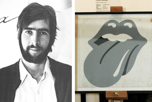

John Pasche with the Rolling Stones Tongue and Lip logo he designed In 1969.
[twitter.com]
John Pasche is an English art designer, most famous for designing the "Tongue and Lip Design" logo for the rock band The Rolling Stones.
This iconic artwork for the Rolling Stones? logo provides a key link between pop art, design, popular music, performance and British culture at the end of the 1960s ? arguably the most innovative decade in UK for graphic design and pop music.
Its pop art-derived simplicity combined with its overt anti-authoritarianism has meant that it has been copied, reworked and parodied in countless ways. The use of sensuous Jagger-like lips and the anti-authoritarian tongue matched the identity of the Rolling Stones perfectly. However, the origin of the design was a picture of the Indian Goddess Kali. This work greatly enhances the rock and pop section of the V&A?s Performance Collection.
[www.artfund.org]
The Story Behind The Rolling Stones’ Logo
By Vienthi Metiary - March 23, 2018
1969. The Rolling Stones are about to kick off their European tour. The band’s looking for some new art work for the tour poster. Their record label Deca comes up with several designs, but Jagger and co are not impressed and they decide to call in the Royal College of Art in London to ask if they know a suitable student that could come to their aid. (Photo credits: The Rolling Stones)
That’s where Jagger meets student John Pasche. He decides to give him the assignment to design the tour poster. Pasche created the 1970 Rolling Stones poster with a big cruise ship and the car.

The birth of ‘Tongue and Lips’
Jagger was so pleased with Pasche’s work that he asked Pasche to design a new logo for their upcoming studio album too. Mick Jagger gave him a image of a Hindu Goddess Kali, known for her long and pointy tongue, and told Pasche that he ‘liked the look of it’. Pasche wanted to design something that was both anti-authority and provocative, just like The Stones were. That’s when he came up with the “Tongue and Lips” design. Jagger loved the cheeky design and paid Pasche astonishing amount of £50. The logo first appeared on the album insert sleeve of their album Sticky Fingers.


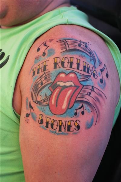
‘Tongue and Lips’ would later become one of the most iconic bandlogos of all time. After The Stones copyrighted the logo, Pasche received a share of the royalties rights. He later sold the original art work to London’s V&A museum for $92,500. He never thought that the British rock band would use the logo for this long: “I’m still amazed by how popular it is. I still get emails from people saying, ‘I’ve just had the logo tattooed on my arm.'” (The Guardian)
It is perhaps the most recognisable logo in the history of pop music, and it has been a symbol of brash rebellion for almost 40 years. But now the Rolling Stones' famous tongue and lips symbol has well and truly entered the establishment with a place in the Victoria and Albert Museum.
The V&A has paid slightly over £50,000 at auction for the original drawings of the symbol, devised by British designer John Pasche in 1970, it announced last night.
In a fitting detail for a band who have, in the main, gradually abandoned dissolute personal lives and anti-establishment bravado to embrace the mainstream, Pasche said he sold the hand-painted black and white work, to finance private school fees.
Advertisement
"I have an 11-year-old son and this money is going to go towards his education," he said.
Pasche had already decided to sell the drawing at a US auction house when the V&A enquired about borrowing it for an exhibition. On learning the work was for sale, the museum lodged a winning bid of $92,500 on Saturday, half of which was provided by the Art Fund charity.
Pasche was a 24-year-old postgraduate design student at London's Royal College of Art when Jagger went looking for new talent, having become dissatisfied with the record label's artworks. After meeting the singer, Pasche designed a tour poster and was commissioned to come up with a band logo.
Sign up to the Art Weekly email
Read more
Pasche said: "Mick had a picture of Kali, the Hindu goddess, which he was very keen on. India was very much in fashion at the time, but I thought something like that might go out of date."
The inspiration for the eventual logo, which took Pasche around two weeks of work, has never been in doubt.
"I wanted something anti-authority, but I suppose the mouth idea came from when I met Jagger for the first time at the Stones' offices. I went into this sort of wood-panelled boardroom and there he was. Face to face with him, the first thing you were aware of was the size of his lips and his mouth."
The logo first appeared on the inside sleeve of the 1971 album Sticky Fingers and has been used ever since, soon becoming a visual shorthand for the group as well as the stage design for gigs such as the Stones' show at the Superbowl in 2006.
Initially paid just £50, when the Stones copyrighted the design Pasche received a share of royalties rights, later selling this for a lump sum.
Pasche, who also worked with the Who and Paul McCartney, said he never expected the image to be used for so long: "I'm still amazed by how popular it is. I get emails from people saying, 'I've just had the logo tattooed on my arm.'"


[www.youtube.com]
JAI KALI MAA!: THE POWERFUL CHANT OF KALI MAA FOR DESTROYING ALL EVIL FROM OUR LIVES
[www.google.com]:
[www.youtube.com]
That's neat.
I'm off to see '2001' next saturday - at the local IMAX - so I'll report back if they have picked this up and included it in the re-mastered version that will be shown.
--
Captain Corella
60 Years a Fan


"GOD SELECTION XXX is now gearing up for a collaboration with iconic Japanese fashion label NUMBER (N)INE. The T-shirts that will lead the collab come emblazoned with a mashup between NUMBER (N)INE’s classic Rolling Stones-inspired tongue motif and the “XXX” censor marking. The back of the shirt will be decorated with 13 phrases done in varying sizes of text that reference the enigmatic views establish by former design head Takahiro Miyashita. The same pierced “tongue and lip” logo appears on a selection of trucker hats." -- [Hypebeast.com] - [www.N-Nine-Store.com] - [www.N-Nine-Store.com] - [www.Instagram.com] - [www.Instagram.com] .
Talk about your favorite band.
![]()
![]()
![]()
![]()
For information about how to use this forum please check out forum help and policies.
Re: Rolling Stones Tongues
Posted by:
Hairball
()
Date: August 21, 2019 05:10
Great work schillid - all of them!
_____________________________________________________________
Rip this joint, gonna save your soul, round and round and round we go......
_____________________________________________________________
Rip this joint, gonna save your soul, round and round and round we go......
Re: Rolling Stones Tongues
Posted by:
Gaetzi
()
Date: August 21, 2019 19:14
I just noticed the Stones website is selling various tongue lithographs. Has anyone purchased one?
Re: Rolling Stones Tongues
Posted by:
exilestones
()
Date: August 21, 2019 21:04
Quote
Hairball
Great work schillid - all of them!
Re: Rolling Stones Tongues
Posted by:
schillid
()
Date: August 22, 2019 01:16
Edited 1 time(s). Last edit at 2020-11-14 14:33 by schillid.

Re: Rolling Stones Tongues
Posted by:
georgie48
()
Date: August 22, 2019 15:30
Shillid and exilestones!
You're really making up for my frustration not to be able to come to the USA due to tough circumstances!
Really a joy to see the immages

You're really making up for my frustration not to be able to come to the USA due to tough circumstances!
Really a joy to see the immages

Re: Rolling Stones Tongues
Posted by:
schillid
()
Date: August 22, 2019 19:57
https://docs.google.com/uc?id=0Bywukak-o6lBMElGSWpIVjlFZFE

Re: Rolling Stones Tongues
Posted by:
Rockman
()
Date: August 23, 2019 00:56
I'm not really a tattoo cat
but hey that one ain't too shabby …… ^^^^^^^^^^^

ROCKMAN
but hey that one ain't too shabby …… ^^^^^^^^^^^
ROCKMAN

Re: Rolling Stones Tongues
Posted by:
Irix
()
Date: August 26, 2019 19:00
Official Litho VIP-Package - [iorr.org] :

Design by José María Campoy - [Twitter.com] · [www.Instagram.com] · Large version
Edited 3 time(s). Last edit at 2019-08-26 21:55 by Irix.
Design by José María Campoy - [Twitter.com] · [www.Instagram.com] · Large version
Edited 3 time(s). Last edit at 2019-08-26 21:55 by Irix.
Re: Rolling Stones Tongues
Posted by:
clapton71
()
Date: August 26, 2019 20:01
I'm really digging this......me want.

Re: Rolling Stones Tongues
Posted by:
frankotero
()
Date: August 26, 2019 20:37
The snake is very cool
Re: Rolling Stones Tongues
Posted by:
clapton71
()
Date: August 26, 2019 20:47
That should have been the shirt.

Re: Rolling Stones Tongues
Posted by:
exilestones
()
Date: August 28, 2019 04:01
John Pasche with the Rolling Stones Tongue and Lip logo he designed In 1969.
[twitter.com]
John Pasche is an English art designer, most famous for designing the "Tongue and Lip Design" logo for the rock band The Rolling Stones.
This iconic artwork for the Rolling Stones? logo provides a key link between pop art, design, popular music, performance and British culture at the end of the 1960s ? arguably the most innovative decade in UK for graphic design and pop music.
Its pop art-derived simplicity combined with its overt anti-authoritarianism has meant that it has been copied, reworked and parodied in countless ways. The use of sensuous Jagger-like lips and the anti-authoritarian tongue matched the identity of the Rolling Stones perfectly. However, the origin of the design was a picture of the Indian Goddess Kali. This work greatly enhances the rock and pop section of the V&A?s Performance Collection.
[www.artfund.org]
The Story Behind The Rolling Stones’ Logo
By Vienthi Metiary - March 23, 2018
1969. The Rolling Stones are about to kick off their European tour. The band’s looking for some new art work for the tour poster. Their record label Deca comes up with several designs, but Jagger and co are not impressed and they decide to call in the Royal College of Art in London to ask if they know a suitable student that could come to their aid. (Photo credits: The Rolling Stones)
That’s where Jagger meets student John Pasche. He decides to give him the assignment to design the tour poster. Pasche created the 1970 Rolling Stones poster with a big cruise ship and the car.
The birth of ‘Tongue and Lips’
Jagger was so pleased with Pasche’s work that he asked Pasche to design a new logo for their upcoming studio album too. Mick Jagger gave him a image of a Hindu Goddess Kali, known for her long and pointy tongue, and told Pasche that he ‘liked the look of it’. Pasche wanted to design something that was both anti-authority and provocative, just like The Stones were. That’s when he came up with the “Tongue and Lips” design. Jagger loved the cheeky design and paid Pasche astonishing amount of £50. The logo first appeared on the album insert sleeve of their album Sticky Fingers.
‘Tongue and Lips’ would later become one of the most iconic bandlogos of all time. After The Stones copyrighted the logo, Pasche received a share of the royalties rights. He later sold the original art work to London’s V&A museum for $92,500. He never thought that the British rock band would use the logo for this long: “I’m still amazed by how popular it is. I still get emails from people saying, ‘I’ve just had the logo tattooed on my arm.'” (The Guardian)
It is perhaps the most recognisable logo in the history of pop music, and it has been a symbol of brash rebellion for almost 40 years. But now the Rolling Stones' famous tongue and lips symbol has well and truly entered the establishment with a place in the Victoria and Albert Museum.
The V&A has paid slightly over £50,000 at auction for the original drawings of the symbol, devised by British designer John Pasche in 1970, it announced last night.
In a fitting detail for a band who have, in the main, gradually abandoned dissolute personal lives and anti-establishment bravado to embrace the mainstream, Pasche said he sold the hand-painted black and white work, to finance private school fees.
Advertisement
"I have an 11-year-old son and this money is going to go towards his education," he said.
Pasche had already decided to sell the drawing at a US auction house when the V&A enquired about borrowing it for an exhibition. On learning the work was for sale, the museum lodged a winning bid of $92,500 on Saturday, half of which was provided by the Art Fund charity.
Pasche was a 24-year-old postgraduate design student at London's Royal College of Art when Jagger went looking for new talent, having become dissatisfied with the record label's artworks. After meeting the singer, Pasche designed a tour poster and was commissioned to come up with a band logo.
Sign up to the Art Weekly email
Read more
Pasche said: "Mick had a picture of Kali, the Hindu goddess, which he was very keen on. India was very much in fashion at the time, but I thought something like that might go out of date."
The inspiration for the eventual logo, which took Pasche around two weeks of work, has never been in doubt.
"I wanted something anti-authority, but I suppose the mouth idea came from when I met Jagger for the first time at the Stones' offices. I went into this sort of wood-panelled boardroom and there he was. Face to face with him, the first thing you were aware of was the size of his lips and his mouth."
The logo first appeared on the inside sleeve of the 1971 album Sticky Fingers and has been used ever since, soon becoming a visual shorthand for the group as well as the stage design for gigs such as the Stones' show at the Superbowl in 2006.
Initially paid just £50, when the Stones copyrighted the design Pasche received a share of royalties rights, later selling this for a lump sum.
Pasche, who also worked with the Who and Paul McCartney, said he never expected the image to be used for so long: "I'm still amazed by how popular it is. I get emails from people saying, 'I've just had the logo tattooed on my arm.'"
[www.youtube.com]
JAI KALI MAA!: THE POWERFUL CHANT OF KALI MAA FOR DESTROYING ALL EVIL FROM OUR LIVES
[www.google.com]:
[www.youtube.com]

Re: Rolling Stones Tongues
Posted by:
exilestones
()
Date: August 29, 2019 01:37
schillid, I always enjoy your creations!


Re: Rolling Stones Tongues
Posted by:
CaptainCorella
()
Date: September 1, 2019 08:54
Quote
schillid
That's neat.
I'm off to see '2001' next saturday - at the local IMAX - so I'll report back if they have picked this up and included it in the re-mastered version that will be shown.
--
Captain Corella
60 Years a Fan
Re: Rolling Stones Tongues
Posted by:
schillid
()
Date: September 3, 2019 07:08
Quote
CaptainCorellaQuote
schillid
That's neat.
I'm off to see '2001' next saturday - at the local IMAX - so I'll report back if they have picked this up and included it in the re-mastered version that will be shown.

Re: Rolling Stones Tongues
Posted by:
Irix
()
Date: September 3, 2019 23:05
"GOD SELECTION XXX is now gearing up for a collaboration with iconic Japanese fashion label NUMBER (N)INE. The T-shirts that will lead the collab come emblazoned with a mashup between NUMBER (N)INE’s classic Rolling Stones-inspired tongue motif and the “XXX” censor marking. The back of the shirt will be decorated with 13 phrases done in varying sizes of text that reference the enigmatic views establish by former design head Takahiro Miyashita. The same pierced “tongue and lip” logo appears on a selection of trucker hats." -- [Hypebeast.com] - [www.N-Nine-Store.com] - [www.N-Nine-Store.com] - [www.Instagram.com] - [www.Instagram.com] .
Sorry, only registered users may post in this forum.
Online Users
alexander paul , bluecore , gagiwh , MisterDDDD , Mr.Soul , niki , Sjouke , snorton , Stoneswolf , TeaAtThree
Guests:
2854
Record Number of Users:
206
on June 1, 2022 23:50
Record Number of Guests:
9627
on January 2, 2024 23:10