Tell Me :
Talk
I was also kinda disappointed by the price back in the days
The Stones itself paid John Pasche "only" £26,250(*) - while the Victoria & Albert Museum (London UK) bought his original artwork in 2008 for £50,000 -- [iorr.org] .
(*)Plus very likely some payments for the usage of the logo between 1972-1984.
You are absolutely right, but .... (and John Pasche also knows!) the version with the two white lines on the tongue part (the "USA" version), was not designed by John, but in the USA (and NOT by the likes of Ernie Cefalu, Syd Maurer or Ruby Mazur).
The USA version was delivered by Craig Braun (based on John Pasche's design!). The facts are all there, despite what fantasizers try to tell you.
Remember when Cefalu joined that company? It was in February 1971 and only for a short time. By that time all the work was already finished and he was only asked to do "some stuff" to see if he was qualified enough. Nothing he did was used. Look around and you can find photos of individual members of the Rolling Stones with T-shirts on with the what was quoted as the "ugly" version.
John Pasch designed the logo around October 1970 and his version was faxed to the USA that same year and taken care of by Braun's company.
I don't see any resemblance to the Cefalu tongue.
As posted on page whatever, this certainly was information to me yet still proves that Cefalu had zero to do with the logo. At this point, Braun's in-house illustrators are still nameless - so someone other than Braun obviously had the idea to change it:
Back in London, John Pasche, a student at the Royal College of Art, worked on a logo for the band and its new label. Mr. Jagger had been inspired by the tongue of the Hindu goddess Kali, Mr. Pasche recalled, “but I didn’t want to do anything Indian, because I thought it would be very dated quickly, as everyone was going through that phase at the time.” Still, Kali’s mouth and lips “triggered something,” he said. (It didn’t hurt that Mr. Jagger had a recognizable mouth himself.)
In New York, Mr. Braun had a deadline and needed the logo. As the tongue design was still unfinished, he settled for a rough one-inch version, faxed over from London by Marshall Chess, the founding president of Rolling Stones Records. “I didn’t tell him what I was going to do with it,” Mr. Braun said.
His in-house illustrators finished the mouth — narrowing the tongue, adding more white accents and a black void for the throat — before blowing it up to cover the entire inside sleeve of the American release (Mr. Pasche’s version was used internationally).
“I thought it was going to get me into trouble,” Mr. Braun said. Instead, his touches on the logo, which still shifts slightly in size and color for different events, often persist to this day, including on the official ads for the “ZIP Code” tour and countless pieces of Stones memorabilia.
Mr. Pasche barely noticed. “It was a relaxed affair,” he said. “I just think things were happening fast and needed to be done, so it was redrawn.”
Mr. Chess, meanwhile, only found out about Mr. Braun’s revisions 45 years later. “He was so nervous about it!” said Mr. Chess, 73.
Both Mr. Braun and Mr. Pasche are pleased with the results of their overlapping contributions to rock mythology. Initially paid just 50 pounds ($76 at current rates) for the design, Mr. Pasche sold his copyright to the band for £26,000 (about $40,000 at the time) in 1984. In 2008, the Victoria and Albert Museum in London bought his original artwork for £50,000 ($92,500).
It was posted here: [www.NYTimes.com] , here: [www.iorr.org] and here: [iorr.org] .
Compare it again ....

There's since 2014 an article on the Web which claims: "Ernie Cefalu, whose album design for the International Paper Company show Dolls Alive! led to his later work, the Rolling Stones' Forty Licks cover."
This assertion, of course, is false.
Edited 1 time(s). Last edit at 2017-04-25 18:35 by Irix.
The Forty Licks logo was adapted so the tongue showed the number 40.

"As we say in England, it can get a bit trainspottery"

Now I see it .... (white outline) ....

[StonesExhibitionismShop.com]
I assumed before Tom Hingston was inspired by both Tongue-versions and made a organic Best-of ....
As the Exhibitionism Book mentions it:

[StonesExhibitionismShop.com]
Quote from the official announcement of Exhibitionism, New York City -- [www.rollingstones.com] :
"The original works of key collaborators who helped to make the band not just musical but cultural icons are also on show, including (...) John Pasche, who designed the band’s iconic tongue logo (...) "
Gaslightstreet, your information is indeed as things went, but the variation on John Pasche's design was Braun's idea and the names of those involved are known (also to me, but I am not (yet) in the position to reveil them). Cefalu was not one of them!
I know that web review. There have been others (incl. a video) too. By the way, about the right version, apparently "signed" by Cefalu, anyone can produce such things with "copy - paste". Some, like Ruby Mazur and Sid Maurer, have come up with similar tricks. Find out for yourself.
Sorry Irix,
My "webpage" response to Deltics' should have been to yours
A step closer to the truth ...
Mr. Braun's two close associates who played a key role in creating the "American version" of the logo are both Americans, one hell of a designer with a Spanish sirname (Mr. V !) and one with an Italian sirname (Mr. D, not the one mentioned in relation to the sleeve design). Mr. Braun himself was inspired by Mr. A after receiving the John Pasche image via Mr. Chess.
You could not be more wrong.
Your picture states "Fall 1971" while John Pasche did his first drafts for the RS-Logo already in 1970 - [iorr.org] .
And the 'Brown Sugar / Bitch / Let It Rock' Single as well as the 'Sticky Fingers' Album with the new Logo on it were released in April 1971 ....
Yes, this was done AFTER Sticky Fingers was done, brilliant detective work...
What's your point? Do YOU think someone would have done this ad if they didn't have the rights to those images?
At least your advertising picture doesn't prove that Ernie Cefalu did his first design of the Tongue&Lips logo before February 1971 or before John Pasche in 1970 ....
OMG, are you that thick? Why would a well-known company place an ad like that? Don't you get that Craig Braun's company created the first tongue. Craig owned the company, and Ernie worked for Craig. What do you know about this? Were you there when it happened, or do you know any of these people?
No, I didn't think so. Or maybe I should post a picture of something called "Dolls Alive", which was an album and a poster for a show done in 1969 that had the exact set of lips, minus the tongue, also done by Cefalu, for......wait for it.....Decca Records. It predates the whole f**king thing. That's the connection between Decca and Craig Braun. Yes, I know, SF was not on Decca. But the tongue design went that far back.
I guess you don't understand that this kind of thing, where one guy designs something, the client says "I don't like it", then takes it to another artist is common practice.
Would it mean more to you if I found the email that was sent I think three weeks ago, from Mrs. Ex Marshall Chess, stating that these facts are true? Would that satisfy?
I tell you, next time I see Mick I'm gonna ask him and get him on record, just to put this to bed.
Those are my facts. What exactly are your's?
Indeed, but Mr Pasche was greatly influenced by this from Alan Aldridge in 1969
[www.theloop.com.au]

John was a student graphic designer in Brighton UK in 1969 and frankly it's totally inconceivable that he didn't see "Beatles Illustrated Lyrics" book when it was published. (Much as The Beachboys must have heard Chuck Berry....)
--
Captain Corella
60 Years a Fan
Very convincing!
I do like the idea of the toungue on the Beatles book cover posted by CaptainCorella as the true inspiration though- it's nearly identical.
That said, and not to rock anyones boat, some form of credit for the Stones logo should really go to Alan Aldridge via his Beatles book and imo Then official credit really goes to Ernie Cefalu followed by John Pasche.
I don't understand why Pasche should get full credit for tweaking a few details of a design presented to him that was already complete for all intents and purposes - he should have an asterisk next to his name as "Creator of the logo".
_____________________________________________________________
Rip this joint, gonna save your soul, round and round and round we go......
Because he came up with it.
PAY ATTENTION.
Officially and contractually it appears that way, but there's much more to the story than a piece of paper.
And for the record, I'm open to all interpretations and not taking sides, just calling it like I see it.
_____________________________________________________________
Rip this joint, gonna save your soul, round and round and round we go......
Pasche gets the credit because in order to obscure the true origins of something and not have to pay the first guy, they have the first guy come up with something, say "no", then give the idea to a second guy. If you ask Cefalu, he'll actually say "Pasche's version was way better than mine, it was more animated".
Cefalu's work sucks. Even Ray Charles can see that. As you said, like you see it. And what Ray Charles sees is a 4th grader's work.
Talk about your favorite band.
![]()
![]()
![]()
![]()
For information about how to use this forum please check out forum help and policies.
Re: First designer of Stones Tongue & Lips logo???
Posted by:
Doc
()
Date: April 23, 2017 08:53
Quote
mattleeuk
The V&A got a crazy cheap for something so iconic.
I was also kinda disappointed by the price back in the days
Re: First designer of Stones Tongue & Lips logo???
Posted by:
Irix
()
Date: April 23, 2017 14:45
Quote
mattleeuk
The V&A got a crazy cheap for something so iconic.
Quote
Doc
I was also kinda disappointed by the price back in the days
The Stones itself paid John Pasche "only" £26,250(*) - while the Victoria & Albert Museum (London UK) bought his original artwork in 2008 for £50,000 -- [iorr.org] .
(*)Plus very likely some payments for the usage of the logo between 1972-1984.
Re: First designer of Stones Tongue & Lips logo???
Posted by:
georgie48
()
Date: April 23, 2017 20:40
Quote
Nate
My father who was an art director used to work with John Pasche at the time that John was commissioned to do the design.
John Pasche designed the logo.
Nate
You are absolutely right, but .... (and John Pasche also knows!) the version with the two white lines on the tongue part (the "USA" version), was not designed by John, but in the USA (and NOT by the likes of Ernie Cefalu, Syd Maurer or Ruby Mazur).
The USA version was delivered by Craig Braun (based on John Pasche's design!). The facts are all there, despite what fantasizers try to tell you.
Re: First designer of Stones Tongue & Lips logo???
Posted by:
georgie48
()
Date: April 23, 2017 20:56
Quote
blivetQuote
GasLightStreet
Ernie Cefalu's logo is ugly. He talks too much. He probably stole the idea and said it was originally his.
One thing he said struck a chord with me. He mentioned that the company he did the design for had the rights to use it for about 18 months (something like that -- I'm to lazy to review the video), and they produced a lot of t-shirts, patches and stickers. I remember those products from when I was a kid, with the "ugly" variant of the Stones' logo with each tooth outlined and no reflections on the upper lip. I always sort of assumed it was some kind of knock-off that was just different enough to avoid any legal issues, but if Cefalu is telling the truth, it was actually the original version of the logo before Pasche improved it.
Remember when Cefalu joined that company? It was in February 1971 and only for a short time. By that time all the work was already finished and he was only asked to do "some stuff" to see if he was qualified enough. Nothing he did was used. Look around and you can find photos of individual members of the Rolling Stones with T-shirts on with the what was quoted as the "ugly" version.
John Pasch designed the logo around October 1970 and his version was faxed to the USA that same year and taken care of by Braun's company.
Re: John Pasche, Not Ernie Cefalu
Posted by:
GasLightStreet
()
Date: April 25, 2017 17:46
Quote
IrixQuote
Doc
In 1995, there were posters sold with the "spicky tongue" and another design, which looked a bit like the Cefalu's tongue
The tongue on 'Forty Licks' looks also a bit like the Cefalu's tongue, but it has been restyled by the British graphic designer Tom Hingston - see the Credits in the Forty-Licks-Booklet as well as the 2016 Book: "Rolling Stones: All the Songs - The Story Behind Every Track" (by Philippe Margotin and Jean-Michel Guesdon), from page 648.
Tom Hingston - [en.Wikipedia.org] - [www.Hingston.net] .

I don't see any resemblance to the Cefalu tongue.
Re: First designer of Stones Tongue & Lips logo???
Posted by:
GasLightStreet
()
Date: April 25, 2017 17:58
Quote
georgie48Quote
blivetQuote
GasLightStreet
Ernie Cefalu's logo is ugly. He talks too much. He probably stole the idea and said it was originally his.
One thing he said struck a chord with me. He mentioned that the company he did the design for had the rights to use it for about 18 months (something like that -- I'm to lazy to review the video), and they produced a lot of t-shirts, patches and stickers. I remember those products from when I was a kid, with the "ugly" variant of the Stones' logo with each tooth outlined and no reflections on the upper lip. I always sort of assumed it was some kind of knock-off that was just different enough to avoid any legal issues, but if Cefalu is telling the truth, it was actually the original version of the logo before Pasche improved it.
Remember when Cefalu joined that company? It was in February 1971 and only for a short time. By that time all the work was already finished and he was only asked to do "some stuff" to see if he was qualified enough. Nothing he did was used. Look around and you can find photos of individual members of the Rolling Stones with T-shirts on with the what was quoted as the "ugly" version.
John Pasch designed the logo around October 1970 and his version was faxed to the USA that same year and taken care of by Braun's company.
As posted on page whatever, this certainly was information to me yet still proves that Cefalu had zero to do with the logo. At this point, Braun's in-house illustrators are still nameless - so someone other than Braun obviously had the idea to change it:
Back in London, John Pasche, a student at the Royal College of Art, worked on a logo for the band and its new label. Mr. Jagger had been inspired by the tongue of the Hindu goddess Kali, Mr. Pasche recalled, “but I didn’t want to do anything Indian, because I thought it would be very dated quickly, as everyone was going through that phase at the time.” Still, Kali’s mouth and lips “triggered something,” he said. (It didn’t hurt that Mr. Jagger had a recognizable mouth himself.)
In New York, Mr. Braun had a deadline and needed the logo. As the tongue design was still unfinished, he settled for a rough one-inch version, faxed over from London by Marshall Chess, the founding president of Rolling Stones Records. “I didn’t tell him what I was going to do with it,” Mr. Braun said.
His in-house illustrators finished the mouth — narrowing the tongue, adding more white accents and a black void for the throat — before blowing it up to cover the entire inside sleeve of the American release (Mr. Pasche’s version was used internationally).
“I thought it was going to get me into trouble,” Mr. Braun said. Instead, his touches on the logo, which still shifts slightly in size and color for different events, often persist to this day, including on the official ads for the “ZIP Code” tour and countless pieces of Stones memorabilia.
Mr. Pasche barely noticed. “It was a relaxed affair,” he said. “I just think things were happening fast and needed to be done, so it was redrawn.”
Mr. Chess, meanwhile, only found out about Mr. Braun’s revisions 45 years later. “He was so nervous about it!” said Mr. Chess, 73.
Both Mr. Braun and Mr. Pasche are pleased with the results of their overlapping contributions to rock mythology. Initially paid just 50 pounds ($76 at current rates) for the design, Mr. Pasche sold his copyright to the band for £26,000 (about $40,000 at the time) in 1984. In 2008, the Victoria and Albert Museum in London bought his original artwork for £50,000 ($92,500).
Re: First designer of Stones Tongue & Lips logo???
Posted by:
Irix
()
Date: April 25, 2017 18:30
Quote
GasLightStreet
As posted on page whatever [...]
It was posted here: [www.NYTimes.com] , here: [www.iorr.org] and here: [iorr.org] .
Re: John Pasche, Not Ernie Cefalu
Posted by:
Irix
()
Date: April 25, 2017 18:30
Quote
GasLightStreet
I don't see any resemblance to the Cefalu tongue.
Compare it again ....
There's since 2014 an article on the Web which claims: "Ernie Cefalu, whose album design for the International Paper Company show Dolls Alive! led to his later work, the Rolling Stones' Forty Licks cover."
This assertion, of course, is false.
Edited 1 time(s). Last edit at 2017-04-25 18:35 by Irix.
Re: John Pasche, Not Ernie Cefalu
Posted by:
Deltics
()
Date: April 25, 2017 18:42
Quote
IrixQuote
GasLightStreet
I don't see any resemblance to the Cefalu tongue.
Compare it again ....
There's since 2014 an article on the Web which claims: "Ernie Cefalu, whose album design for the International Paper Company show Dolls Alive! led to his later work, the Rolling Stones' Forty Licks cover."
This assertion, of course, is false.
The Forty Licks logo was adapted so the tongue showed the number 40.
"As we say in England, it can get a bit trainspottery"
Re: John Pasche, Not Ernie Cefalu
Posted by:
Irix
()
Date: April 25, 2017 20:25
Quote
Deltics
The Forty Licks logo was adapted so the tongue showed the number 40.
Now I see it .... (white outline) ....
[StonesExhibitionismShop.com]
I assumed before Tom Hingston was inspired by both Tongue-versions and made a organic Best-of ....
Re: First designer of Stones Tongue & Lips logo???
Posted by:
Irix
()
Date: April 25, 2017 20:55
Quote
Nate
My father who was an art director used to work with John Pasche at the time that John was commissioned to do the design.
John Pasche designed the logo.
As the Exhibitionism Book mentions it:
[StonesExhibitionismShop.com]
Quote from the official announcement of Exhibitionism, New York City -- [www.rollingstones.com] :
"The original works of key collaborators who helped to make the band not just musical but cultural icons are also on show, including (...) John Pasche, who designed the band’s iconic tongue logo (...) "
Re: First designer of Stones Tongue & Lips logo???
Posted by:
georgie48
()
Date: April 26, 2017 18:58
Quote
GasLightStreetQuote
georgie48Quote
blivetQuote
GasLightStreet
Ernie Cefalu's logo is ugly. He talks too much. He probably stole the idea and said it was originally his.
One thing he said struck a chord with me. He mentioned that the company he did the design for had the rights to use it for about 18 months (something like that -- I'm to lazy to review the video), and they produced a lot of t-shirts, patches and stickers. I remember those products from when I was a kid, with the "ugly" variant of the Stones' logo with each tooth outlined and no reflections on the upper lip. I always sort of assumed it was some kind of knock-off that was just different enough to avoid any legal issues, but if Cefalu is telling the truth, it was actually the original version of the logo before Pasche improved it.
Remember when Cefalu joined that company? It was in February 1971 and only for a short time. By that time all the work was already finished and he was only asked to do "some stuff" to see if he was qualified enough. Nothing he did was used. Look around and you can find photos of individual members of the Rolling Stones with T-shirts on with the what was quoted as the "ugly" version.
John Pasch designed the logo around October 1970 and his version was faxed to the USA that same year and taken care of by Braun's company.
As posted on page whatever, this certainly was information to me yet still proves that Cefalu had zero to do with the logo. At this point, Braun's in-house illustrators are still nameless - so someone other than Braun obviously had the idea to change it:
Back in London, John Pasche, a student at the Royal College of Art, worked on a logo for the band and its new label. Mr. Jagger had been inspired by the tongue of the Hindu goddess Kali, Mr. Pasche recalled, “but I didn’t want to do anything Indian, because I thought it would be very dated quickly, as everyone was going through that phase at the time.” Still, Kali’s mouth and lips “triggered something,” he said. (It didn’t hurt that Mr. Jagger had a recognizable mouth himself.)
In New York, Mr. Braun had a deadline and needed the logo. As the tongue design was still unfinished, he settled for a rough one-inch version, faxed over from London by Marshall Chess, the founding president of Rolling Stones Records. “I didn’t tell him what I was going to do with it,” Mr. Braun said.
His in-house illustrators finished the mouth — narrowing the tongue, adding more white accents and a black void for the throat — before blowing it up to cover the entire inside sleeve of the American release (Mr. Pasche’s version was used internationally).
“I thought it was going to get me into trouble,” Mr. Braun said. Instead, his touches on the logo, which still shifts slightly in size and color for different events, often persist to this day, including on the official ads for the “ZIP Code” tour and countless pieces of Stones memorabilia.
Mr. Pasche barely noticed. “It was a relaxed affair,” he said. “I just think things were happening fast and needed to be done, so it was redrawn.”
Mr. Chess, meanwhile, only found out about Mr. Braun’s revisions 45 years later. “He was so nervous about it!” said Mr. Chess, 73.
Both Mr. Braun and Mr. Pasche are pleased with the results of their overlapping contributions to rock mythology. Initially paid just 50 pounds ($76 at current rates) for the design, Mr. Pasche sold his copyright to the band for £26,000 (about $40,000 at the time) in 1984. In 2008, the Victoria and Albert Museum in London bought his original artwork for £50,000 ($92,500).
Gaslightstreet, your information is indeed as things went, but the variation on John Pasche's design was Braun's idea and the names of those involved are known (also to me, but I am not (yet) in the position to reveil them). Cefalu was not one of them!
Re: John Pasche, Not Ernie Cefalu
Posted by:
georgie48
()
Date: April 26, 2017 19:11
Quote
DelticsQuote
IrixQuote
GasLightStreet
I don't see any resemblance to the Cefalu tongue.
Compare it again ....
There's since 2014 an article on the Web which claims: "Ernie Cefalu, whose album design for the International Paper Company show Dolls Alive! led to his later work, the Rolling Stones' Forty Licks cover."
This assertion, of course, is false.
The Forty Licks logo was adapted so the tongue showed the number 40.
I know that web review. There have been others (incl. a video) too. By the way, about the right version, apparently "signed" by Cefalu, anyone can produce such things with "copy - paste". Some, like Ruby Mazur and Sid Maurer, have come up with similar tricks. Find out for yourself.
Re: John Pasche, Not Ernie Cefalu
Posted by:
georgie48
()
Date: April 26, 2017 19:18
Quote
IrixQuote
GasLightStreet
I don't see any resemblance to the Cefalu tongue.
Compare it again ....
There's since 2014 an article on the Web which claims: "Ernie Cefalu, whose album design for the International Paper Company show Dolls Alive! led to his later work, the Rolling Stones' Forty Licks cover."
This assertion, of course, is false.
Sorry Irix,
My "webpage" response to Deltics' should have been to yours
Re: First designer of Stones Tongue & Lips logo???
Posted by:
georgie48
()
Date: May 8, 2017 11:49
Quote
Irix
Not to forget how it came to the US-Version of the Tongue, which is now the most widely used one - [www.iorr.org] · [www.nytimes.com] :
Art of the Rolling Stones: Behind That Zipper and That Tongue
By JOE COSCARELLI · JUNE 7, 2015
Large versions: Picture-1 · Picture-2 · Picture-3 · Picture-4 · Picture-5 · Picture-6
As the Rolling Stones prepared recently to rerelease “Sticky Fingers,” their classic 1971 album featuring hits like “Wild Horses” and “Brown Sugar,” the manufacturing process hit a snag: The functional zipper from Andy Warhol’s bulging blue jean album cover, recreated for some new deluxe editions, was taking longer than expected to produce, Universal Music announced, pushing back the release to Tuesday.
They might have asked Craig Braun for help.
As the owner and creative director of the Sound Packaging Corporation, Mr. Braun became known in the ’60s and ’70s as the go-to inventor of elaborate album covers, making his name with projects like the peelable banana on the cover of 1967’s “The Velvet Underground & Nico,” another over-the-top phallic concept by Mr. Warhol.
Now, with the Stones’ revisiting “Sticky Fingers” on the aptly named “ZIP Code” tour, which takes them across North America through July 15, Mr. Braun is eager to share the story behind what VH1 called the best album cover ever. “Sticky Fingers” also included the debut of the Stones’ iconic lips and tongue logo, another piece of rock history with a tangled origin story — once again involving Mr. Braun.
“This album heralded an age of really imaginative and provocative packaging,” said the rock critic Richard Harrington, who is working on a book about controversial album art. “It also introduced the greatest band logo of all time.”
After “Let It Bleed” in 1969, the Stones split with their original label, Decca Records, and started their own, Rolling Stones Records. For the label’s first release, the band planned to pair edgy songs like “Can’t You Hear Me Knocking” and “Sister Morphine” with an alluring visual statement. “They were the bad boys of rock ’n’ roll, expressing anger, lust and sex,” said Mr. Braun, now 75 and working as an actor.
While Mr. Braun and his team experimented with other playful concepts — including the oversize Bambu rolling paper cover later used by Cheech & Chong — Mick Jagger was set on Mr. Warhol’s zipper idea. And not only did the zipper have to work — it had to have something behind it.
“They knew if they put jeans and a working zipper that people were going to want to see what was back there,” Mr. Braun said. The reveal also served a practical purpose. “I knew the back of the zippers, which had to be glued down by hand, could damage the record,” he said. “So I decided to fold in a third panel.”
Mr. Braun called Warhol’s Factory looking for extra art. It came in the form of Polaroids from Warhol of a model in his tighty whities — photos that Mr. Braun still has, in their original envelope, at his Manhattan apartment today. (Commonly mistaken for Mr. Jagger, the “Sticky Fingers” underwear model as well as the cover star have remained a mystery; suspects include the Warhol Factory kids Joe Dallesandro, Jay Johnson and Corey Tippin.)
The zipper and underwear in place, Mr. Braun hit still more bumps. Even with a piece of protective cardboard separating each album, the first shipment of records arrived at retailers with some damage. Because of the weight of the stacked albums during transport, the zipper pull from one record was denting the vinyl on top of it, right on the grooves for “Sister Morphine,” the third track on the B-side.
Here, too, Mr. Braun finagled a solution. In the middle of a panicked night, “I got this idea that maybe, if the glue was dry enough, we could have the little old ladies at the end of the assembly line pull the zipper down far enough so that the round part would hit the center disc label,” he said. “It worked, and it was even better to see the zipper pulled halfway down.”
That wasn’t the only makeshift fix that would stick with the Stones. Back in London, John Pasche, a student at the Royal College of Art, worked on a logo for the band and its new label. Mr. Jagger had been inspired by the tongue of the Hindu goddess Kali, Mr. Pasche recalled, “but I didn’t want to do anything Indian, because I thought it would be very dated quickly, as everyone was going through that phase at the time.” Still, Kali’s mouth and lips “triggered something,” he said. (It didn’t hurt that Mr. Jagger had a recognizable mouth himself.)
In New York, Mr. Braun had a deadline and needed the logo. As the tongue design was still unfinished, he settled for a rough one-inch version, faxed over from London by Marshall Chess, the founding president of Rolling Stones Records. “I didn’t tell him what I was going to do with it,” Mr. Braun said.
His in-house illustrators finished the mouth — narrowing the tongue, adding more white accents and a black void for the throat — before blowing it up to cover the entire inside sleeve of the American release (Mr. Pasche’s version was used internationally).
“I thought it was going to get me into trouble,” Mr. Braun said. Instead, his touches on the logo, which still shifts slightly in size and color for different events, often persist to this day, including on the official ads for the “ZIP Code” tour and countless pieces of Stones memorabilia.
Mr. Pasche barely noticed. “It was a relaxed affair,” he said. “I just think things were happening fast and needed to be done, so it was redrawn.”
Mr. Chess, meanwhile, only found out about Mr. Braun’s revisions 45 years later. “He was so nervous about it!” said Mr. Chess, 73.
Both Mr. Braun and Mr. Pasche are pleased with the results of their overlapping contributions to rock mythology. Initially paid just 50 pounds ($76 at current rates) for the design, Mr. Pasche sold his copyright to the band for £26,000 (about $40,000 at the time) in 1984. In 2008, the Victoria and Albert Museum in London bought his original artwork for £50,000 ($92,500).
Mr. Braun estimates that he made six figures creating the “Sticky Fingers” packaging. For a few years in the ’70s, he also licensed and designed an alternate version of the Stones logo for a memorabilia line called Licks, which included jewelry, belt buckles and pins, paying the band only a small royalty.
Licks was a modest success, but probably ahead of its time. “The merchandising for the Rolling Stones is in the billions now,” Mr. Braun said. “I should have stayed in the business.”
(A version of this article appears in print on June 8, 2015, on page C1 of the New York edition with the headline: Behind That Zipper and That Tongue.)
PS - Caption of the pictures (Credit Benjamin Norman for The New York Times):
Picture 1: "Craig Braun was the go-to designer of innovative album covers in the 1960s and ’70s. His work includes the original concept art of the working Andy Warhol zipper on the Rolling Stones’ album 'Sticky Fingers'.”
Picture 2: "The original sketch of the Rolling Stones’ logo for the Licks memorabilia line, created by Mr. Braun, and a piece of merchandize attached, top right."
Picture 3: "The two stamps used to create the text on the album cover."
Picture 4: "For a few years in the 1970s, Mr. Braun also licensed and designed a version of the Stones logo for a memorabilia line called Licks, which included jewelry and belt buckles. A cutout of Mr. Braun, which was used to advertise the line. Major chain stores wouldn't carry the then-controversial apparel and jewelry, so they were mostly featured in headshops."
Picture 5: "Jewelry and other memorabilia."
Picture 6: "Mr. Braun with the 'Sticky Fingers' album, which will be reissued Tuesday. The Rolling Stones are revisiting this 1971 album featuring hits like 'Wild Horses' and 'Brown Sugar' on their 'ZIP Code' tour."

A step closer to the truth ...
Mr. Braun's two close associates who played a key role in creating the "American version" of the logo are both Americans, one hell of a designer with a Spanish sirname (Mr. V !) and one with an Italian sirname (Mr. D, not the one mentioned in relation to the sleeve design). Mr. Braun himself was inspired by Mr. A after receiving the John Pasche image via Mr. Chess.
Re: First designer of Stones Tongue & Lips logo???
Posted by:
roller99
()
Date: June 7, 2017 04:06
Quote
georgie48Quote
Irix
Not to forget how it came to the US-Version of the Tongue, which is now the most widely used one - [www.iorr.org] · [www.nytimes.com] :
Art of the Rolling Stones: Behind That Zipper and That Tongue
By JOE COSCARELLI · JUNE 7, 2015
Large versions: Picture-1 · Picture-2 · Picture-3 · Picture-4 · Picture-5 · Picture-6
As the Rolling Stones prepared recently to rerelease “Sticky Fingers,” their classic 1971 album featuring hits like “Wild Horses” and “Brown Sugar,” the manufacturing process hit a snag: The functional zipper from Andy Warhol’s bulging blue jean album cover, recreated for some new deluxe editions, was taking longer than expected to produce, Universal Music announced, pushing back the release to Tuesday.
They might have asked Craig Braun for help.
As the owner and creative director of the Sound Packaging Corporation, Mr. Braun became known in the ’60s and ’70s as the go-to inventor of elaborate album covers, making his name with projects like the peelable banana on the cover of 1967’s “The Velvet Underground & Nico,” another over-the-top phallic concept by Mr. Warhol.
Now, with the Stones’ revisiting “Sticky Fingers” on the aptly named “ZIP Code” tour, which takes them across North America through July 15, Mr. Braun is eager to share the story behind what VH1 called the best album cover ever. “Sticky Fingers” also included the debut of the Stones’ iconic lips and tongue logo, another piece of rock history with a tangled origin story — once again involving Mr. Braun.
“This album heralded an age of really imaginative and provocative packaging,” said the rock critic Richard Harrington, who is working on a book about controversial album art. “It also introduced the greatest band logo of all time.”
After “Let It Bleed” in 1969, the Stones split with their original label, Decca Records, and started their own, Rolling Stones Records. For the label’s first release, the band planned to pair edgy songs like “Can’t You Hear Me Knocking” and “Sister Morphine” with an alluring visual statement. “They were the bad boys of rock ’n’ roll, expressing anger, lust and sex,” said Mr. Braun, now 75 and working as an actor.
While Mr. Braun and his team experimented with other playful concepts — including the oversize Bambu rolling paper cover later used by Cheech & Chong — Mick Jagger was set on Mr. Warhol’s zipper idea. And not only did the zipper have to work — it had to have something behind it.
“They knew if they put jeans and a working zipper that people were going to want to see what was back there,” Mr. Braun said. The reveal also served a practical purpose. “I knew the back of the zippers, which had to be glued down by hand, could damage the record,” he said. “So I decided to fold in a third panel.”
Mr. Braun called Warhol’s Factory looking for extra art. It came in the form of Polaroids from Warhol of a model in his tighty whities — photos that Mr. Braun still has, in their original envelope, at his Manhattan apartment today. (Commonly mistaken for Mr. Jagger, the “Sticky Fingers” underwear model as well as the cover star have remained a mystery; suspects include the Warhol Factory kids Joe Dallesandro, Jay Johnson and Corey Tippin.)
The zipper and underwear in place, Mr. Braun hit still more bumps. Even with a piece of protective cardboard separating each album, the first shipment of records arrived at retailers with some damage. Because of the weight of the stacked albums during transport, the zipper pull from one record was denting the vinyl on top of it, right on the grooves for “Sister Morphine,” the third track on the B-side.
Here, too, Mr. Braun finagled a solution. In the middle of a panicked night, “I got this idea that maybe, if the glue was dry enough, we could have the little old ladies at the end of the assembly line pull the zipper down far enough so that the round part would hit the center disc label,” he said. “It worked, and it was even better to see the zipper pulled halfway down.”
That wasn’t the only makeshift fix that would stick with the Stones. Back in London, John Pasche, a student at the Royal College of Art, worked on a logo for the band and its new label. Mr. Jagger had been inspired by the tongue of the Hindu goddess Kali, Mr. Pasche recalled, “but I didn’t want to do anything Indian, because I thought it would be very dated quickly, as everyone was going through that phase at the time.” Still, Kali’s mouth and lips “triggered something,” he said. (It didn’t hurt that Mr. Jagger had a recognizable mouth himself.)
In New York, Mr. Braun had a deadline and needed the logo. As the tongue design was still unfinished, he settled for a rough one-inch version, faxed over from London by Marshall Chess, the founding president of Rolling Stones Records. “I didn’t tell him what I was going to do with it,” Mr. Braun said.
His in-house illustrators finished the mouth — narrowing the tongue, adding more white accents and a black void for the throat — before blowing it up to cover the entire inside sleeve of the American release (Mr. Pasche’s version was used internationally).
“I thought it was going to get me into trouble,” Mr. Braun said. Instead, his touches on the logo, which still shifts slightly in size and color for different events, often persist to this day, including on the official ads for the “ZIP Code” tour and countless pieces of Stones memorabilia.
Mr. Pasche barely noticed. “It was a relaxed affair,” he said. “I just think things were happening fast and needed to be done, so it was redrawn.”
Mr. Chess, meanwhile, only found out about Mr. Braun’s revisions 45 years later. “He was so nervous about it!” said Mr. Chess, 73.
Both Mr. Braun and Mr. Pasche are pleased with the results of their overlapping contributions to rock mythology. Initially paid just 50 pounds ($76 at current rates) for the design, Mr. Pasche sold his copyright to the band for £26,000 (about $40,000 at the time) in 1984. In 2008, the Victoria and Albert Museum in London bought his original artwork for £50,000 ($92,500).
Mr. Braun estimates that he made six figures creating the “Sticky Fingers” packaging. For a few years in the ’70s, he also licensed and designed an alternate version of the Stones logo for a memorabilia line called Licks, which included jewelry, belt buckles and pins, paying the band only a small royalty.
Licks was a modest success, but probably ahead of its time. “The merchandising for the Rolling Stones is in the billions now,” Mr. Braun said. “I should have stayed in the business.”
(A version of this article appears in print on June 8, 2015, on page C1 of the New York edition with the headline: Behind That Zipper and That Tongue.)
PS - Caption of the pictures (Credit Benjamin Norman for The New York Times):
Picture 1: "Craig Braun was the go-to designer of innovative album covers in the 1960s and ’70s. His work includes the original concept art of the working Andy Warhol zipper on the Rolling Stones’ album 'Sticky Fingers'.”
Picture 2: "The original sketch of the Rolling Stones’ logo for the Licks memorabilia line, created by Mr. Braun, and a piece of merchandize attached, top right."
Picture 3: "The two stamps used to create the text on the album cover."
Picture 4: "For a few years in the 1970s, Mr. Braun also licensed and designed a version of the Stones logo for a memorabilia line called Licks, which included jewelry and belt buckles. A cutout of Mr. Braun, which was used to advertise the line. Major chain stores wouldn't carry the then-controversial apparel and jewelry, so they were mostly featured in headshops."
Picture 5: "Jewelry and other memorabilia."
Picture 6: "Mr. Braun with the 'Sticky Fingers' album, which will be reissued Tuesday. The Rolling Stones are revisiting this 1971 album featuring hits like 'Wild Horses' and 'Brown Sugar' on their 'ZIP Code' tour."
A step closer to the truth ...
Mr. Braun's two close associates who played a key role in creating the "American version" of the logo are both Americans, one hell of a designer with a Spanish sirname (Mr. V !) and one with an Italian sirname (Mr. D, not the one mentioned in relation to the sleeve design). Mr. Braun himself was inspired by Mr. A after receiving the John Pasche image via Mr. Chess.
You could not be more wrong.
Re: First designer of Stones Tongue & Lips logo???
Posted by:
roller99
()
Date: June 7, 2017 04:12
You want proof that Ernie Cefalu did the first design? Here's an ad by the man who owned the company that Ernie worked for, Craig Braun. While I despise Braun and think he's a troll, he owned the company, Ernie did the work, and Craig gets to take credit, that's just how it works. Here's an ad that Craig took out where he was adverstising with said tongue.
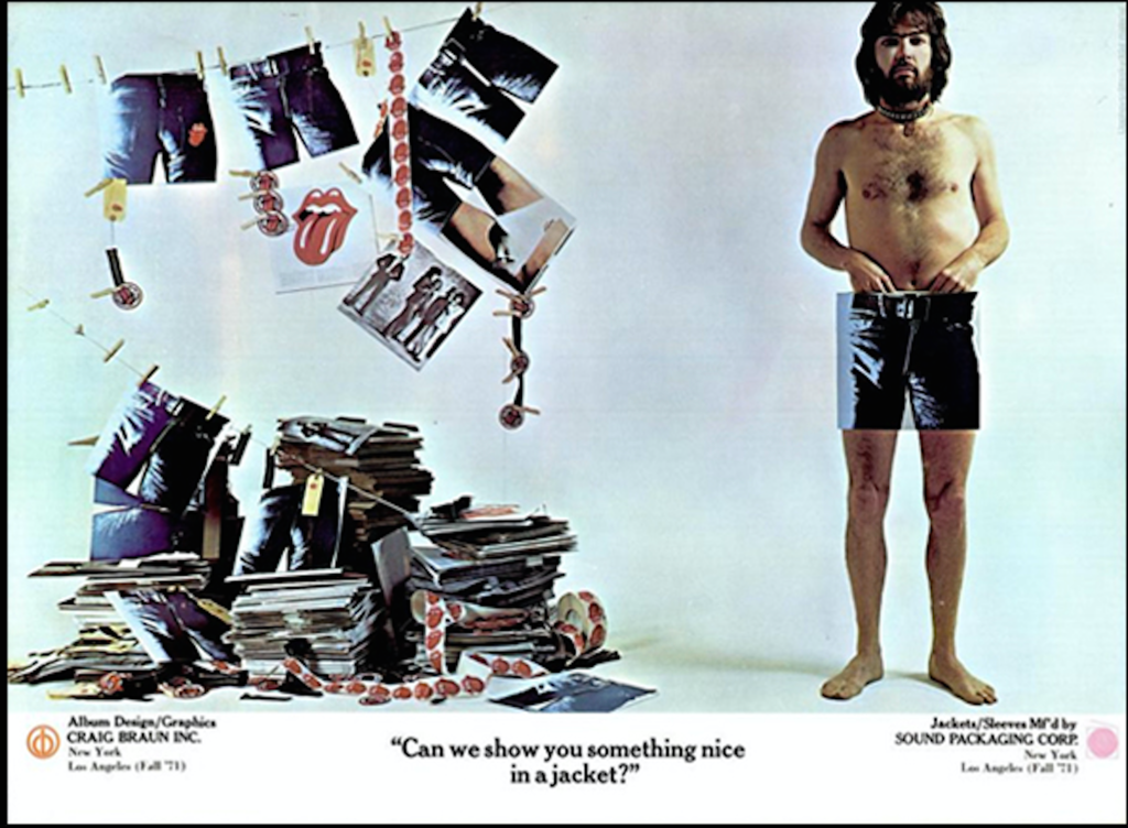
Still wanna debate this? I'll have Ernie find the email where Marshall Chess's wife has something to say about it. She was there, were you?
Still wanna debate this? I'll have Ernie find the email where Marshall Chess's wife has something to say about it. She was there, were you?
Re: First designer of Stones Tongue & Lips logo???
Posted by:
Irix
()
Date: June 7, 2017 11:05
Quote
roller99

Your picture states "Fall 1971" while John Pasche did his first drafts for the RS-Logo already in 1970 - [iorr.org] .
And the 'Brown Sugar / Bitch / Let It Rock' Single as well as the 'Sticky Fingers' Album with the new Logo on it were released in April 1971 ....
Re: First designer of Stones Tongue & Lips logo???
Posted by:
roller99
()
Date: June 7, 2017 15:31
Quote
IrixQuote
roller99
Your picture states "Fall 1971" while John Pasche did his first drafts for the RS-Logo already in 1970 - [iorr.org] .
And the 'Brown Sugar / Bitch / Let It Rock' Single as well as the 'Sticky Fingers' Album with the new Logo on it were released in April 1971 ....
Yes, this was done AFTER Sticky Fingers was done, brilliant detective work...
What's your point? Do YOU think someone would have done this ad if they didn't have the rights to those images?
Re: First designer of Stones Tongue & Lips logo???
Posted by:
Irix
()
Date: June 7, 2017 17:00
Quote
roller99
What's your point? Do YOU think someone would have done this ad if they didn't have the rights to those images?
At least your advertising picture doesn't prove that Ernie Cefalu did his first design of the Tongue&Lips logo before February 1971 or before John Pasche in 1970 ....
Re: First designer of Stones Tongue & Lips logo???
Posted by:
roller99
()
Date: June 8, 2017 01:28
Quote
IrixQuote
roller99
What's your point? Do YOU think someone would have done this ad if they didn't have the rights to those images?
At least your advertising picture doesn't prove that Ernie Cefalu did his first design of the Tongue&Lips logo before February 1971 or before John Pasche in 1970 ....
OMG, are you that thick? Why would a well-known company place an ad like that? Don't you get that Craig Braun's company created the first tongue. Craig owned the company, and Ernie worked for Craig. What do you know about this? Were you there when it happened, or do you know any of these people?
No, I didn't think so. Or maybe I should post a picture of something called "Dolls Alive", which was an album and a poster for a show done in 1969 that had the exact set of lips, minus the tongue, also done by Cefalu, for......wait for it.....Decca Records. It predates the whole f**king thing. That's the connection between Decca and Craig Braun. Yes, I know, SF was not on Decca. But the tongue design went that far back.
I guess you don't understand that this kind of thing, where one guy designs something, the client says "I don't like it", then takes it to another artist is common practice.
Would it mean more to you if I found the email that was sent I think three weeks ago, from Mrs. Ex Marshall Chess, stating that these facts are true? Would that satisfy?
I tell you, next time I see Mick I'm gonna ask him and get him on record, just to put this to bed.
Those are my facts. What exactly are your's?
Re: First designer of Stones Tongue & Lips logo???
Posted by:
roller99
()
Date: June 8, 2017 01:36
I don't know why this is even a thing here on IORR. All the "fact checkers" and such, they act like they have a personal stake in this. Or like they have some facts that they think "solves" the whole thing.
Cefalu and Pasche have a laugh over this. Cefalu has been licensing the tongue/lips logo for years. Do you think that The Stones would hesitate for more than a day if they found an unlicensed tongue on some T-shirt? I don't.
Do you think that if Cefalu was a fake, his original art would be hanging in the Smithsonian? I don't.
Do you think that if Cefalu did most of the album covers for Alice Cooper, Cheech and Chong, Aerosmith, and many other, totalling over 120, he would pick one thing to falsely claim he'd done it? I don't.
But you naysayers, keep on stating what you don't know, because of what you've read somewhere, because you think that if you're on IORR you have the market cornered on Stones facts.
I'll go with the reality.
Re: First designer of Stones Tongue & Lips logo???
Posted by:
GasLightStreet
()
Date: June 8, 2017 04:40
roller99, JOHN PASCHE did The Rolling Stones logo. Craig Braun's company via Marshall Chess updated it.
That's it.
For THE LAST TIME, there is no other official logo creator than JOHN PASCHE.
Said.
That's it.
For THE LAST TIME, there is no other official logo creator than JOHN PASCHE.
Said.
Re: First designer of Stones Tongue & Lips logo???
Posted by:
CaptainCorella
()
Date: June 8, 2017 05:17
Quote
GasLightStreet
roller99, JOHN PASCHE did The Rolling Stones logo. Craig Braun's company via Marshall Chess updated it.
That's it.
For THE LAST TIME, there is no other official logo creator than JOHN PASCHE.
Said.
Indeed, but Mr Pasche was greatly influenced by this from Alan Aldridge in 1969
[www.theloop.com.au]
John was a student graphic designer in Brighton UK in 1969 and frankly it's totally inconceivable that he didn't see "Beatles Illustrated Lyrics" book when it was published. (Much as The Beachboys must have heard Chuck Berry....)
--
Captain Corella
60 Years a Fan
Re: First designer of Stones Tongue & Lips logo???
Posted by:
GasLightStreet
()
Date: June 8, 2017 05:22
I've seen that - I have that book.
HOWEVER... Pasche designed the logo.
SAID.
HOWEVER... Pasche designed the logo.
SAID.
Re: First designer of Stones Tongue & Lips logo???
Posted by:
Hairball
()
Date: June 8, 2017 05:50
Quote
roller99
I don't know why this is even a thing here on IORR. All the "fact checkers" and such, they act like they have a personal stake in this. Or like they have some facts that they think "solves" the whole thing.
Cefalu and Pasche have a laugh over this. Cefalu has been licensing the tongue/lips logo for years. Do you think that The Stones would hesitate for more than a day if they found an unlicensed tongue on some T-shirt? I don't.
Do you think that if Cefalu was a fake, his original art would be hanging in the Smithsonian? I don't.
Do you think that if Cefalu did most of the album covers for Alice Cooper, Cheech and Chong, Aerosmith, and many other, totalling over 120, he would pick one thing to falsely claim he'd done it? I don't.
But you naysayers, keep on stating what you don't know, because of what you've read somewhere, because you think that if you're on IORR you have the market cornered on Stones facts.
I'll go with the reality.
Very convincing!
I do like the idea of the toungue on the Beatles book cover posted by CaptainCorella as the true inspiration though- it's nearly identical.
That said, and not to rock anyones boat, some form of credit for the Stones logo should really go to Alan Aldridge via his Beatles book and imo Then official credit really goes to Ernie Cefalu followed by John Pasche.
I don't understand why Pasche should get full credit for tweaking a few details of a design presented to him that was already complete for all intents and purposes - he should have an asterisk next to his name as "Creator of the logo".
_____________________________________________________________
Rip this joint, gonna save your soul, round and round and round we go......
Re: First designer of Stones Tongue & Lips logo???
Posted by:
GasLightStreet
()
Date: June 8, 2017 06:11
Quote
Hairball
I don't understand why Pasche should get full credit for tweaking a few details of a design presented to him that was already complete for all intents and purposes - he should have an asterisk next to his name as "Creator of the logo".
Because he came up with it.
PAY ATTENTION.
Quote
Irix
But John Pasche has been contacted by the Stones already in April 1970:
Detailed object description: Victoria and Albert Museum

Re: First designer of Stones Tongue & Lips logo???
Posted by:
Hairball
()
Date: June 8, 2017 06:24
Quote
GasLightStreetQuote
Hairball
I don't understand why Pasche should get full credit for tweaking a few details of a design presented to him that was already complete for all intents and purposes - he should have an asterisk next to his name as "Creator of the logo".
Because he came up with it.
PAY ATTENTION.Quote
Irix
But John Pasche has been contacted by the Stones already in April 1970:
Detailed object description: Victoria and Albert Museum
Officially and contractually it appears that way, but there's much more to the story than a piece of paper.
And for the record, I'm open to all interpretations and not taking sides, just calling it like I see it.
_____________________________________________________________
Rip this joint, gonna save your soul, round and round and round we go......
Re: First designer of Stones Tongue & Lips logo???
Posted by:
roller99
()
Date: June 8, 2017 07:14
Quote
HairballQuote
roller99
I don't know why this is even a thing here on IORR. All the "fact checkers" and such, they act like they have a personal stake in this. Or like they have some facts that they think "solves" the whole thing.
Cefalu and Pasche have a laugh over this. Cefalu has been licensing the tongue/lips logo for years. Do you think that The Stones would hesitate for more than a day if they found an unlicensed tongue on some T-shirt? I don't.
Do you think that if Cefalu was a fake, his original art would be hanging in the Smithsonian? I don't.
Do you think that if Cefalu did most of the album covers for Alice Cooper, Cheech and Chong, Aerosmith, and many other, totalling over 120, he would pick one thing to falsely claim he'd done it? I don't.
But you naysayers, keep on stating what you don't know, because of what you've read somewhere, because you think that if you're on IORR you have the market cornered on Stones facts.
I'll go with the reality.
Very convincing!
I do like the idea of the toungue on the Beatles book cover posted by CaptainCorella as the true inspiration though- it's nearly identical.
That said, and not to rock anyones boat, some form of credit for the Stones logo should really go to Alan Aldridge via his Beatles book and imo Then official credit really goes to Ernie Cefalu followed by John Pasche.
I don't understand why Pasche should get full credit for tweaking a few details of a design presented to him that was already complete for all intents and purposes - he should have an asterisk next to his name as "Creator of the logo".
Pasche gets the credit because in order to obscure the true origins of something and not have to pay the first guy, they have the first guy come up with something, say "no", then give the idea to a second guy. If you ask Cefalu, he'll actually say "Pasche's version was way better than mine, it was more animated".
Re: First designer of Stones Tongue & Lips logo???
Posted by:
GasLightStreet
()
Date: June 8, 2017 07:15
Quote
Hairball
Officially and contractually it appears that way, but there's much more to the story than a piece of paper.
And for the record, I'm open to all interpretations and not taking sides, just calling it like I see it.
Cefalu's work sucks. Even Ray Charles can see that. As you said, like you see it. And what Ray Charles sees is a 4th grader's work.
Sorry, only registered users may post in this forum.
Online Users
Blueranger , doubledoor , EddieByword , gagiwh , Halup , harjen , hbwriter , Heart for Stones , HollywoodStone , HouseBoyKnows , keefriffhards , Kobroo , mab1888 , MJAGGER123 , Necessitor , resotele , spunky , zeppfloyd
Guests:
1279
Record Number of Users:
206
on June 1, 2022 23:50
Record Number of Guests:
9627
on January 2, 2024 23:10