Tell Me :
Talk

IORR............but I like it!
Talk about your favorite band.
![]()
![]()
![]()
![]()
For information about how to use this forum please check out forum help and policies.
The Proposed IORR Design Thread
Posted by:
schillid
()
Date: February 7, 2007 18:17
-
Edited 2 time(s). Last edit at 2007-06-25 21:12 by schillid.
Edited 2 time(s). Last edit at 2007-06-25 21:12 by schillid.
Re: The Proposed IORR Design Thread
Posted by:
inopeng
()
Date: February 7, 2007 18:22
Wow...very, very nice.
If used for the t-shirt, just don't print it too big. It will look richer and more, shall we say "appropriate" for those of us over 35, if it was smaller placed on the breast). IMHO.
If used for the t-shirt, just don't print it too big. It will look richer and more, shall we say "appropriate" for those of us over 35, if it was smaller placed on the breast). IMHO.
Re: The Proposed IORR Design Thread
Posted by:
sluissie
()
Date: February 7, 2007 18:32
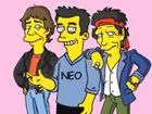
I still like the concept, but I think the, well, how can I explain this... the 'schwung' is less. Seperating the bandmembers in the image has made it more rigid. Maybe too rigid. Maybe it has something to do with the heads of Mick, Ronnie and Charlie, that seem to be placed on one horizontal line. Less 'movement' than in the concept picture.
That said, let's move on to the positive aspects: the faces are much more recognizable, which is very nice. The letters are not translucent anymore, you don't see the O shine through the I anymore, which makes it very clear.
Charlie and Keith are transferred very good, Mick and Ronnie are still very 'photoshopped', if you see what I mean. (around the hair)
Don't get me wrong: I'm trying to point things out, that in my opinion are holding the design back from its full potency. It is still growing, and I still like the idea very much.
Jelle
Edited 1 time(s). Last edit at 2007-02-07 18:33 by sluissie.
Re: The Proposed IORR Design Thread
Posted by:
Doc
()
Date: February 7, 2007 18:35
inopeng Wrote:
-------------------------------------------------------
> Wow...very, very nice.
>
> If used for the t-shirt, just don't print it too
> big. It will look richer and more, shall we say
> "appropriate" for those of us over 35, if it was
> smaller placed on the breast). IMHO.
Couldn't have said it any better, even if I am still under 35 LOL.
Why not a grey shirt instead of these too classic black shirts ?
[doctorstonesblog.blogspot.com]
Re: The Proposed IORR Design Thread
Posted by:
with sssoul
()
Date: February 7, 2007 18:37
really nice work Schillid - thank you for all your good hard work.
Keith looks great! so do the colours; and i like the style of the letters a lot.
do the outlines of the others look a lot more artificial than Keith's? (especially Mick, and Ronnie's hair)
and ... does Charlie now look closer to the front than Keith?
and ... sorry but ... it's not the image of Mick i'd choose.
sorry if i'm out of line - i'm just sayin, because you asked.
Re: The Proposed IORR Design Thread
Posted by:
rrronnie
()
Date: February 7, 2007 18:40
Great job, schillid! You da man!
Re: The Proposed IORR Design Thread
Posted by:
schillid
()
Date: February 7, 2007 18:51
Jagged photoshop cuts will disappear... that's the easy part.
I agree that it's losing something from the original though. I will go back and check later.
I agree that it's losing something from the original though. I will go back and check later.
Re: The Proposed IORR Design Thread
Posted by:
sweet neo con
()
Date: February 7, 2007 19:03
like it...but keith, ron & charlie...have basically the same expression.
re: photo choice.....any more variety? ronnie smiling? keith glaring?
mick & charlie are fine.
i also agree with what openg & doc said (size).
and i agree with all the positives...
schillid....you did a great job. i/we don't mean to be picky.
people who do creative/subjective things open themselves up.....it's unfair. i know.
IORR............but I like it!
Re: The Proposed IORR Design Thread
Posted by:
schillid
()
Date: February 7, 2007 19:07
I agree about facial expressions. They're all looking down (excpt mj). I'd like especially to see Keith or Ronnie looking at the other guy... BV?
Re: The Proposed IORR Design Thread
Posted by:
with sssoul
()
Date: February 7, 2007 19:10
>> like it...but keith, ron & charlie...<<
smile: yeah, they're all transfixed by our left breasts :E
>> I'd like especially to see Keith or Ronnie looking at the other guy <<
that would be beautiful
>> schillid....you did a great job. i/we don't mean to be picky. <<
absolutely.
Edited 1 time(s). Last edit at 2007-02-07 19:12 by with sssoul.
Re: The Proposed IORR Design Thread
Posted by:
schillid
()
Date: February 7, 2007 19:11
sweet neo con Wrote:
-------------------------------------------------------
> we don't mean to be picky.
> people who do creative/subjective things open
> themselves up.....it's unfair. i know.
I can take it.
-------------------------------------------------------
> we don't mean to be picky.
> people who do creative/subjective things open
> themselves up.....it's unfair. i know.
I can take it.
Re: The Proposed IORR Design Thread
Posted by:
Bingo
()
Date: February 7, 2007 19:12
Nice.......IMO, either Ron and Charlie or Keith and Charlie should be changed, so they are looking at a different focal point.
Otherwise, looks great.

Otherwise, looks great.
Re: The Proposed IORR Design Thread
Posted by:
Manofwealthandtaste
()
Date: February 7, 2007 19:20
But nice to have the detail of Charlie's drum in the picture.
Re: The Proposed IORR Design Thread
Posted by:
schillid
()
Date: February 7, 2007 19:23
Ideally:
Mick looking at audience (the pic we have is fine)
switch keith and Ron positions
Ronnie------->Keith-------> Charlie looking down (the pic we have is fine)
"----->" = where RW and KR are looking
Mick looking at audience (the pic we have is fine)
switch keith and Ron positions
Ronnie------->Keith-------> Charlie looking down (the pic we have is fine)
"----->" = where RW and KR are looking
Re: The Proposed IORR Design Thread
Posted by:
schillid
()
Date: February 7, 2007 19:25
Manofwealthandtaste Wrote:
-------------------------------------------------------
> nice to have the detail of Charlie's drum in the picture.
I had hoped to have keth and ron's guitars in it too.
-------------------------------------------------------
> nice to have the detail of Charlie's drum in the picture.
I had hoped to have keth and ron's guitars in it too.
Re: The Proposed IORR Design Thread
Posted by:
Manofwealthandtaste
()
Date: February 7, 2007 19:28
schillid Wrote:
-------------------------------------------------------
> Manofwealthandtaste Wrote:
> --------------------------------------------------
> -----
> > nice to have the detail of Charlie's drum in the
> picture.
>
>
> I had hoped to have keth and ron's guitars in it
> too.
Still quite cool to have their guitar straps, thus showing they are 'in action' rather than standing at a Press shoot.
Re: The Proposed IORR Design Thread
Posted by:
with sssoul
()
Date: February 7, 2007 19:30
>> I had hoped to have Keith and Ron's guitars in it too. <<
great idea - part of at least one guitar would be cool
have some of this very creative 4-colour popcorn :E
great idea - part of at least one guitar would be cool
have some of this very creative 4-colour popcorn :E
Re: The Proposed IORR Design Thread
Posted by:
schillid
()
Date: February 7, 2007 19:34
with sssoul Wrote:
-------------------------------------------------------
> have some of this very creative 4-colour popcorn
Do you know if the popcorn is CMYK or not?
-------------------------------------------------------
> have some of this very creative 4-colour popcorn
Do you know if the popcorn is CMYK or not?
Re: The Proposed IORR Design Thread
Posted by:
with sssoul
()
Date: February 7, 2007 19:36
>> Do you know if the popcorn is CMYK or not? <<
smile: nah, but if you hum a few bars i'll try to wing it :E
smile: nah, but if you hum a few bars i'll try to wing it :E
Re: The Proposed IORR Design Thread
Posted by:
schillid
()
Date: February 7, 2007 20:21
-
Edited 2 time(s). Last edit at 2007-02-08 04:12 by schillid.
Edited 2 time(s). Last edit at 2007-02-08 04:12 by schillid.
Re: The Proposed IORR Design Thread
Posted by:
ohnonotyouagain
()
Date: February 7, 2007 20:25
I much prefer the original, as seen on this page: [www.iorr.org]
Any reason you can't use that one? Looks perfect to me.
Any reason you can't use that one? Looks perfect to me.
Re: The Proposed IORR Design Thread
Posted by:
sweet neo con
()
Date: February 7, 2007 20:30
yes...actually i agree with ohnonotyouagain...i like the feel of those images across the IORR. if it's ok to use those images....that's my vote.
IORR............but I like it!
IORR............but I like it!
Re: The Proposed IORR Design Thread
Posted by:
Erik_Snow
()
Date: February 7, 2007 20:33
sweet neo con Wrote:
-------------------------------------------------------
> yes...actually i agree with ohnonotyouagain...i
> like the feel of those images across the IORR. if
> it's ok to use those images....that's my vote.
>
> [www.iorr.org]
Me too, I think it's better when Stones are spread around, inside the letters, instead of this version...but it's good work, schillid, you made the first version too
Re: The Proposed IORR Design Thread
Posted by:
schillid
()
Date: February 7, 2007 20:37
Seriously
I will obviously need to go back and examine my earlie design.
I gotten too far away from it
I will obviously need to go back and examine my earlie design.
I gotten too far away from it
Re: The Proposed IORR Design Thread
Posted by:
stoned_in_dc
()
Date: February 7, 2007 20:38
oh is this the thread for us to say what we personally want?? provide comments on things that should be changed???
i understood shirt deal was done?
i understood shirt deal was done?
Re: The Proposed IORR Design Thread
Posted by:
sweet neo con
()
Date: February 7, 2007 20:41
IORR............but I like it!
Re: The Proposed IORR Design Thread
Posted by:
schillid
()
Date: February 7, 2007 20:48
I was just asking for people's reaction to the logo...
We now rejoin the main thread ...
We now rejoin the main thread ...
Re: The Proposed IORR Design Thread
Posted by:
little queenie
()
Date: February 7, 2007 20:48
i like the original images but in the new layout - i like how each one is in a letter.
Re: The Proposed IORR Design Thread
Posted by:
ohnonotyouagain
()
Date: February 7, 2007 20:51
I think the design flows better with the overlap in the original.
Sorry, only registered users may post in this forum.
Online Users
EJM , fedecarp , JackM , MadMetaphoricalMax , matatu , Purplevienna1 , rcfoxy , rebelhipi , Redstone5 , spunky , stargroover , Stilllife09 , Stonesfan2146 , tumblingdice , z
Guests:
1567
Record Number of Users:
206
on June 1, 2022 23:50
Record Number of Guests:
9627
on January 2, 2024 23:10