Tell Me :
Talk
That's what I thought, if you visit their site it shows sold out, but if you sign up for their email updates it sends you an email with a link to a different store/page where it shows you can still order all versions (I literally just placed an order before typing this and it went through).. Price is about $10 u.s. more than the pre-sale price, but it also gives you code for 10% off in the same email
Just curious...what Stones EP?
All the best
CrazyMama
Just hoping they will release 3 or 4 new songs coming month.
Jeroen
Won't happen.

"As we say in England, it can get a bit trainspottery"
There is info about each of the songwriters. no specific info about the song or info about why the Stones have ""handpicked"" each specific song.
The music is Great however, and only E 16,00 in the Netherlands (cd version).
jeroen
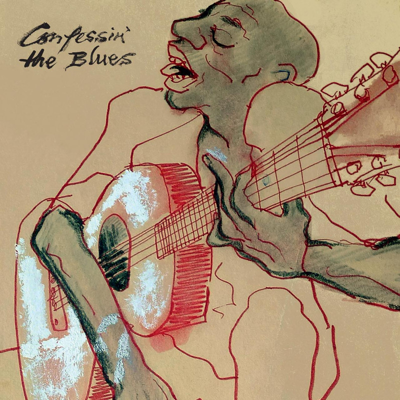
opposite feeling completely, i decide to buy the thing (i already have much of the songs compiled) just because ofbthe artwork which i see immediate, precise, not realistic, with a nice touch in the tongue and lips of the man pointing loosely at the heritage of the band. brilliant work, imo
Not to mention that tongue...is that supposed to be a tongue? Or the right collar of his shirt? Either way, an awkward distraction and unnecessary.
_____________________________________________________________
Rip this joint, gonna save your soul, round and round and round we go......
* Love how he positioned the man's middle finger though, in anticipation of critiques like this no doubt
Not going there...
Booking a Paris studio for November, three singles next year and eventually a new album + apparently touring it tell me otherwise
Talk about your favorite band.
![]()
![]()
![]()
![]()
For information about how to use this forum please check out forum help and policies.
Re: Confessin’ The Blues – In Collaboration With The Rolling Stones
Posted by:
Rockman
()
Date: November 6, 2018 01:33
Fanks Cristiano …. Fings are happenin' again …..
I'm back livin' with Blue & Lonesome …. I just nudge
the bass up a couple of clicks …. What a trip …. what a record ……… What a journey

ROCKMAN
I'm back livin' with Blue & Lonesome …. I just nudge
the bass up a couple of clicks …. What a trip …. what a record ……… What a journey
ROCKMAN
Re: Confessin’ The Blues – In Collaboration With The Rolling Stones
Posted by:
Rockman
()
Date: November 6, 2018 01:54
….Hey that Jimmy Reed story is classic ….
ROCKMAN
ROCKMAN
Re: Confessin’ The Blues – In Collaboration With The Rolling Stones
Posted by:
Cristiano Radtke
()
Date: November 7, 2018 19:40
Re: Confessin’ The Blues – In Collaboration With The Rolling Stones
Posted by:
Rockman
()
Date: November 7, 2018 23:57
FANKS Cristiano …. Good ta watch … luv Ronnie's cover art … way coooool
ROCKMAN
ROCKMAN
Re: Confessin’ The Blues – In Collaboration With The Rolling Stones
Posted by:
MononoM
()
Date: November 8, 2018 21:21
Guess its on the mail now ))
Delivery 1 of 1 has been dispatched
Order No. xxxxxxxx — Tuesday, August 7, 2018 4:39:00 AM
Shipped Item(s)
1 x Confessin' The Blues 10in Book Pack (Exclusive Stones Store Limited Edition)
Life's just a cocktail party on the street
))Delivery 1 of 1 has been dispatched
Order No. xxxxxxxx — Tuesday, August 7, 2018 4:39:00 AM
Shipped Item(s)
1 x Confessin' The Blues 10in Book Pack (Exclusive Stones Store Limited Edition)
Life's just a cocktail party on the street
Re: Confessin’ The Blues – In Collaboration With The Rolling Stones
Posted by:
resotele
()
Date: November 9, 2018 11:47
my vinyl deluxe boxset arrived this morning. Very nice edition, well done. I'm looking forward to listen to the vinyls this evening.
Resotele
Resotele
Re: Confessin’ The Blues – In Collaboration With The Rolling Stones
Posted by:
maumau
()
Date: November 9, 2018 12:09
boxset arrived early this morning: sweet 
Re: Confessin’ The Blues – In Collaboration With The Rolling Stones
Posted by:
snoopy2
()
Date: November 9, 2018 12:51
Quote
masoudi
I see the stones store versions many have sold out!
That's what I thought, if you visit their site it shows sold out, but if you sign up for their email updates it sends you an email with a link to a different store/page where it shows you can still order all versions (I literally just placed an order before typing this and it went through).. Price is about $10 u.s. more than the pre-sale price, but it also gives you code for 10% off in the same email
Re: Confessin’ The Blues – In Collaboration With The Rolling Stones
Posted by:
runrudolph
()
Date: November 9, 2018 14:49
Just bought it in a store.sounding good.
Now waiting for the Stones EP...
Jeroen
Now waiting for the Stones EP...
Jeroen
Re: Confessin’ The Blues – In Collaboration With The Rolling Stones
Posted by:
Norbert
()
Date: November 9, 2018 15:46
Quote
corriecas
Just bought it in a store.sounding good.
Now waiting for the Stones EP...
Jeroen
Just curious...what Stones EP?
All the best
CrazyMama
Re: Confessin’ The Blues – In Collaboration With The Rolling Stones
Posted by:
runrudolph
()
Date: November 9, 2018 16:02
Quote
NorbertQuote
corriecas
Just bought it in a store.sounding good.
Now waiting for the Stones EP...
Jeroen
Just curious...what Stones EP?
All the best
CrazyMama
Just hoping they will release 3 or 4 new songs coming month.
Jeroen
Re: Confessin’ The Blues – In Collaboration With The Rolling Stones
Posted by:
Norbert
()
Date: November 9, 2018 19:00
Re: Confessin’ The Blues – In Collaboration With The Rolling Stones
Posted by:
odean73
()
Date: November 9, 2018 20:28
Is there any official downloads for this album.
Looked at all the obvious one's, but nothing showing.
Looked at all the obvious one's, but nothing showing.
Re: Confessin’ The Blues – In Collaboration With The Rolling Stones
Posted by:
Deltics
()
Date: November 9, 2018 20:31
Quote
corriecasQuote
NorbertQuote
corriecas
Just bought it in a store.sounding good.
Now waiting for the Stones EP...
Jeroen
Just curious...what Stones EP?
All the best
CrazyMama
Just hoping they will release 3 or 4 new songs coming month.
Jeroen
Won't happen.
"As we say in England, it can get a bit trainspottery"
Re: Confessin’ The Blues – In Collaboration With The Rolling Stones
Posted by:
bye bye johnny
()
Date: November 10, 2018 16:17
Re: Confessin’ The Blues – In Collaboration With The Rolling Stones
Posted by:
Lynd8
()
Date: November 10, 2018 17:00
Can anyone comment on the booklet that comes with the CDs? I have about 90% of this music already but to have a nice booklet and a couple songs I'm missing wouldn't be all bad I guess...
Re: Confessin’ The Blues – In Collaboration With The Rolling Stones
Posted by:
schillid
()
Date: November 10, 2018 18:40
I'll bet the music is great! I can't get past the silly drawing on the cover, however.
If I was gonna give it a harsh treatment -- a critique -- like it might get if it really was a second year art school drawing class assignment... I would say:
* Red line quality is monotonous and extremely uniform throughout... no finesse. (Compared even to the expressive qualities of the black line in the hand, for example... which varies some in thickness and density to begin to reveal the actual form of the hand.)
* Lazy use of the red color to show the side of the guitar. Ditto for the white color on the guitar's top.
* Lack of any spatial or formal relationships between head, shoulders, arms, hands.
* Cartoonish, stereotype facial features.
Sorry, Ron.
Re: Confessin’ The Blues – In Collaboration With The Rolling Stones
Posted by:
runrudolph
()
Date: November 10, 2018 19:36
Quote
Lynd8
Can anyone comment on the booklet that comes with the CDs? I have about 90% of this music already but to have a nice booklet and a couple songs I'm missing wouldn't be all bad I guess...
There is info about each of the songwriters. no specific info about the song or info about why the Stones have ""handpicked"" each specific song.
The music is Great however, and only E 16,00 in the Netherlands (cd version).
jeroen
Re: Confessin’ The Blues – In Collaboration With The Rolling Stones
Posted by:
tomcasagranda
()
Date: November 11, 2018 19:01
The music is great, the liner notes less so.
It would've been nice to have had some notes as to what made The Rolling Stones record Commit A Crime, Mannish Boy, etc. I just feel that such a set has a thin-gruel content issue, when it shouldn't have.
In comparison the Chicago Stones blues tribute, with Buddy Guy, Mick and Keith, explains itself rather well. Likewise, the other blues tribute to the Stones with Johnny Copeland, Luther Allison, Alvin Youngblood Hart etc explained the methodology.
I can remember, a few Xmas's ago, Mick Jagger appearing on a Radio 2 show wherein he explained how he loved, inter alia, Jerry Lee Lewis' version of She Even Woke Me Up to Say Goodbye, and that seemed better. It's as if we were, or are, a little short-changed as to the song selection for Confessin' The Blues.
Certainly, the notes to Blue & Lonesome do some justice as to explaining that album. Oh well, maybe I shouldn't moan, but just my thoughts for what it's worth.
Re: Confessin’ The Blues – In Collaboration With The Rolling Stones
Posted by:
maumau
()
Date: November 11, 2018 19:35
Quote
schillid
I'll bet the music is great! I can't get past the silly drawing on the cover, however.
If I was gonna give it a harsh treatment -- a critique -- like it might get if it really was a second year art school drawing class assignment... I would say:
* Red line quality is monotonous and extremely uniform throughout... no finesse. (Compared even to the expressive qualities of the black line in the hand, for example... which varies some in thickness and density to begin to reveal the actual form of the hand.)
* Lazy use of the red color to show the side of the guitar. Ditto for the white color on the guitar's top.
* Lack of any spatial or formal relationships between head, shoulders, arms, hands.
* Cartoonish, stereotype facial features.
Sorry, Ron.
opposite feeling completely, i decide to buy the thing (i already have much of the songs compiled) just because ofbthe artwork which i see immediate, precise, not realistic, with a nice touch in the tongue and lips of the man pointing loosely at the heritage of the band. brilliant work, imo
Re: Confessin’ The Blues – In Collaboration With The Rolling Stones
Posted by:
Hairball
()
Date: November 11, 2018 19:39
Quote
schillid
I'll bet the music is great! I can't get past the silly drawing on the cover, however.
If I was gonna give it a harsh treatment -- a critique -- like it might get if it really was a second year art school drawing class assignment... I would say:
* Red line quality is monotonous and extremely uniform throughout... no finesse. (Compared even to the expressive qualities of the black line in the hand, for example... which varies some in thickness and density to begin to reveal the actual form of the hand.)
* Lazy use of the red color to show the side of the guitar. Ditto for the white color on the guitar's top.
* Lack of any spatial or formal relationships between head, shoulders, arms, hands.
* Cartoonish, stereotype facial features.
Sorry, Ron.
Not to mention that tongue...is that supposed to be a tongue? Or the right collar of his shirt? Either way, an awkward distraction and unnecessary.
_____________________________________________________________
Rip this joint, gonna save your soul, round and round and round we go......
Re: Confessin’ The Blues – In Collaboration With The Rolling Stones
Posted by:
MisterDDDD
()
Date: November 11, 2018 20:10
Quote
schillid
I'll bet the music is great! I can't get past the silly drawing on the cover, however.
If I was gonna give it a harsh treatment -- a critique -- like it might get if it really was a second year art school drawing class assignment... I would say:
* Red line quality is monotonous and extremely uniform throughout... no finesse. (Compared even to the expressive qualities of the black line in the hand, for example... which varies some in thickness and density to begin to reveal the actual form of the hand.)
* Lazy use of the red color to show the side of the guitar. Ditto for the white color on the guitar's top.
* Lack of any spatial or formal relationships between head, shoulders, arms, hands.
* Cartoonish, stereotype facial features.
Sorry, Ron.
* Love how he positioned the man's middle finger though, in anticipation of critiques like this no doubt
Re: Confessin’ The Blues – In Collaboration With The Rolling Stones
Posted by:
maumau
()
Date: November 11, 2018 23:37
very lively and dynamic sketch imo
love the instinctive balancing of the arms, ron knows how to draw, which is not just to make "nice" drawings, it is to give an impression, a feel. and this man does, imo
and the tongue is the tongue of course
and it is a brilliant loose reference to the band logo
if you look for bad and kitsch artwork dig for a bigger bang or steel wheels covers
agree with tomcasagranda on the liner notes instead, poor
Edited 2 time(s). Last edit at 2018-11-11 23:43 by maumau.
Re: Confessin’ The Blues – In Collaboration With The Rolling Stones
Posted by:
Rockman
()
Date: November 12, 2018 00:00
There's only one way out of this schillid …..
Show us what you think the Confessin' cover should be ...
ROCKMAN
Show us what you think the Confessin' cover should be ...
ROCKMAN
Re: Confessin’ The Blues – In Collaboration With The Rolling Stones
Posted by:
Stoneage
()
Date: November 12, 2018 00:00
I hear you, Schillid. You seem to know what you're talking about. My father was an artist so I have the deepest respect for the trade. You have to be schooled to be able to see the details - or the big picture.
I think Ronnie is a decent amateur though and should be judged in that manner.
I think Ronnie is a decent amateur though and should be judged in that manner.
Re: Confessin’ The Blues – In Collaboration With The Rolling Stones
Posted by:
schillid
()
Date: November 12, 2018 03:30
Quote
Rockman
Show us what you think the Confessin' cover should be ...
Not going there...
Re: Confessin’ The Blues – In Collaboration With The Rolling Stones
Posted by:
Rockman
()
Date: November 12, 2018 04:12
….aaaawwwwwww Schill you can do it ….. turn on da lights ...show us ya work
ROCKMAN
ROCKMAN
Re: Confessin’ The Blues – In Collaboration With The Rolling Stones
Posted by:
longlongwinter
()
Date: November 12, 2018 06:04
will this be released digitally?
Re: Confessin’ The Blues – In Collaboration With The Rolling Stones
Posted by:
Stoneage
()
Date: November 12, 2018 15:18
Seems like the Stones are doing everything else these days in order to avoid producing a new record with fresh material. It's like procrastination - a term very well known among IORR members...
The blues is, of course, a dead format by now. Like jazz. Something for the museums. It will live on though, but on a smaller stage. For the aficionados.
The blues is, of course, a dead format by now. Like jazz. Something for the museums. It will live on though, but on a smaller stage. For the aficionados.
Re: Confessin’ The Blues – In Collaboration With The Rolling Stones
Posted by:
DandelionPowderman
()
Date: November 12, 2018 15:41
Quote
Stoneage
Seems like the Stones are doing everything else these days in order to avoid producing a new record with fresh material. It's like procrastination - a term very well known among IORR members...
The blues is, of course, a dead format by now. Like jazz. Something for the museums. It will live on though, but on a smaller stage. For the aficionados.
Booking a Paris studio for November, three singles next year and eventually a new album + apparently touring it tell me otherwise
Sorry, only registered users may post in this forum.
Online Users
1963luca0 , bobo , colonial , falo01 , GJB , Mabru , mikey C , NedKellyBandit , oscarlueje , Papo , RollstoDRSC , spunky , tiffanyblu , wupperstein , zubbid
Guests:
1773
Record Number of Users:
206
on June 1, 2022 23:50
Record Number of Guests:
9627
on January 2, 2024 23:10