Tell Me :
Talk

Owned by Bill Wyman - sold at auction - Winning bid:$22,400
we need a rerelease of the video on Blu Ray. It's something I've never owned on VHS and think it would be a great little time capsule.
Yes, Amazon for the shirt. The mask isn't in Amazon anymore.
[smile.amazon.com]
 Very cool mask.. (like I need another)
Hi roller99,
It's amusing to read that you are once again turning history upside down. Maybe not intensionally, but still upside down.
Mick came up with the idea of a logo for a future Rolling Stones Records company (at that time that title wasn't settled yet. Based on the Beatles' experience with their apple logo, there was a very short lived "pear" in the picture, but fortunately it turned out differently. Pasche was asked by the Stones management to create, apart from a poster, a logo for the band ( the official dates from April 1970). Mick visited the art school where Pasche was at the time and liked his work. He invited Pasche and showed him a Kali image late summer 1970. At a meeting in the Netherlands in October 1970 Chess came up with the idea to have a logo that wouldn't need any addition naming (inspired by the famous shell logo from the oilcompany with the same name) when he passed a Shell gasoline station on his way to Amsterdam. One plus one makes two and Pasche created a bunch of "tongue and lips" images, first sent home by Mick with "you can do better than that". After that (!) Chess came with one of the Pasche images and a simple version was faxed to Braun. This was all in 1970. Only in 1971 there was any communication with Ernie at Braun's company and Chess was present (as Ernie has correctly confirmed (!!!)). There Ernie was asked to add a tongue to his once created mouth only image. It resulted in the end into the eyeless version, that Braun used (via a business deal with Musidor BV in Amsterdam) that version during three years to create merchandise. Some Stones members are for instance immortalised with a T-Shirt with that (Stones owned) image.
Happy, corona free New Year!

That was in regard of the 1970 Tour-Poster, not the Logo. See the interview with John Pasche, Pos. 1:45-2:15 - [www.YouTube.com] .
Edited 1 time(s). Last edit at 2020-12-11 21:00 by Irix.
You're right about the poster. I was referring to the April 1970 letter, in which he was asked to think about a logo, not a tongue logo. The lips&tongue logo idea came later that year (Mick's Kali image), but we both know those details

RCA: Fifty Years exhibition at the Royal College of Art, central London.

The Royal College of Art's GraphicsRCA: Fifty Years exhibition - London
Royal College of Art's (RCA) employee Honour Bayes cleans former
RCA student John Pasche's 1971 lips and tongue logo which was commissioned
by Mick Jagger of the Rolling Stones, whilst Pasche was still a student
at the college, as part of The Royal College of Art's Graphics

HIV charity gig - London 2001
Former Big Brother contestant Aisleyne Horgan Wallace
arrives at Koko in Camden, north London, where she was
attending a benefit gig hosted by Ben Elton, Kelly
Osbourne and friends for HIV charity Body & Soul.
Talk about your favorite band.
![]()
![]()
![]()
![]()
For information about how to use this forum please check out forum help and policies.
Re: Rolling Stones Tongues
Posted by:
Irix
()
Date: November 20, 2020 14:15
4th EP, Streaming only, 20-Nov-2020:
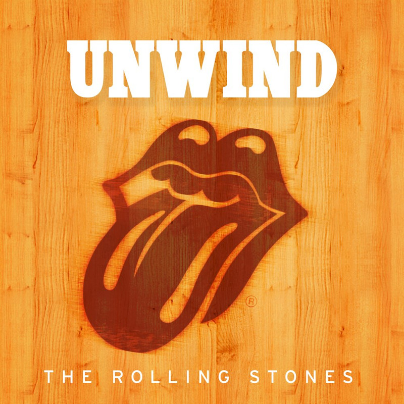
[open.Spotify.com] , [Music.Apple.com] , [www.Qobuz.com] - Large picture - [iorr.org] .
[open.Spotify.com] , [Music.Apple.com] , [www.Qobuz.com] - Large picture - [iorr.org] .
Re: Rolling Stones Tongues
Posted by:
MisterDDDD
()
Date: November 20, 2020 14:59
Thanks Irix!
Nice track list for this one.
Perhaps they release a physical set of all these at some point.
1- Miss You
2- Emotional Rescue
3- Rain Fall Down
4- 100 Years Ago (Piano Demo)
5- Waiting On A Friend
6- Slipping Away
Nice track list for this one.
Perhaps they release a physical set of all these at some point.
1- Miss You
2- Emotional Rescue
3- Rain Fall Down
4- 100 Years Ago (Piano Demo)
5- Waiting On A Friend
6- Slipping Away

Re: Rolling Stones Tongues
Posted by:
Hairball
()
Date: November 24, 2020 20:16
It's beginning to look a lot like Christmas....


_____________________________________________________________
Rip this joint, gonna save your soul, round and round and round we go......
_____________________________________________________________
Rip this joint, gonna save your soul, round and round and round we go......
Re: Rolling Stones Tongues
Posted by:
georgie48
()
Date: November 24, 2020 20:21
Beauties!
Far, far better than the ones I "made"
Far, far better than the ones I "made"
Re: Rolling Stones Tongues
Posted by:
exilestones
()
Date: November 25, 2020 16:56
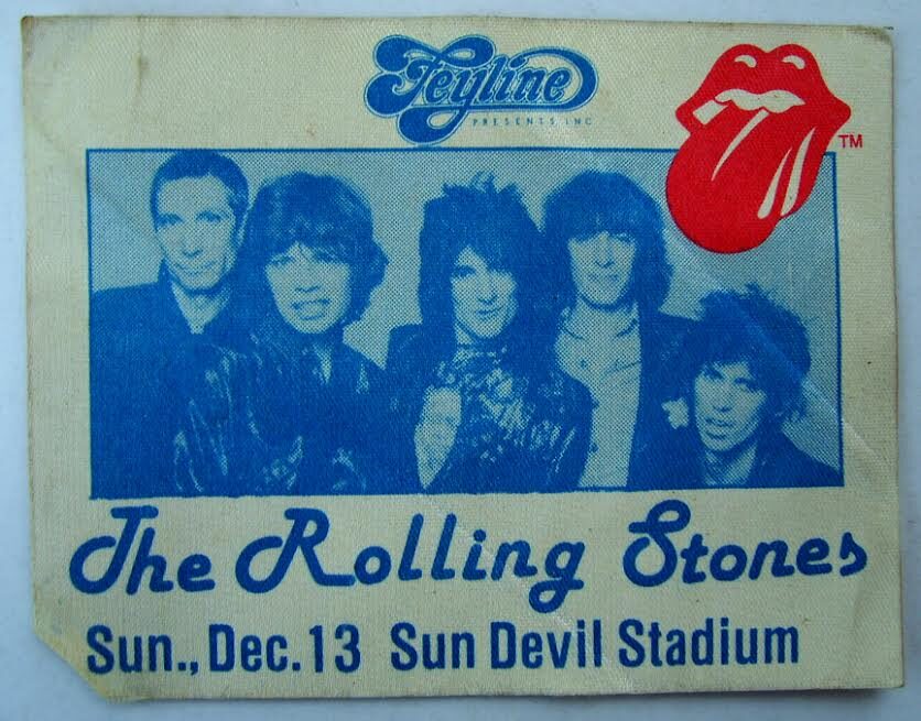
Owned by Bill Wyman - sold at auction - Winning bid:$22,400


Re: Rolling Stones Tongues
Posted by:
GasLightStreet
()
Date: November 30, 2020 17:54
From what I can find, the Ruby Mazur "logo" was only used for
Rocks Off, Happy, IORR and Hang Fire. Horrible design, really. There's nothing appealing about it - it's not even nasty, it's gross.
Rocks Off, Happy, IORR and Hang Fire. Horrible design, really. There's nothing appealing about it - it's not even nasty, it's gross.
Re: Rolling Stones Tongues
Posted by:
Irix
()
Date: December 2, 2020 16:20
Unzipped-Exhibition: "Make your own Stones record sleeve after your visit to Unzipped. You can get to work yourself in our atelier! Make your own record sleeve here in the Stones colours with convenient printing techniques."
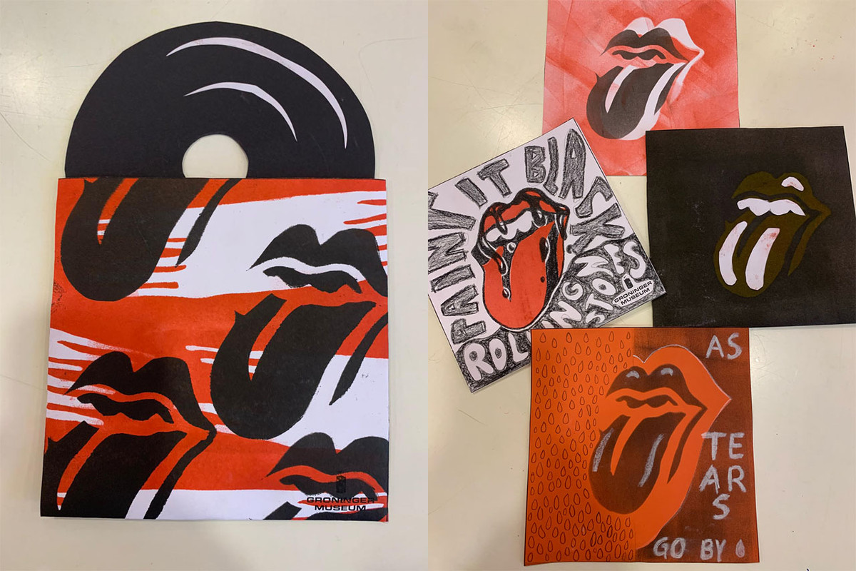
[Twitter.com] · [www.Facebook.com] · Large picture · Large picture
[Twitter.com] · [www.Facebook.com] · Large picture · Large picture


Re: Rolling Stones Tongues
Posted by:
MisterDDDD
()
Date: December 7, 2020 03:09
Like both of those, exile..
Available for purchase or ??
Available for purchase or ??
Re: Rolling Stones Tongues
Posted by:
treaclefingers
()
Date: December 7, 2020 06:39
Quote
GasLightStreet
One of the best!
we need a rerelease of the video on Blu Ray. It's something I've never owned on VHS and think it would be a great little time capsule.
Re: Rolling Stones Tongues
Posted by:
exilestones
()
Date: December 7, 2020 06:53
Quote
MisterDDDD
Like both of those, exile..
Available for purchase or ??
Yes, Amazon for the shirt. The mask isn't in Amazon anymore.
[smile.amazon.com]
Re: Rolling Stones Tongues
Posted by:
MisterDDDD
()
Date: December 11, 2020 03:59
Very cool mask.. (like I need another)Re: Rolling Stones Tongues
Posted by:
georgie48
()
Date: December 11, 2020 13:15
Quote
roller99
When I interview Mick and Keith, I'm going to ask Mick, let's see if he remembers.
Hi roller99,
It's amusing to read that you are once again turning history upside down. Maybe not intensionally, but still upside down.
Mick came up with the idea of a logo for a future Rolling Stones Records company (at that time that title wasn't settled yet. Based on the Beatles' experience with their apple logo, there was a very short lived "pear" in the picture, but fortunately it turned out differently. Pasche was asked by the Stones management to create, apart from a poster, a logo for the band ( the official dates from April 1970). Mick visited the art school where Pasche was at the time and liked his work. He invited Pasche and showed him a Kali image late summer 1970. At a meeting in the Netherlands in October 1970 Chess came up with the idea to have a logo that wouldn't need any addition naming (inspired by the famous shell logo from the oilcompany with the same name) when he passed a Shell gasoline station on his way to Amsterdam. One plus one makes two and Pasche created a bunch of "tongue and lips" images, first sent home by Mick with "you can do better than that". After that (!) Chess came with one of the Pasche images and a simple version was faxed to Braun. This was all in 1970. Only in 1971 there was any communication with Ernie at Braun's company and Chess was present (as Ernie has correctly confirmed (!!!)). There Ernie was asked to add a tongue to his once created mouth only image. It resulted in the end into the eyeless version, that Braun used (via a business deal with Musidor BV in Amsterdam) that version during three years to create merchandise. Some Stones members are for instance immortalised with a T-Shirt with that (Stones owned) image.
Happy, corona free New Year!
Re: Rolling Stones Tongues
Posted by:
Irix
()
Date: December 11, 2020 14:05
Quote
georgie48
first sent home by Mick with "you can do better than that".
That was in regard of the 1970 Tour-Poster, not the Logo. See the interview with John Pasche, Pos. 1:45-2:15 - [www.YouTube.com] .
Edited 1 time(s). Last edit at 2020-12-11 21:00 by Irix.
Re: Rolling Stones Tongues
Posted by:
georgie48
()
Date: December 11, 2020 19:19
Quote
IrixQuote
georgie48
first sent home by Mick with "you can do better than that".
That was in regard of the Tour-Poster, not the Tongue-Logo. Interview with John Pasche, Pos. 1:45-2:15 - [www.YouTube.com] .
You're right about the poster. I was referring to the April 1970 letter, in which he was asked to think about a logo, not a tongue logo. The lips&tongue logo idea came later that year (Mick's Kali image), but we both know those details
Re: Rolling Stones Tongues
Posted by:
exilestones
()
Date: December 13, 2020 07:02
RCA: Fifty Years exhibition at the Royal College of Art, central London.
The Royal College of Art's GraphicsRCA: Fifty Years exhibition - London
Royal College of Art's (RCA) employee Honour Bayes cleans former
RCA student John Pasche's 1971 lips and tongue logo which was commissioned
by Mick Jagger of the Rolling Stones, whilst Pasche was still a student
at the college, as part of The Royal College of Art's Graphics
Re: Rolling Stones Tongues
Posted by:
exilestones
()
Date: December 15, 2020 01:57
HIV charity gig - London 2001
Former Big Brother contestant Aisleyne Horgan Wallace
arrives at Koko in Camden, north London, where she was
attending a benefit gig hosted by Ben Elton, Kelly
Osbourne and friends for HIV charity Body & Soul.
Re: Rolling Stones Tongues
Posted by:
Rockman
()
Date: December 15, 2020 02:11
GULP!! for a moment there
thought it was Heather Locklear
botoxed from the gut to the gills ..... ^^^^^^^^^^^

ROCKMAN
thought it was Heather Locklear
botoxed from the gut to the gills ..... ^^^^^^^^^^^
ROCKMAN

Sorry, only registered users may post in this forum.
Online Users
Guests:
1430
Record Number of Users:
206
on June 1, 2022 23:50
Record Number of Guests:
9627
on January 2, 2024 23:10