For information about how to use this forum please check out forum help and policies.
Re: No Filter 2021 Tour Posters
Posted by:
schillid
()
Date: November 16, 2021 21:26
I cannot decide if I am more embarrassed by these posters as a Rolling Stones fan or as a graphic artist.
They need not always have a graphics novice make a dumb visual pun for each city with their iconic logo using Photoshop.
They could hire a real designer to create one good imaginative design for the entire tour; use their logo tastefully, iconically. Then just swap out the type for each successive city. Just like movie or tv show ad campaign... posters, etc. don't have a separate design for each and every damn city.
Edited 1 time(s). Last edit at 2021-11-16 21:27 by schillid.
Re: No Filter 2021 Tour Posters
Posted by:
Nate
()
Date: November 16, 2021 21:42
I am guessing a different design for each city creates more income for them and there are lots of people who aren't blessed with an eye for good aesthetics who are willing to buy this garbage.
Nate
Nate
Re: No Filter 2021 Tour Posters
Posted by:
2014Slayer
()
Date: November 16, 2021 23:16
Quote
MisterDDDDQuote
jason8903
didn't Charlie have a say in all merchandise design?
Was thinking the same.. he definitely did at one time, as did Charlotte Watts.
Perhaps we are seeing another aspect where the Watts's input is missed.
My thinking exactly! We are missing Charlie's input. The only one I thought was nice was the Tampa one—that is the only city shirt I am buying. Most of the designs are very poor in my opinion, I am also a graphic designer.
Re: No Filter 2021 Tour Posters
Posted by:
slewan
()
Date: November 16, 2021 23:22
unbelievable – things are really getting worse
Re: No Filter 2021 Tour Posters
Posted by:
schillid
()
Date: November 17, 2021 21:33
This one is nice.
I like the negative-positive interplay of the logo on the black background and overall looseness and flatness.
The foreground buildings defining the bottom of the logo is cool.
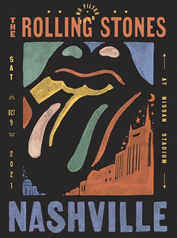
The typography could be better. SAT ? Typography is not on the S.A.T. test.
But it's good that it keeps ROLLING as in "ROLLING STONES"
This one for me is the best one of the bunch:

I like the negative-positive interplay of the logo on the black background and overall looseness and flatness.
The foreground buildings defining the bottom of the logo is cool.

The typography could be better. SAT ? Typography is not on the S.A.T. test.
But it's good that it keeps ROLLING as in "ROLLING STONES"
This one for me is the best one of the bunch:

Re: No Filter 2021 Tour Posters
Posted by:
MisterDDDD
()
Date: November 17, 2021 22:54
Quote
schillid
This one is nice.
I like the negative-positive interplay of the logo on the black background and overall looseness and flatness.
The foreground buildings defining the bottom of the logo is cool.
The typography could be better. SAT ? Typography is not on the S.A.T. test.
But it's good that it keeps ROLLING as in "ROLLING STONES"
This one for me is the best one of the bunch:
Like the Nashville one..

The LA one, while I liked it initially, was a no go for me in person.. First LA show was OK.. not litho worthy but bought a shirt.
This one, and I'm a HUGE fan of vintage signs and like the retro concept in general, but it looks like it's right out of The Flintstones to me..
Not even based on a real sign or place? Hard pass.
Didn't buy anything for LA 2, and man.. I really wanted to.
Made the trek down there early with every intent.
Edited 1 time(s). Last edit at 2021-11-17 23:00 by MisterDDDD.
Re: No Filter 2021 Tour Posters
Posted by:
angee
()
Date: November 18, 2021 06:20
If you look hard enough, the Hollywood sign is based on the real sign, seems to me.
Not a great bunch, in general, I agree.
~"Love is Strong"~
Edited 1 time(s). Last edit at 2021-11-18 10:41 by angee.
Not a great bunch, in general, I agree.
~"Love is Strong"~
Edited 1 time(s). Last edit at 2021-11-18 10:41 by angee.
Re: No Filter 2021 Tour Posters
Posted by:
Hairball
()
Date: November 18, 2021 22:05
Quote
schillid
This one for me is the best one of the bunch:
No doubt, and many would agree as it's the only litho to have completely sold out in the official online store.
Bought a numbered version at the show (limited to only 500), and went looking to pick up another online as a gift for someone with a 15% discount that was just emailed to me, but unfortunately there's no more.
[therollingstonesshop.com]
_____________________________________________________________
Rip this joint, gonna save your soul, round and round and round we go......
Edited 1 time(s). Last edit at 2021-11-18 22:07 by Hairball.
Re: No Filter 2021 Tour Posters
Posted by:
Maindefender
()
Date: November 20, 2021 16:25
Only two left…
Re: No Filter 2021 Tour Posters
Posted by:
TumblinDice76
()
Date: November 20, 2021 18:54
Actually like this one!
Re: No Filter 2021 Tour Posters
Posted by:
MisterDDDD
()
Date: November 20, 2021 18:59
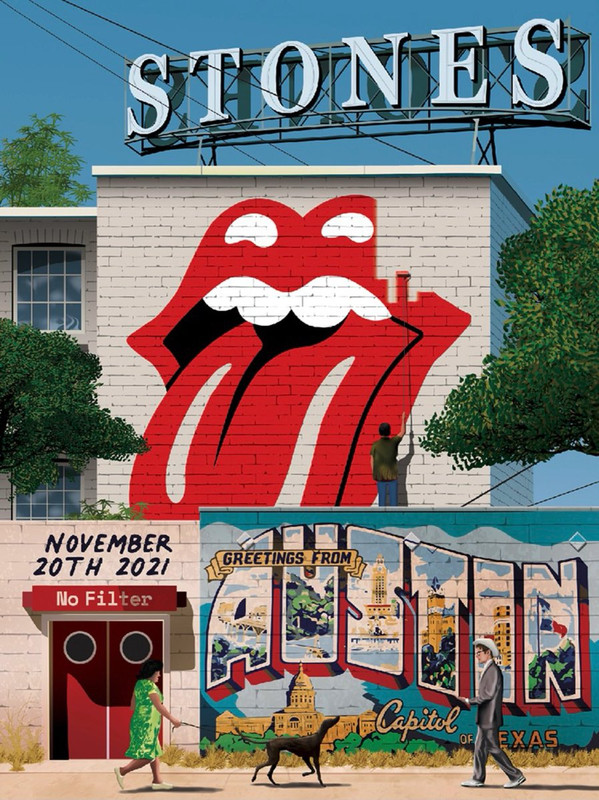
Really good one for Austin!
Especially on a litho!
I'd say get there early grab one and take back to hotel, but not with the logistics at this show
Also sounds like a bit of a trek back to parking, but maybe an option for some.
Especially on a litho!
I'd say get there early grab one and take back to hotel, but not with the logistics at this show

Also sounds like a bit of a trek back to parking, but maybe an option for some.
Re: No Filter 2021 Tour Posters
Posted by:
angee
()
Date: November 20, 2021 19:38
This is a good one, online now. Is it more expensive or different quality if you get it online rather than in person?
I may have to consider the Hollywood, FL poster if it's decent.
~"Love is Strong"~
I may have to consider the Hollywood, FL poster if it's decent.
~"Love is Strong"~
Re: No Filter 2021 Tour Posters
Posted by:
Hairball
()
Date: November 20, 2021 19:47
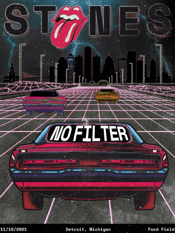
Not too bad - especially when compared to some of the terrible lithos this leg of tour (Detroit, Vegas, Charlotte, St. Louis).
I'd try my best to get a numbered one if at the show, and in fact would even be happy with an unnumbered one purchased online...even though I'm not even attending the show!
(Looks a bit like Mick strolling down the sidewalk incognito).
_____________________________________________________________
Rip this joint, gonna save your soul, round and round and round we go......
Re: No Filter 2021 Tour Posters
Posted by:
MisterDDDD
()
Date: November 20, 2021 19:53
Quote
angee
This is a good one, online now. Is it more expensive or different quality if you get it online rather than in person?
I may have to consider the Hollywood, FL poster if it's decent.
Same price I believe angee.. (except shipping) they rarely differ (bought a Cardiff one once that did tho, still stuck in my craw
 )
)Only difference is the ones at the show are numbered editions of 500.
Don't normally buy lithos for shows I don't attend, but as I had GC ticket, Lucky Dip tix, air, hotel, shuttles, all booked for this at one time, Imma go ahead and pick one up.

Put too much into it to walk away with nothing

Re: No Filter 2021 Tour Posters
Posted by:
TheBluesHadaBaby
()
Date: November 20, 2021 20:58
Thank you!
What a refreshing change the Austin poster is.
Out of 13 so far, now we have, IMO, three* that are very worthy of wall space: Austin, LA 2, and Nashville.
You see, RS Inc.? Put out lithos that look good and we'll actually say so.
* Edit: And two more, Pittsburgh and Tampa, that are interesting and kind of cool. My runners-up.
****
I'm down in Virginia
with your Cousin Lou
Edited 1 time(s). Last edit at 2021-11-20 21:19 by TheBluesHadaBaby.
Re: No Filter 2021 Tour Posters
Posted by:
TumblinDice76
()
Date: November 20, 2021 22:11
Totally agree D's. You spent that much already, buy the Litho and proudly display!Quote
MisterDDDD
Don't normally buy lithos for shows I don't attend, but as I had GC ticket, Lucky Dip tix, air, hotel, shuttles, all booked for this at one time, Imma go ahead and pick one up. smileys with beer
Put too much into it to walk away with nothing winking smiley
Re: No Filter 2021 Tour Posters
Posted by:
BFR
()
Date: November 20, 2021 22:52
Austin is my favorite poster this tour. Hoping Hollywood, FL will be a good one but even if it’s not, I’ll probably get it anyway since that will be such a special show.
Re: No Filter 2021 Tour Posters
Posted by:
Justin
()
Date: November 22, 2021 05:51
What have people been doing to find sold out posters? I'd love LA 2 and Tampa...
Re: No Filter 2021 Tour Posters
Posted by:
Nikkei
()
Date: November 23, 2021 14:48
That gets bonus points for actually using the No Filter tongue
Re: No Filter 2021 Tour Posters
Posted by:
frankotero
()
Date: November 23, 2021 15:53
I was hoping for more since that’s my hometown. I’m comparing it to Austin which is great in my opinion.
Re: No Filter 2021 Tour Posters
Posted by:
slewan
()
Date: November 23, 2021 15:55
this 2021 tour should really be called the 'Badly designed tour poster tour'
Re: No Filter 2021 Tour Posters
Posted by:
floodonthepage
()
Date: November 23, 2021 16:17
Austin and Hollywood win for best posters of the tour IMHO, though Austin is #1.
Vegas, LA #2 and Dallas round out my top 5.
Edited 1 time(s). Last edit at 2021-11-23 18:24 by floodonthepage.
Vegas, LA #2 and Dallas round out my top 5.
Edited 1 time(s). Last edit at 2021-11-23 18:24 by floodonthepage.
Re: No Filter 2021 Tour Posters
Posted by:
UrbanSteel
()
Date: November 23, 2021 16:36

No Filter 2021 A4 Posters.
A4 Posters on HP A4 Everyday Photo Paper Glossy.
Epson ET-2720 Ecotank printer.
Edited 1 time(s). Last edit at 2021-11-24 20:57 by UrbanSteel.
Re: No Filter 2021 Tour Posters
Posted by:
spikenyc
()
Date: November 23, 2021 18:01
I like the St. Louis poster the best from this tour.
Yes, I think they missed Charlie's input.
Interesting how only 2 of the posters (Nashville & Vegas) say "The Rolling Stones" and the rest of them only say "Stones".
Yes, I think they missed Charlie's input.
Interesting how only 2 of the posters (Nashville & Vegas) say "The Rolling Stones" and the rest of them only say "Stones".
Re: No Filter 2021 Tour Posters
Posted by:
floodonthepage
()
Date: November 23, 2021 18:23
Quote
spikenyc
I like the St. Louis poster the best from this tour.
Yes, I think they missed Charlie's input.
Interesting how only 2 of the posters (Nashville & Vegas) say "The Rolling Stones" and the rest of them only say "Stones".
And LA #1. But yes, interesting. And definitely missing Charlie's input in so many ways.
Re: No Filter 2021 Tour Posters
Posted by:
Hairball
()
Date: November 23, 2021 19:29
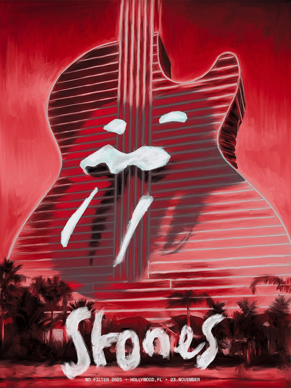
Terribly unimaginative, and the color scheme is horribly bad...nothing says Florida like "blood red" ...  ...
...
Out of all of them Austin and L.A. #2 for the win.
L.A. #1 also.
_____________________________________________________________
Rip this joint, gonna save your soul, round and round and round we go......
Edited 1 time(s). Last edit at 2021-11-23 19:38 by Hairball.
 ...
...Out of all of them Austin and L.A. #2 for the win.
Quote
spikenyc
Interesting how only 2 of the posters (Nashville & Vegas) say "The Rolling Stones" and the rest of them only say "Stones".
L.A. #1 also.
_____________________________________________________________
Rip this joint, gonna save your soul, round and round and round we go......
Edited 1 time(s). Last edit at 2021-11-23 19:38 by Hairball.
Re: No Filter 2021 Tour Posters
Posted by:
bv
()
Date: November 23, 2021 19:36
Most of the US tour posters this year have US date format, but the Hollywood poster have European date format, saying "23. NOVEMBER".
Bjornulf
Bjornulf
Re: No Filter 2021 Tour Posters
Posted by:
swimtothemoon
()
Date: November 23, 2021 21:01
Quote
bv
Most of the US tour posters this year have US date format, but the Hollywood poster have European date format, saying "23. NOVEMBER".
Yes… good catch Bjornulf. In my opinion the best are Nashville, LA #1, LA #2
and Austin.
Sorry, only registered users may post in this forum.
Online Users
Guests:
1332
Record Number of Users:
206
on June 1, 2022 23:50
Record Number of Guests:
9627
on January 2, 2024 23:10
