Tell Me :
Talk
I thought you might.
.....
Olly.
And Bridges and ABB for that matter
Thanks for your input, but I wasn't asking which album covers you liked or disliked.
You can surmise, assess, critique something regardless of its perceived quality.
What do those covers mean to you; what do you think they represent?
.....
Olly.
Yes, upon viewing the cover for the first time in a while, I noticed immediately the nautical setting and instantly thought of Othello.
Now to piece together which characters Watts, Wood and Wyman represent...
.....
Olly.
At least it's a generally good reflection of the content, we can thank them for that!
Most likely it's nothing being said at all but if he were to say something he's probably saying...
Well, it's in this video but it's, HA HA!, possibly "Who do you think you are, Mick Jagger."
[www.youtube.com]
Re. Mick's face and Tattoo You et al....... on the 1981 tour as you recall the band had a sign flashing on stage that said "Mick Jagger and the Rolling Stones". Mick was surrounded by sycophants telling him that HE was the star, not the band.... this is why it was necessary for Mick to try out his solo career, and play the Stones songs live with his solo band.... let's just say that come 1989 Mick never had to learn that lesson again, and never again was there an album cover with just Mick's face.
Talk about your favorite band.
![]()
![]()
![]()
![]()
For information about how to use this forum please check out forum help and policies.
What do you surmise from Stones album covers?
Posted by:
Olly
()
Date: November 4, 2015 01:14
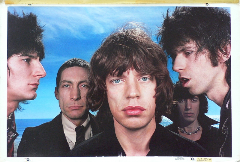
Album covers are interesting texts to consider.
Are they all simply products of their time designed to sell their contents, or do they convey messages about the condition of the band / its members or the contents of the record within?
Between lectures today, I was looking at the cover of Black and Blue. Richards appears to be saying or whispering something into Jagger's ear. What do you suppose this might be?
The positioning and expression of both men, in the context of the nautical setting, reminded me of Othello.
Could Richards be whispering something, Iago-esque, into the General's ear?
.....
Olly.
Re: What do you surmise from Stones album covers?
Posted by:
treaclefingers
()
Date: November 4, 2015 01:22
I think Keith is saying "you're standing on my foot", or something
Re: What do you surmise from Stones album covers?
Posted by:
Stoneage
()
Date: November 4, 2015 01:33
Great cover on Black and Blue. In fact it's better than the content. Which was a bit bland. Sir Michael is only a Commander yet. But who knows? Maybe he will make it to the rank of General?
Re: What do you surmise from Stones album covers?
Posted by:
Olly
()
Date: November 4, 2015 02:56
Quote
treaclefingers
I think Keith is saying "you're standing on my foot", or something
I thought you might.
.....
Olly.
Re: What do you surmise from Stones album covers?
Posted by:
Naturalust
()
Date: November 4, 2015 03:18
While I think they are mostly just a statement of the artist and their agents trying to be clever and artistic at the time, they certainly are/were a more entertaining part of the whole package when vinyl ruled the day. Who didn't spend considerable time browsing the cover art while they listened to the first few tracks of a new record. As far as a statement or clue to what's inside, probably not really, just another stab at creativity like another song, imo.
Stones covers have gone the whole gamut of quality from genius to downright horrid but like books, you can't judge the content by the cover as a general rule.
A bit OT but I loved the story that was told about the cover of the famous Allman Brothers at Fillmore East record by Butch Trucks a while back. Here it is at 02:21 in this video:
[www.youtube.com]
Re: What do you surmise from Stones album covers?
Posted by:
DrPete
()
Date: November 4, 2015 03:25
I surmise Sucking in the 70s just plain SUCKED as an album cover. Steel Wheels too for that matter
Re: What do you surmise from Stones album covers?
Posted by:
treaclefingers
()
Date: November 4, 2015 04:18
Quote
DrPete
I surmise Sucking in the 70s just plain SUCKED as an album cover. Steel Wheels too for that matter
And Bridges and ABB for that matter
Re: What do you surmise from Stones album covers?
Posted by:
DrPete
()
Date: November 4, 2015 04:26
No Security too. Terrible. And Grrr?? Do the Stones even care about the covers anymore?
Edited 1 time(s). Last edit at 2015-11-04 04:28 by DrPete.
Edited 1 time(s). Last edit at 2015-11-04 04:28 by DrPete.
Re: What do you surmise from Stones album covers?
Posted by:
latebloomer
()
Date: November 4, 2015 04:31
Othello, eh Olly? Probably more Hal and Hotspur at that point in time....both vying for the same kingdom.
Re: What do you surmise from Stones album covers?
Posted by:
Olly
()
Date: November 4, 2015 04:32
Quote
DrPete
No Security too. Terrible. And Grrr?? Do the Stones even care about the covers anymore?
Thanks for your input, but I wasn't asking which album covers you liked or disliked.
You can surmise, assess, critique something regardless of its perceived quality.
What do those covers mean to you; what do you think they represent?
.....
Olly.
Re: What do you surmise from Stones album covers?
Posted by:
Olly
()
Date: November 4, 2015 04:37
Quote
latebloomer
Othello, eh Olly? Probably more Hal and Hotspur at that point in time....both vying for the same kingdom.
Yes, upon viewing the cover for the first time in a while, I noticed immediately the nautical setting and instantly thought of Othello.
Now to piece together which characters Watts, Wood and Wyman represent...
.....
Olly.
Re: What do you surmise from Stones album covers?
Posted by:
DrPete
()
Date: November 4, 2015 05:05
Quote
Olly
Sorry, wasn't being crass. Actually truely loved all the covers till the last few and really looked forward to seeing the Stones concept. But lately the just don't seem to care. Just contract the job and so be it.Quote
DrPete
No Security too. Terrible. And Grrr?? Do the Stones even care about the covers anymore?
Thanks for your input, but I wasn't asking which album covers you liked or disliked.
You can surmise, assess, critique something regardless of its perceived quality.
What do those covers mean to you; what do you think they represent?
Re: What do you surmise from Stones album covers?
Posted by:
Naturalust
()
Date: November 4, 2015 05:26
The cover of Black and Blue never struck me as having much meaning at all, probably just a photograph that Mick happened to like because it showed him in a way he liked, blue eyed, big lipped soul singer. . I always though the image of Keith with his eyes half closed and his mouth open looked like he was just totally smacked out and about to drool on Jagger. If anything Jagger's way of saying look at this wreck I have to work with. LOL
Re: What do you surmise from Stones album covers?
Posted by:
35love
()
Date: November 4, 2015 07:16
OMG that made me laugh Naturalust.
Honestly, the album covers mean nothing to me. Never have, and the B & B album cover is just a picture shot/ not thought out, IMO.
This particular one I just marvel at their youth/ time period/ close up faces.
Honestly, the album covers mean nothing to me. Never have, and the B & B album cover is just a picture shot/ not thought out, IMO.
This particular one I just marvel at their youth/ time period/ close up faces.
Re: What do you surmise from Stones album covers?
Posted by:
Turner68
()
Date: November 4, 2015 07:22
I think naturalist nailed it
Album covers are marketing. Images designed to get you to buy the product. I think they say very little about the band.
Album covers are marketing. Images designed to get you to buy the product. I think they say very little about the band.
Re: What do you surmise from Stones album covers?
Posted by:
RollingFreak
()
Date: November 4, 2015 07:36
I surmise from it that some of them are fantastic and some of them just plain suck. For what its worth, and its always been hard for me to explain, but album covers really reflect how I listen to the music. That image really does stay with me in some form or another. For example, whenever I listen to Exile, its always the band playing in black and white. Its that basement feel, and its essentially the images from the cover and stuff from Stones In Exile (or @#$%& Blues) that go through my head.
So the album cover means a lot to me and when they were great they were great. Let It Bleed, Sticky Fingers, Their Satanic Majesties Request. When I listen to something like Between The Buttons, I think of them being in a studio all night, banging out these songs, and then taking that shot in the early morning. Thats just how I hear it.
Most of them have been crap since the 70s. But their great ones are amazing, and they've made some incredibly iconic covers. Which is I think they were one of the best in that department. Great opening tracks and great album covers are definitely a Stones Staple.
Re: What do you surmise from Stones album covers?
Posted by:
Straycat13
()
Date: November 4, 2015 07:37
The Black and Blue cover has the guys in black with a blue background: sky and sea. I think that's all the thought process that went into that. The music is black and bluesy.
We've discussed what Keith might be whispering in the past, and much of it wasn't very nice! Keith is a bully, after all.
We've discussed what Keith might be whispering in the past, and much of it wasn't very nice! Keith is a bully, after all.
Re: What do you surmise from Stones album covers?
Posted by:
treaclefingers
()
Date: November 4, 2015 08:08
Quote
DrPete
No Security too. Terrible. And Grrr?? Do the Stones even care about the covers anymore?
At least it's a generally good reflection of the content, we can thank them for that!
Re: What do you surmise from Stones album covers?
Posted by:
Come On
()
Date: November 4, 2015 08:33
I like the kind of album covers like Stones debut, no 2, Out of...US, and Aftermath...All English bands had these pictures around 1964-65 and the best are the ones that stand out .... such as Aftermath UK with its purple color ... outstanding cool...
2 1 2 0
2 1 2 0
Re: What do you surmise from Stones album covers?
Posted by:
bitusa2012
()
Date: November 4, 2015 10:32
That The Stones themselves don't pay much attention to them anymore - Post Some Girls era have all been pretty awful
Rod
Rod
Re: What do you surmise from Stones album covers?
Posted by:
aliceinseattle
()
Date: November 4, 2015 11:18
I love album covers.
Re: What do you surmise from Stones album covers?
Posted by:
matxil
()
Date: November 4, 2015 11:45
I don't think I surmise much from them.
Maybe their first ones, up till Aftermath: a bunch of snotty young men, looking morosely, slightly hostile into the camera.
You could read a lot into Exile.
And maybe into Black & Blue: here is that same bunch of men, not so young anymore and a lot more "torn and frayed".
But most of their album covers look just silly, or funny, but pretty much meaningless.
I think since the end of vinyl people don't care about album covers anymore, and since "music on internet" even less so. Still, unintentionally or not, in some of them you still might read some message. Dirty Work seems to say: see how horrible we look, please, don't buy this album.
Re: What do you surmise from Stones album covers?
Posted by:
Manofwealthandtaste
()
Date: November 4, 2015 13:05
I have always loved the Ya Ya's cover, probably mainly because I love the album itself, but as to 'surmising' anything from the cover? Charlie jumping for joy (?) clutching a couple of guitars, dressed in white, his t-shirt, the 'beast of burden' looking somewhat bemused, the wonderful camera angle........
Let's get surmising!
Let's get surmising!
Re: What do you surmise from Stones album covers?
Posted by:
Elmo Lewis
()
Date: November 4, 2015 16:20
Paul is dead.
Re: What do you surmise from Stones album covers?
Posted by:
CanFan
()
Date: November 4, 2015 16:29
On Black and Blue it is interesting that jaggers eye is on the spine.....
Re: What do you surmise from Stones album covers?
Posted by:
Roll73
()
Date: November 4, 2015 16:47
For me Exile is the most obvious example of a cover that conveys
the mood/ feel/ atmosphere/ whatever of the music itself.
And Beggars Banquet (the toilet version) really seems to fit the music. Not saying the music is shit for one minute of course! - but it's earthy, grimy and raw. That dirty yellowy colour is the colour of that music.
the mood/ feel/ atmosphere/ whatever of the music itself.
And Beggars Banquet (the toilet version) really seems to fit the music. Not saying the music is shit for one minute of course! - but it's earthy, grimy and raw. That dirty yellowy colour is the colour of that music.
Re: What do you surmise from Stones album covers?
Posted by:
GasLightStreet
()
Date: November 4, 2015 16:50
Quote
Olly
Between lectures today, I was looking at the cover of Black and Blue. Richards appears to be saying or whispering something into Jagger's ear. What do you suppose this might be?
Most likely it's nothing being said at all but if he were to say something he's probably saying...
Well, it's in this video but it's, HA HA!, possibly "Who do you think you are, Mick Jagger."
[www.youtube.com]
Re: What do you surmise from Stones album covers?
Posted by:
GasLightStreet
()
Date: November 4, 2015 16:55
Their covers are a bit odd at times. GOATS HEAD SOUP... with Mick's face? TATTOO YOU... with Mick's face?
Most of the 1960s covers have the entire band on them. If I'm not mistaken, BEGGARS BANQUET is the first LP to not have the band on the cover.
What do I surmise of them? I dunno. DIRTY WORK is easy: let's look trendy and awful and it will define the album.
Ever since that LP, their covers have been too slick. The voodoo... bunny? That's always been a head scratcher. BRIDGES is nice but it's a glossy cartoon. NO SECURITY, uh, OK, so all kinds of people go see the Stones. BANG was - it seemed like a bit of a throwback in a way, the 4 of them gathered around the light exploding, with the mirrored bottom image a bit different.
Perhaps that's what that meant in a way, that ABB was "a bit different than it appears".
I thought UNDERCOVER was brilliant - a dirty almost violent cover with goofy things on it depending on the stickers being on or off. It's a great summation of the music inside.
Edited 1 time(s). Last edit at 2015-11-04 17:00 by GasLightStreet.
Re: What do you surmise from Stones album covers?
Posted by:
Turner68
()
Date: November 4, 2015 17:21
Quote
GasLightStreet
Their covers are a bit odd at times. GOATS HEAD SOUP... with Mick's face? TATTOO YOU... with Mick's face?
Most of the 1960s covers have the entire band on them. If I'm not mistaken, BEGGARS BANQUET is the first LP to not have the band on the cover.
What do I surmise of them? I dunno. DIRTY WORK is easy: let's look trendy and awful and it will define the album.
Ever since that LP, their covers have been too slick. The voodoo... bunny? That's always been a head scratcher. BRIDGES is nice but it's a glossy cartoon. NO SECURITY, uh, OK, so all kinds of people go see the Stones. BANG was - it seemed like a bit of a throwback in a way, the 4 of them gathered around the light exploding, with the mirrored bottom image a bit different.
Perhaps that's what that meant in a way, that ABB was "a bit different than it appears".
I thought UNDERCOVER was brilliant - a dirty almost violent cover with goofy things on it depending on the stickers being on or off. It's a great summation of the music inside.
Re. Mick's face and Tattoo You et al....... on the 1981 tour as you recall the band had a sign flashing on stage that said "Mick Jagger and the Rolling Stones". Mick was surrounded by sycophants telling him that HE was the star, not the band.... this is why it was necessary for Mick to try out his solo career, and play the Stones songs live with his solo band.... let's just say that come 1989 Mick never had to learn that lesson again, and never again was there an album cover with just Mick's face.
Re: What do you surmise from Stones album covers?
Posted by:
GasLightStreet
()
Date: November 4, 2015 17:57
I don't recall ever seeing that sign in any live videos from that tour but I've seen pictures of it and figured it was from the 1982 tour.
Pretty stupid, really.
Pretty stupid, really.
Sorry, only registered users may post in this forum.
Online Users
2120Joe , EasterMan , henrik87 , hj3009 , keefriffhards , MJAGGER123 , NilsHolgersson , Palace Revolution 2000 , RollstoDRSC , rootsman , SirMuddy , stonesmuziekfan , tiffanyblu , vancouver , wiredallnight , wupperstein
Guests:
1554
Record Number of Users:
206
on June 1, 2022 23:50
Record Number of Guests:
9627
on January 2, 2024 23:10