Tell Me :
Talk
Yeah, I really enjoyed that one and remember being happy to learn Francesco Clemente was doing the cover of Mick's solo album the next year. Then I saw it. Mick as Gollum (or a dybbuk or Yoda or whatever that thing is supposed to be) wasn't exactly one of the great concepts.
Those pictures remind me of torture. It was one of my very first Stones albums. I had saved and saved and bought it, but then I had to travel through the south of Italy with my dad and zillion sisters. I did not have access to a record player. At this point I had read the yellow book called "Let it Bleed" - it was the story of Altamont. So I knew all these incredibly cool sounding song titles already. We are talking about the 69 setlist plus "Sugar" and Gimme Shelter" I guess. But at this point I had never heard these songs. I came at the Stones through the back door. I knew 'Buttons' and then all the early Blues albums way before any of the classics. Those song titles on ya-yas with those live images were driving me crazy. I think my dad was hoping I'd get into some porn or something.

My first Stones album,bought it in '76 I guess...still has a special meaning...
a time when band members weren't outbrushed...

Their worst album title ever.
Their worst album cover after DIRTY WORK.
Embarrassing.
Talk about your favorite band.
![]()
![]()
![]()
![]()
For information about how to use this forum please check out forum help and policies.
Listing Albums Artwork
Posted by:
Palace Revolution 2000
()
Date: October 11, 2018 19:37
Rocky mentions this in another adjoining thread, and we haven't done this. (At least not recently): a thread where we rank album's artworks.
I very much believe that the artwork brings a lot to the final product. How it helps to create the identity of this piece of work. Even at this later stage in recordings, with digital files taking over; you still usually get some kind of visual image of the music.
Colors - I always, always think of "emotional rescue" as the blue album, GHS is yellow, Tattoo You is red. I am realizing these things as I type: 'Between the Buttons" is British and foggy.
What would be an overview?
Well IMO, in '89 the Stones' albums artwork went down the crapper. I don't want to say "They took so much care up until then, and then boom" because I don't think that is what happened. It's most likely Jagger alone, maybe Charlie is involved, with some suits; and they are making bad decisions. 'Steel Wheels", "Flashpoint" and "Babylon" look like something Mussolini had hanging in his office. "No Security", "Grrr" and "Bigger Bang" are beyond comprehension. "Voodoo", "Primitive Cool" seem to spring from the same well.
So as unpopular as 'Dirty Work's cover is, it is the last in the line of 'real' covers for me. It is the Stones being the Stones in '86. Myself I always liked DW cover pic. DW also had the inside cover w/ cartoons.
"Undercover" is okay when you took it all as a package. The early releases (and I got UC on the day it came out) had the stickers, the inside sleeve with the plush red drape, liner notes and especially the address to get the whole Fan Club package, which was awesome.
Not wild about 'Tattoo You" - the images are okay, but there was no info, no liner notes.
'Emotional Rescue" - this was still in the days on albums being albums, and it was probably an experiment gone a little wrong. The heat photography. It didn't help that the music was not very exciting.
"Some Girls" - there is no way to separate the brilliant packaging from the brilliant music. Everything was right on time with this release. It was all New York; it was all that Punk asked from them. There was good natured controversy with the photos.The idea of the hair dresser theme, and then the blurbs about each individual Stone-ette.
"Black & Blue" was a weird one. the photo is just odd. Mainly Jagger is a bit much. I think Keith and Ron's make-up kind of helped. The inside photo is great, and the liner notes were a huge part of this album.
IORR - very good because Guy Pelleart's book was everywhere; Bowie used him; plus it had decent liner notes.
GHS - I always thought that the main cover did not match the album. That the cover art could have been used for another record. The pic of the soup was better. There is a brownish inside sleeve with Jim Horn, Preston etc.
Exile - one of the great alltime covers. It's scattered, nervous, schizoid; there is the Deep South, there are ICONIC images of Mick and Keith with Jack Daniels and beer singing at the mike, unshaven - one of the greatest Stones photos ever! Jagger's often inaccurate liner notes, but info to be memorized immediately; the postcards of course. A classic.
Sticky Fingers - another classic. "SF was probably even more decadent than Exile because it is much darker and tight. Everything about the cover is high art: Warhol's model, the inside with the underwear, the working zipper, the balls to use an image like that.
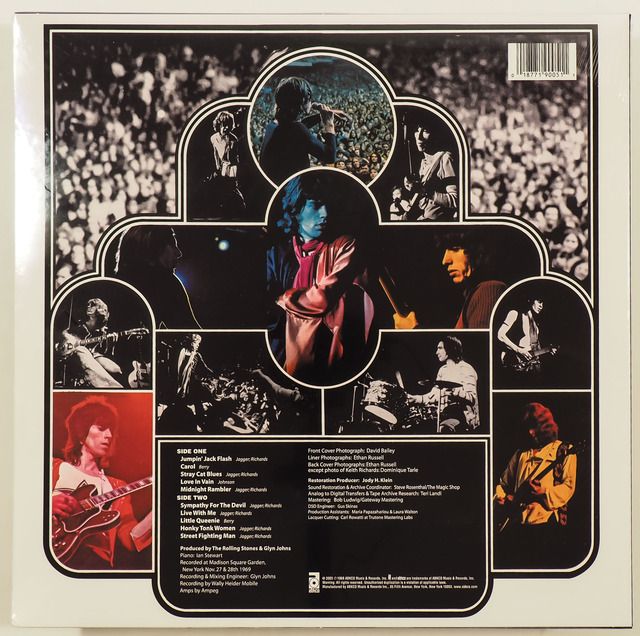
"Ya-Ya's" - is very good because it says America right away. And while there's a donkey, and Charlie jumping on a lonely highway, it still calls out 'Live!'.
'Let it Bleed" is always considered one of the great ones. It has never done all that much for me. Only early copies, and then lat re-releases have the inside cover.
"Banquet" - I understand that the band fought for the bathroom wall, and that it meant a lot more in '68 than it would now, but IMO the white RSVP cover is way better. Coupled with that great, great inside picture. Again - I see that pic, and I hear "Jigsaw Puzzle". The music and image are one.
'Satanic" is fun of course, but I'd say - even for those times it was a little silly. There is no undercurrent whatsoever; no threat, no suggestion of new ideas to explore, new realms to conquer. I see Jagger in that hat, I see Charlie and Bill looking uncomfortable and ridiculous. There is a bit off the image when a little toddler runs rampant in the kitchen with his Fruit-of-the-looms on his head, banging pot-lids together; happy as can be.
'Buttons" is once again a perfect cover for it's record. The most British of all Stones releases, it shows the band bleary eyed in London fog, huddled together in their coats. You hear "She Smiled Sweetly" or "Something Happened to Me yesterday"; you know about the drug busts.
'Aftermath' - most excellent. And I always think of the UK version; the red one.It's the last of those early albums where you always had the five kind of posed in a groupshot. But the back cover with the great credit of "Mick Jagger - lighting" switches it up. And again - those images make me think of LA studio and all the songs from this album. Brian on marimba.
'Got Live if you want it" - one of the very early covers that cemented the band in my visual memory banks.It's one of the covers that I stared at for hours. Brian's jacket; that shot of Keith singing at the mike; and the call out for "Billy Wyman"; Charlie's snare on 'Satisfaction'.
"out of our Heads", "December's Children", 'Now' are kind of the same album to me, visually.
"No 2" is tight. IMO it is darker than the first one.
"Hitmakers" - Honestly, until I read about it years later I never even noticed the whole thing about their name not being on the cover. Love that photo, the ties, the bit of awkwardness , and I hear every note from the grooves coming from the glossy shot as well.
Other
"Hot Rocks" - the best part about that cover are the ones with them hanging in that ravaged castle.
"Gimme Shelter" - its a great shot, and it came to me when I was still about 12 or 13. Love any live pics from 70/71 with Mick and Keith wearing clothes from So America.
"Stone Age" - I knew this album and cover way before I knew anything about "Beggars Banquet" and the story of the cover.
The single "JJF" - this was a big picture for me too that I stared at for hours. I remember saying to my buddies "You see Keith's thumbnail? Red! he is obviously a homosexual" haha, keep in mind I was about 10 years old. I already knew I was going to do everything possible to also be a Rolling Stone.
"Have you seen you Mother Baby" 45 single - this is the image that started everything for me. I still have a poster of it hanging on my wall. I had got the 45 for Xmas one year as a 6 or 7 year old.It was a life changer.I couldn't tell Keith and Bill apart. I used to think Bill was the guy.
Please don't leave me hanging guys.
I very much believe that the artwork brings a lot to the final product. How it helps to create the identity of this piece of work. Even at this later stage in recordings, with digital files taking over; you still usually get some kind of visual image of the music.
Colors - I always, always think of "emotional rescue" as the blue album, GHS is yellow, Tattoo You is red. I am realizing these things as I type: 'Between the Buttons" is British and foggy.
What would be an overview?
Well IMO, in '89 the Stones' albums artwork went down the crapper. I don't want to say "They took so much care up until then, and then boom" because I don't think that is what happened. It's most likely Jagger alone, maybe Charlie is involved, with some suits; and they are making bad decisions. 'Steel Wheels", "Flashpoint" and "Babylon" look like something Mussolini had hanging in his office. "No Security", "Grrr" and "Bigger Bang" are beyond comprehension. "Voodoo", "Primitive Cool" seem to spring from the same well.
So as unpopular as 'Dirty Work's cover is, it is the last in the line of 'real' covers for me. It is the Stones being the Stones in '86. Myself I always liked DW cover pic. DW also had the inside cover w/ cartoons.
"Undercover" is okay when you took it all as a package. The early releases (and I got UC on the day it came out) had the stickers, the inside sleeve with the plush red drape, liner notes and especially the address to get the whole Fan Club package, which was awesome.
Not wild about 'Tattoo You" - the images are okay, but there was no info, no liner notes.
'Emotional Rescue" - this was still in the days on albums being albums, and it was probably an experiment gone a little wrong. The heat photography. It didn't help that the music was not very exciting.
"Some Girls" - there is no way to separate the brilliant packaging from the brilliant music. Everything was right on time with this release. It was all New York; it was all that Punk asked from them. There was good natured controversy with the photos.The idea of the hair dresser theme, and then the blurbs about each individual Stone-ette.
"Black & Blue" was a weird one. the photo is just odd. Mainly Jagger is a bit much. I think Keith and Ron's make-up kind of helped. The inside photo is great, and the liner notes were a huge part of this album.
IORR - very good because Guy Pelleart's book was everywhere; Bowie used him; plus it had decent liner notes.
GHS - I always thought that the main cover did not match the album. That the cover art could have been used for another record. The pic of the soup was better. There is a brownish inside sleeve with Jim Horn, Preston etc.
Exile - one of the great alltime covers. It's scattered, nervous, schizoid; there is the Deep South, there are ICONIC images of Mick and Keith with Jack Daniels and beer singing at the mike, unshaven - one of the greatest Stones photos ever! Jagger's often inaccurate liner notes, but info to be memorized immediately; the postcards of course. A classic.
Sticky Fingers - another classic. "SF was probably even more decadent than Exile because it is much darker and tight. Everything about the cover is high art: Warhol's model, the inside with the underwear, the working zipper, the balls to use an image like that.
"Ya-Ya's" - is very good because it says America right away. And while there's a donkey, and Charlie jumping on a lonely highway, it still calls out 'Live!'.
'Let it Bleed" is always considered one of the great ones. It has never done all that much for me. Only early copies, and then lat re-releases have the inside cover.
"Banquet" - I understand that the band fought for the bathroom wall, and that it meant a lot more in '68 than it would now, but IMO the white RSVP cover is way better. Coupled with that great, great inside picture. Again - I see that pic, and I hear "Jigsaw Puzzle". The music and image are one.
'Satanic" is fun of course, but I'd say - even for those times it was a little silly. There is no undercurrent whatsoever; no threat, no suggestion of new ideas to explore, new realms to conquer. I see Jagger in that hat, I see Charlie and Bill looking uncomfortable and ridiculous. There is a bit off the image when a little toddler runs rampant in the kitchen with his Fruit-of-the-looms on his head, banging pot-lids together; happy as can be.
'Buttons" is once again a perfect cover for it's record. The most British of all Stones releases, it shows the band bleary eyed in London fog, huddled together in their coats. You hear "She Smiled Sweetly" or "Something Happened to Me yesterday"; you know about the drug busts.
'Aftermath' - most excellent. And I always think of the UK version; the red one.It's the last of those early albums where you always had the five kind of posed in a groupshot. But the back cover with the great credit of "Mick Jagger - lighting" switches it up. And again - those images make me think of LA studio and all the songs from this album. Brian on marimba.
'Got Live if you want it" - one of the very early covers that cemented the band in my visual memory banks.It's one of the covers that I stared at for hours. Brian's jacket; that shot of Keith singing at the mike; and the call out for "Billy Wyman"; Charlie's snare on 'Satisfaction'.
"out of our Heads", "December's Children", 'Now' are kind of the same album to me, visually.
"No 2" is tight. IMO it is darker than the first one.
"Hitmakers" - Honestly, until I read about it years later I never even noticed the whole thing about their name not being on the cover. Love that photo, the ties, the bit of awkwardness , and I hear every note from the grooves coming from the glossy shot as well.
Other
"Hot Rocks" - the best part about that cover are the ones with them hanging in that ravaged castle.
"Gimme Shelter" - its a great shot, and it came to me when I was still about 12 or 13. Love any live pics from 70/71 with Mick and Keith wearing clothes from So America.
"Stone Age" - I knew this album and cover way before I knew anything about "Beggars Banquet" and the story of the cover.
The single "JJF" - this was a big picture for me too that I stared at for hours. I remember saying to my buddies "You see Keith's thumbnail? Red! he is obviously a homosexual" haha, keep in mind I was about 10 years old. I already knew I was going to do everything possible to also be a Rolling Stone.
"Have you seen you Mother Baby" 45 single - this is the image that started everything for me. I still have a poster of it hanging on my wall. I had got the 45 for Xmas one year as a 6 or 7 year old.It was a life changer.I couldn't tell Keith and Bill apart. I used to think Bill was the guy.
Please don't leave me hanging guys.
Re: Listing Albums Artwork
Posted by:
DandelionPowderman
()
Date: October 11, 2018 20:10
Stripped might have been a step in the right direction, but I agree about the decline from 1989 and on.
The flipside of YaYas is awesome. Great pics put together nicely. Love the whole package on that one as well.
The flipside of YaYas is awesome. Great pics put together nicely. Love the whole package on that one as well.
Re: Listing Albums Artwork
Posted by:
MisterDDDD
()
Date: October 11, 2018 20:14
Good topic..
If I had to choose a favorite it would go to what I suppose is their most iconic cover.. Sticky Fingers. Even as a kid, there was no escaping the buzz that the cover generated.
Would have to be in the conversation of best album cover of all time, let alone best RS cover.
A few of 'em..

Edited 1 time(s). Last edit at 2018-10-11 20:17 by MisterDDDD.
If I had to choose a favorite it would go to what I suppose is their most iconic cover.. Sticky Fingers. Even as a kid, there was no escaping the buzz that the cover generated.
Would have to be in the conversation of best album cover of all time, let alone best RS cover.
A few of 'em..
Edited 1 time(s). Last edit at 2018-10-11 20:17 by MisterDDDD.
Re: Listing Albums Artwork
Posted by:
schillid
()
Date: October 11, 2018 20:16
Nice assessment PR2000. Mostly agree.
Re: Listing Albums Artwork
Posted by:
More Hot Rocks
()
Date: October 11, 2018 20:21
Out of our heads should be before DC. Sorry but it looks cool anyways!
Re: Listing Albums Artwork
Posted by:
floodonthepage
()
Date: October 11, 2018 20:55
I kind of like 'Steel Wheels' art. It reflects a "steely" cold sentiment for me. I also like 'Stripped', definitely their best of the modern, post 'Dirty Work' era....and I agree that 'Dirty Work' is a good cover and well reflective of it's own time, though I think the 'Bigger Bang' cover accomplishes that too. I think worst of all is 'Blue and Lonesome' closely followed by 'Licks'. A big tongue and that's it? For a compilation like 'Licks' I can see it (though it's still very lazy), but for a fresh (albeit covers) release? Seems practically cut and pasted from google images. If an album was to have a simple tongue on the cover it seems it should have been 'Sucking in the Seventies'. I think a great album cover for 'Blue and Lonesome' would have been something akin to the layout of Edith Grove in the "Exhibitionism" exhibit, i.e. blues albums laying out near a record player with worn furniture nearby.
Favorites:
Between the Buttons
It's Only Rock n Roll
Some Girls
Sticky Fingers
Exile on Main Street
Least Favorites:
Blue and Lonesome
Licks
Grrrr
Voodoo Lounge
Jump Back
Edited 3 time(s). Last edit at 2018-11-26 19:27 by floodonthepage.
Favorites:
Between the Buttons
It's Only Rock n Roll
Some Girls
Sticky Fingers
Exile on Main Street
Least Favorites:
Blue and Lonesome
Licks
Grrrr
Voodoo Lounge
Jump Back
Edited 3 time(s). Last edit at 2018-11-26 19:27 by floodonthepage.
Re: Listing Albums Artwork
Posted by:
tupelo68
()
Date: October 11, 2018 21:28
Voodoo, like the albul, is underrated. And the booklet is a great one !
Re: Listing Albums Artwork
Posted by:
Rocky Dijon
()
Date: October 11, 2018 21:37
Covers I don't like...
METAMORPHOSIS (looks like a mock-up from a magazine cover)
JAMMING WITH EDWARD (no offense to Nicky, but this should not have been the cover)
SUCKING IN THE SEVENTIES (the trade ad was much better)
JUMP BACK (footwear 1971-1989 was a real puzzler)
STRIPPED (they look exhausted. The cover of either single would have been better)
NO SECURITY (looked like a poor bootleg cover. Again, the single was much better)
FORTY LICKS (reminded me of VIDEO REWIND, still not the very worst)
LIVE LICKS (the censorship is bad, the Sprint symbol is bad, the anime stripper is pointless)
RARITIES (a pointless choice made worse by airbrushing Bill out)
GRRR (the worst ever. A joke. A terrible one. It fits the worst album title)
BLUE AND LONESOME (imagine BLACK AND BLUE as nothing but a two-tone tongue)
Re: Listing Albums Artwork
Posted by:
ThePaleRider
()
Date: October 11, 2018 22:05
There are a lot of good ones...but Exile and Some Girls are the only two that make a great over sized canvass poster.
Re: Listing Albums Artwork
Posted by:
NICOS
()
Date: October 11, 2018 22:27
Great post Palace Revolution 2000.......I see my self again listening to the stones with the cover in my hand and thresh out what was written on the cover................
__________________________

__________________________
Re: Listing Albums Artwork
Posted by:
shortfatfanny
()
Date: October 11, 2018 23:21
Sticky Fingers and Some Girls are my favourite covers.
Re: Listing Albums Artwork
Posted by:
Rockman
()
Date: October 12, 2018 00:07
'Steel Wheels", "Flashpoint" and "Babylon" look like something Mussolini had hanging in his office
Hey that's a good line man ….
And Benito most likely hummed his own version Slipping Away..... hhaaa

ROCKMAN
Hey that's a good line man ….
And Benito most likely hummed his own version Slipping Away..... hhaaa
ROCKMAN
Re: Listing Albums Artwork
Posted by:
Hairball
()
Date: October 12, 2018 00:51
When I was 10 and my older brother brought Goats Head Soup home, the front cover pic of Mick creeped me out.
As for band photo covers, I like Between the Buttons,Through the Past, Darkly, Flowers, Aftermath, Metamorphosis, Big Hits (High Tide and Green Grass), and Decembers Children.
All around best cover would have to be Exile - spent many an hour staring at it while listening to the album - lots to take in both visually and musically.
_____________________________________________________________
Rip this joint, gonna save your soul, round and round and round we go......
Re: Listing Albums Artwork
Posted by:
35love
()
Date: October 12, 2018 00:57
The 45 singles art work is the best.
How do I know?
Our very own ‘Honestman’ poster here on IORR.
I believe it was from him I stole the ‘Beast of Burden’ picture of a Lion sitting on top of a distressed brunette across a train track.
Or, his recent post on the Black and Blue cover/ inside photos thread
he posted the 45 ‘Hot Stuff/Crazy Mama’ check out the gorilla breaking out of jail...
(I’m not good creating the images here, sorry)
But the 45 single vinyl artwork!!
Edited 2 time(s). Last edit at 2018-10-12 00:59 by 35love.
Re: Listing Albums Artwork
Posted by:
NICOS
()
Date: October 12, 2018 01:37
This one was very enjoyable to look at listing to GYYYO at the age of 17....as if I was at the concerts back in '69
__________________________

__________________________
Re: Listing Albums Artwork
Posted by:
35love
()
Date: October 12, 2018 01:38
Here is a link to a funky picture/ artwork
for the 45 single ‘One Hit To The Body’
[www.classic45s.com]
for the 45 single ‘One Hit To The Body’
[www.classic45s.com]
Re: Listing Albums Artwork
Posted by:
35love
()
Date: October 12, 2018 01:45
Here is ‘Time Is On My Side’
showing yes, indeed, it is most certainly on Mick’s. Yowza.
[www.classic45s.com]
showing yes, indeed, it is most certainly on Mick’s. Yowza.
[www.classic45s.com]
Re: Listing Albums Artwork
Posted by:
buttons67
()
Date: October 12, 2018 02:13
i used to stick my vinyl album covers on the wall.
used to annoy the hell out of my parents although i left out undercover.
the drawing pins making holes in the wall didnt help either.
many albums art is mediocre in my opinion.
early photos of the band are my favourites, decembers children, out of our heads etc.
and its only rock and roll is great art work.
Re: Listing Albums Artwork
Posted by:
dmay
()
Date: October 12, 2018 02:21
Exile is still a great album cover, one of their best, if not the best. It led me to explore the work of Robert Frank. I knew of his book, The Americans, but had only seen a few photos from it in various photography magazines. I found a copy of it back during the Exile release era. Then, a few years ago, I got the deluxe version of The Americans as a Christmas gift. What a great book if you're into iconic images and photography. Times have changed, but the stories conveyed by the images in The Americans are still rather true today.
Regarding the other covers, I like a number, but Voodoo Lounge is just a cool graphic, IMHO. I have a t-shirt or two with the image and some posters of the same I took off a wall when the album came out.
Regarding the other covers, I like a number, but Voodoo Lounge is just a cool graphic, IMHO. I have a t-shirt or two with the image and some posters of the same I took off a wall when the album came out.
Re: Listing Albums Artwork
Posted by:
Rocky Dijon
()
Date: October 12, 2018 02:50
Quote
35love
Here is a link to a funky picture/ artwork
for the 45 single ‘One Hit To The Body’
[www.classic45s.com]
Yeah, I really enjoyed that one and remember being happy to learn Francesco Clemente was doing the cover of Mick's solo album the next year. Then I saw it. Mick as Gollum (or a dybbuk or Yoda or whatever that thing is supposed to be) wasn't exactly one of the great concepts.
Re: Listing Albums Artwork
Posted by:
TeaAtThree
()
Date: October 12, 2018 04:01
That compilation of covers reveals why Beggars Banquet was such a departure. Every single cover before that had the band's faces -- and then they proposed a toilet!!! Holy cow!
I happen to love the invitation cover myself, but I lacked the context to know why the original proposal was so off the wall.
T@3
I happen to love the invitation cover myself, but I lacked the context to know why the original proposal was so off the wall.
T@3
Re: Listing Albums Artwork
Posted by:
Rockman
()
Date: October 12, 2018 04:09
Stickin up for Blue Lonesome cover ….
Displayed in record store or racks it stands out …..
Simple..... highly distinctive from the rest of the crowd … and advertises itself … Stones Tongue...job done
ROCKMAN
Displayed in record store or racks it stands out …..
Simple..... highly distinctive from the rest of the crowd … and advertises itself … Stones Tongue...job done
ROCKMAN
Re: Listing Albums Artwork
Posted by:
GasLightStreet
()
Date: October 12, 2018 04:41
Their most striking cover that sticks out above them all:
TATTOO YOU
Their best cover?
STICKY FINGERS
LP covers I really like:
UNDERCOVER
BLACK AND BLUE
BEGGARS BANQUET (the original)
GOATS HEAD SOUP
LET IT BLEED (even though it's for a different LP title)
The rest of them stink.
TATTOO YOU
Their best cover?
STICKY FINGERS
LP covers I really like:
UNDERCOVER
BLACK AND BLUE
BEGGARS BANQUET (the original)
GOATS HEAD SOUP
LET IT BLEED (even though it's for a different LP title)
The rest of them stink.
Re: Listing Albums Artwork
Posted by:
Palace Revolution 2000
()
Date: October 12, 2018 08:39
Quote
NICOS
This one was very enjoyable to look at listing to GYYYO at the age of 17....as if I was at the concerts back in '69
Those pictures remind me of torture. It was one of my very first Stones albums. I had saved and saved and bought it, but then I had to travel through the south of Italy with my dad and zillion sisters. I did not have access to a record player. At this point I had read the yellow book called "Let it Bleed" - it was the story of Altamont. So I knew all these incredibly cool sounding song titles already. We are talking about the 69 setlist plus "Sugar" and Gimme Shelter" I guess. But at this point I had never heard these songs. I came at the Stones through the back door. I knew 'Buttons' and then all the early Blues albums way before any of the classics. Those song titles on ya-yas with those live images were driving me crazy. I think my dad was hoping I'd get into some porn or something.
Re: Listing Albums Artwork
Posted by:
rogerriffin
()
Date: October 12, 2018 17:57
Really don´t like Grrregory´s picture??
it´s really a piece of art, in the super deluxe boxset you can see the little hairs in the painting, i really like the concept and the merchandising about GRRR!

it´s really a piece of art, in the super deluxe boxset you can see the little hairs in the painting, i really like the concept and the merchandising about GRRR!
Re: Listing Albums Artwork
Posted by:
shortfatfanny
()
Date: October 12, 2018 21:47
My first Stones album,bought it in '76 I guess...still has a special meaning...
a time when band members weren't outbrushed...
Re: Listing Albums Artwork
Posted by:
Rockman
()
Date: October 13, 2018 00:01
WOOOOW!!! yeah Palace that's torture …..
My first time with Ya Ya's was when local town solicitor
Chris Larkins bought it back from Melbourne the day it was
released down here ..Chris played it once then lent it to me
....So me and Super-Scruff took it back to her mum's house and
played it till daybreak … Stared at the cover all night loooooooooong …. memories memories …. cool memories
ROCKMAN
Re: Listing Albums Artwork
Posted by:
TravelinMan
()
Date: October 13, 2018 01:56
Hmmm
It’s Only Rock and Roll
Exile (weirded me out as a kid)
Beggars Banquet (original toilet artwork)
Let It Bleed
Metamorphosis
Honorable mention:
Some Girls/Tattoo You/Ya Ya’s
IORR is one of my favorites of all time.
The German single for Angie is good too!
It’s Only Rock and Roll
Exile (weirded me out as a kid)
Beggars Banquet (original toilet artwork)
Let It Bleed
Metamorphosis
Honorable mention:
Some Girls/Tattoo You/Ya Ya’s
IORR is one of my favorites of all time.
The German single for Angie is good too!
Re: Listing Albums Artwork
Posted by:
GasLightStreet
()
Date: October 13, 2018 02:43
Quote
rogerriffin
Really don´t like Grrregory´s picture??
it´s really a piece of art, in the super deluxe boxset you can see the little hairs in the painting, i really like the concept and the merchandising about GRRR!
Their worst album title ever.
Their worst album cover after DIRTY WORK.
Embarrassing.
Re: Listing Albums Artwork
Posted by:
mosthigh
()
Date: October 13, 2018 03:02
Dirty Work and Steel Wheels are kind of opposites visually, but they are both eyesores (imo).
Sorry, only registered users may post in this forum.
Online Users
Guests:
2032
Record Number of Users:
206
on June 1, 2022 23:50
Record Number of Guests:
9627
on January 2, 2024 23:10