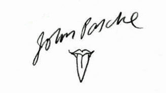
Tell Me :
Talk
Not quite .... it would be interesting to know more about John Pasche:
- how did John Pasche's first version look (the rubber stamp, faxed over to Craig Braun) ?
- how was John Pasche influenced by Craig Braun's version of the logo or by the Alan Aldridge illustration when finalizing his Sticky Fingers version ?
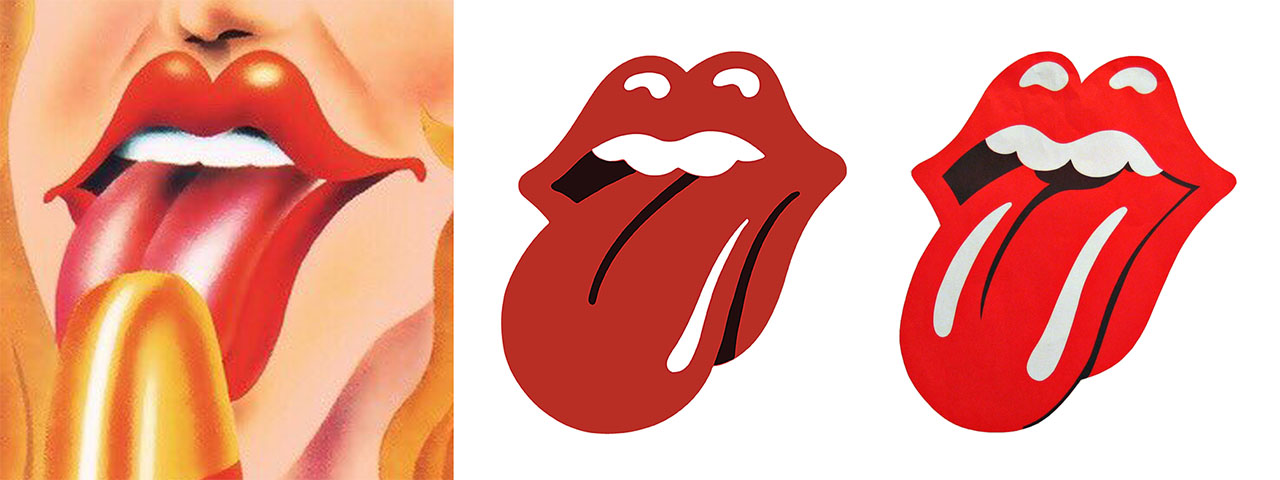
Too many geometrical similarities (sizes, arches, angles) between the 3 Tongues/logos ....
If so, why says Craig Braun then three times:
"Since it was a handmade album sleeve, I needed the logo done, so I got them to send me the basic ‘lips and tongue’ rough idea. It was based on images of The Goddess Kali Ma… suggested by Mick and Keith. With Mick and Pasche working on the unfinished logo, I needed the logo done for it to be included on Sticky Fingers, so I got Marshall to send me the basic rough sketch, which was simply a black rubber stamp." - [www.LongLiveVinyl.net]
"Mick had commissioned a young art school student [John Pasche] in London to design a logo, but he had not completed a design. He'd only completed some sketches, rough sketches of it. And Marshall Chess [...] was in London, and I said to him, 'I want to put the design on the inner sleeve'." - [www.Amoeba.com]
"In New York, Mr. Braun had a deadline and needed the logo. As the tongue design was still unfinished, he settled for a rough one-inch version, faxed over from London by Marshall Chess, the founding president of Rolling Stones Records. 'I didn’t tell him what I was going to do with it,' Mr. Braun said." [...] Mr. Pasche barely noticed. 'It was a relaxed affair,' he said. 'I just think things were happening fast and needed to be done, so it was redrawn'.” - [www.NYTimes.com] - [www.NYTimes.com]
Edited 2 time(s). Last edit at 2020-09-21 20:25 by Irix.
I've never seen the stamp version and Google finds absolutely no image about it. It would really be interesting to see it.
Edited 1 time(s). Last edit at 2020-09-22 22:45 by Irix.
I don't think so. If I did I didn't know it. I've looked at so many links I can't remember anything.
I found the image, which I received from Braun, but I have to place it myself, because as a receiver I can/ have to take responsability if trouble or anything occurs ...
Ok, understandable. If you wanna post it by yourself, see: 'How to publish a picture on the IORR forum pages' - [iorr.org] . As external host you could use e.g. [Imgur.com] , [Postimages.org] or [www.Directupload.net] .
The [Postimages.org] has even a Delete-Link where you can (in case of doubt) remove the picture from the host (not only from IORR). Don't forget to save the Delete-Link if it's needed in the future (hopefully not).
Rolling Stones, Lips With Tongue, Papercraft Lip with Tongue, Lip, Mouth, Papercraft mouth, Home decor, Wall decor, Diy, Craft, Party Decor
[www.etsy.com]
No, it's not visible since the picture is removed from Postimage. You can probably see it because it's still in your Browser-cache.
You shouldn't have delete it from Postimage. The Delete-Link I had written about was for the case that Craig Braun faxes you over from New York two rubber stamps - Pic 3: [iorr.org] - with the lines: "Copyright Issue".
Postimage is the "Hard Disk Drive" where the pictures are stored. There're no pictures stored on IORR, except the ones provided by Bjornulf Vik himself.
I understand now. I just didn't want to take "risks" with possibly crossing border lines
The only thing in all the previous discussions, but even more so in the research that I did many years ago (you made the link to the thread I once started), I still hope one day to run into, are copies of correspondence that Marshall Chess made as president of Rolling Stones Records during those early months, where he used his stamp.
They will have a similar impact as the copies, that (f.i. GasLightStreet) placed on the thread, of the correspondence between the Rolling Stones and John Pasche in early 1970. Patience ...

That would be interesting: it would clearly show when John Pasche's first logo was done in 1970 and how it looked in detail. Maybe Bill Wyman has some of the correspondence in his RS-Archive?
Here's a letter without date:
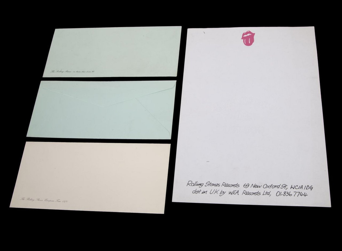
"A group of 1970s Rolling Stones stationery pieces including a sheet of Rolling Stones Records letterhead with tongue logo; two nearly identical green envelopes with the London office address for the Rolling Stones, one with slightly larger font treatment; and an off-white envelope reading 'Rolling Stones European Tour 1970.' The pieces date between 1968 and 1971." -- BW #3267 LOT 247 - [www.JuliensLive.com]
Letter & Logo from above straightened:
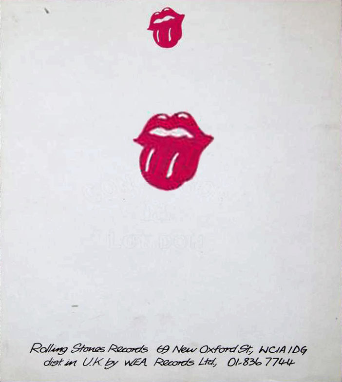
29-Apr-1970 - "Letter from The Rolling Stones (via their personal assistant, Jo Bergman) to John Pasche confirming that he will design a logo [...]" -- "used on note paper" :

Part of the Victoria and Albert Museum (London, UK).
Edited 4 time(s). Last edit at 2020-09-28 11:35 by Irix.
Hi Irix,
The young men clear the paths for the "lazy" old man
Since it's part of Bill Wyman's collection there can be no doubt concerning the stamp! It says 1970, so that indeed rules out Craig's influence on the making of the stamp image! (which I knew already). John Pasche was officiallly commissioned for making both a poster and a logo early 1970, so the timing fits nicely.
It's a real shame Aldridge past away, because he, for one, knew about "what happened between 1968 and 1970". Why were his creations (I really like his tiger-guitar creation) not "bought" by the Stones? Was he asked a lot of money (ripping them off?) for them, because he was already THE man for the Beatles? Or was it something else. I don't think we'll ever find out ... or John Pasche one day may ...?
Still, I fully dig the influence of Kali on the design. Both Mick and Keith mentioned it from different angles several times. It also perfectly fits with the feeling the band (Mick?) wanted to radiate to the outside world. The "red" Kali stands for "life", the "white" Kali stands for "birth" and the "black" Kali for "death". And "life" it still is 50 years after the creation of the logo!
Thanks for waking me up again, Irix!
Yes, it's very pity that Alan Aldridge doesn't live anymore. There would be many questions about his illustrations and what's his opinion about the influence for the Stones-logo. But Alan Aldridge must have had family, friends and business partners - maybe they know still some things?
Yes, there's no doubt that the original inspiration for the Stones-logo came from the Hindu goddess Kali.
But - when you look at depictions of Kali - it would have probably looked like this Kali-illustration done by John Pasche in 2020:
[Gramho.com] , [iorr.org]
The description of the V&A Museum about John Pasche's logo says: "Pasche, honing in on the goddess's protruding tongue, was inspired to create his famous logo, which captured perfectly the impudence of the band, and the prominence and sensuality of Jagger's mouth". And to achieve this in the logo, the Day-Tripper-illustration by Alan Aldridge was probably a welcome inspiration too. A 2016 interview with John Pasche:
[www.YouTube.com]
Edited 2 time(s). Last edit at 2020-09-28 14:55 by Irix.
Right. The Kali images on calanders from f.i. indian restaurants are closer to what the logo became. I collected quite a few from the Internet. So Pasche's "first" sketches must have been very basic.
Also, when I did my "investigation" I collected around 400 mouth/tongue images from the Internet. Quite some were from way before 1968. Alan Aldridge for sure has been inspired by some of them too. I don't think any 60s artist could have claimed uniqueness at the time.
But I am happy that "the circle" is almost closed. It was all hanging in my head ever since I bought the Sticky Fingers album in my Liverpool days in 1971
Of course, Alan Aldridge could have been inspired by some of the previous Tongue&Lips depictions too. Two typical examples - already posted on [iorr.org] :
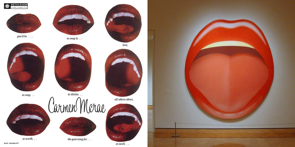
Album-Cover Carmen McRae (1954) ; Tom Wesselmann, 'Mouth' series (1966/67)
Maybe such depictions were also part of the artistic education at that time, who knows? But the similarities between John Pasche's Rubber-Stamp-Logo and Alan Aldridge's illustration are simply too vast - [iorr.org] .
Talk about your favorite band.
![]()
![]()
![]()
![]()
For information about how to use this forum please check out forum help and policies.
Re: Rolling Stones Tongues
Posted by:
Irix
()
Date: September 21, 2020 18:35
Quote
georgie48
It's all been cleared up
Not quite .... it would be interesting to know more about John Pasche:
- how did John Pasche's first version look (the rubber stamp, faxed over to Craig Braun) ?
- how was John Pasche influenced by Craig Braun's version of the logo or by the Alan Aldridge illustration when finalizing his Sticky Fingers version ?
Too many geometrical similarities (sizes, arches, angles) between the 3 Tongues/logos ....
Re: Rolling Stones Tongues
Posted by:
georgie48
()
Date: September 21, 2020 19:36
Hi Irix,
Okay, some more info from me.
Your third question first:
John Pasche was not influenced by Graig Brain. Pasche's version was already finished before a fax was send to Braun! Pasche had started with making designs after Mick Jagger had shown him an image of the Hindi goddess Kali (sticks out her tongue, some say because she was embarrased) somewhere early second half 1970.
Braun and his team started working on what became the "USA" version in late Autumn 1970.
Second question:
The simplified rubber stamp was also made after Pasche had finished his work. The rubber stamp was used by Marshall Chess to mark letters, etc., with this new Stones logo (using red ink). As you may know, Chess was made president of Rolling Stones Records, the new company of the band. Chess has said in interviews that he came up with the idea of just only using an image (so no name), inspired by the Shell logo, which he saw when driving by car in the Netherlands.
First question:
I do have an image of the simplified stamp version, but you need to tell me how to place it on this site (link). It's not a secret thing, so maybe you can also find it in other communication. Possibly GasLightStreet has placed it somewhere before?
Enjoy!
Re: Rolling Stones Tongues
Posted by:
Irix
()
Date: September 21, 2020 19:55
Quote
georgie48
Pasche's version was already finished before a fax was send to Braun!
If so, why says Craig Braun then three times:
"Since it was a handmade album sleeve, I needed the logo done, so I got them to send me the basic ‘lips and tongue’ rough idea. It was based on images of The Goddess Kali Ma… suggested by Mick and Keith. With Mick and Pasche working on the unfinished logo, I needed the logo done for it to be included on Sticky Fingers, so I got Marshall to send me the basic rough sketch, which was simply a black rubber stamp." - [www.LongLiveVinyl.net]
"Mick had commissioned a young art school student [John Pasche] in London to design a logo, but he had not completed a design. He'd only completed some sketches, rough sketches of it. And Marshall Chess [...] was in London, and I said to him, 'I want to put the design on the inner sleeve'." - [www.Amoeba.com]
"In New York, Mr. Braun had a deadline and needed the logo. As the tongue design was still unfinished, he settled for a rough one-inch version, faxed over from London by Marshall Chess, the founding president of Rolling Stones Records. 'I didn’t tell him what I was going to do with it,' Mr. Braun said." [...] Mr. Pasche barely noticed. 'It was a relaxed affair,' he said. 'I just think things were happening fast and needed to be done, so it was redrawn'.” - [www.NYTimes.com] - [www.NYTimes.com]
Edited 2 time(s). Last edit at 2020-09-21 20:25 by Irix.
Re: Rolling Stones Tongues
Posted by:
Chris Fountain
()
Date: September 21, 2020 20:14
Whichever is deemed worst will be sold at the Carnaby Street Store.
Edited 1 time(s). Last edit at 2020-09-21 20:15 by Chris Fountain.
Edited 1 time(s). Last edit at 2020-09-21 20:15 by Chris Fountain.
Re: Rolling Stones Tongues
Posted by:
Irix
()
Date: September 21, 2020 20:15
Quote
georgie48
I do have an image of the simplified stamp version
I've never seen the stamp version and Google finds absolutely no image about it. It would really be interesting to see it.
Edited 1 time(s). Last edit at 2020-09-22 22:45 by Irix.
Re: Rolling Stones Tongues
Posted by:
georgie48
()
Date: September 21, 2020 20:19
I don't know why Braun says/said these things. I have very extensive correspondence with him and "if he really said that" (sometimes interviews are manipulated) to me it means his mind has started to float. Braun also once stated that he thought that Pasche had pinched his idea from Aldridge, later to say that he should not have said that (in fact he himself used Aldridge's image to finalize the perfect USA version with his team), so ...
The stamp was a simplified image of the real thing. Everything had to be done in a rush, because they (the Stones, the record company, etc.) were very worried that the Sticky Fingers recordings might be "hacked"/copied/stolen for the purpose of making a bootleg (like what happened to Get Your Yaya's Out, any many records of other artists, like Dylan f.i.). Faxing (still black and white in those days) was by far the quickest way to get info across the Atlantic. Packaged mail could take weeks (and could be stolen too).
The stamp was a simplified image of the real thing. Everything had to be done in a rush, because they (the Stones, the record company, etc.) were very worried that the Sticky Fingers recordings might be "hacked"/copied/stolen for the purpose of making a bootleg (like what happened to Get Your Yaya's Out, any many records of other artists, like Dylan f.i.). Faxing (still black and white in those days) was by far the quickest way to get info across the Atlantic. Packaged mail could take weeks (and could be stolen too).
Re: Rolling Stones Tongues
Posted by:
GasLightStreet
()
Date: September 22, 2020 19:22
Quote
georgie48
Hi Irix,
Okay, some more info from me.
Your third question first:
John Pasche was not influenced by Graig Brain. Pasche's version was already finished before a fax was send to Braun! Pasche had started with making designs after Mick Jagger had shown him an image of the Hindi goddess Kali (sticks out her tongue, some say because she was embarrased) somewhere early second half 1970.
Braun and his team started working on what became the "USA" version in late Autumn 1970.
Second question:
The simplified rubber stamp was also made after Pasche had finished his work. The rubber stamp was used by Marshall Chess to mark letters, etc., with this new Stones logo (using red ink). As you may know, Chess was made president of Rolling Stones Records, the new company of the band. Chess has said in interviews that he came up with the idea of just only using an image (so no name), inspired by the Shell logo, which he saw when driving by car in the Netherlands.
First question:
I do have an image of the simplified stamp version, but you need to tell me how to place it on this site (link). It's not a secret thing, so maybe you can also find it in other communication. Possibly GasLightStreet has placed it somewhere before?
Enjoy!
I don't think so. If I did I didn't know it. I've looked at so many links I can't remember anything.
Re: Rolling Stones Tongues
Posted by:
georgie48
()
Date: September 22, 2020 22:09
Quote
IrixQuote
georgie48
I do have an image of the simplified stamp version, but you need to tell me how to place it on this site (link).
I've never seen the stamp version and Google finds absolutely no image about it.
It would really be interesting to see it. My eMail is currently open, you could send me a Scan. I'll post it then here.
I found the image, which I received from Braun, but I have to place it myself, because as a receiver I can/ have to take responsability if trouble or anything occurs ...
Re: Rolling Stones Tongues
Posted by:
Irix
()
Date: September 22, 2020 22:45
Quote
georgie48
I found the image, which I received from Braun, but I have to place it myself, because as a receiver I can/ have to take responsability if trouble or anything occurs ...
Ok, understandable. If you wanna post it by yourself, see: 'How to publish a picture on the IORR forum pages' - [iorr.org] . As external host you could use e.g. [Imgur.com] , [Postimages.org] or [www.Directupload.net] .
The [Postimages.org] has even a Delete-Link where you can (in case of doubt) remove the picture from the host (not only from IORR). Don't forget to save the Delete-Link if it's needed in the future (hopefully not).
Re: Rolling Stones Tongues
Posted by:
georgie48
()
Date: September 23, 2020 10:52
Thanks, I'm going to figure out ...
Re: Rolling Stones Tongues
Posted by:
exilestones
()
Date: September 24, 2020 13:10
Rolling Stones, Lips With Tongue, Papercraft Lip with Tongue, Lip, Mouth, Papercraft mouth, Home decor, Wall decor, Diy, Craft, Party Decor
[www.etsy.com]
Re: Rolling Stones Tongues
Posted by:
georgie48
()
Date: September 24, 2020 19:40
Hi Irix,
I hope this works.
I need to tell you that when I received it (many years ago now, and named "first-image"), I was somewhat surprised, because it has two lines on the tongue part. Also it's a slim version. John Pasche's final "European" result was with only one line on the tongue part and the tongue was more swollen. But what can you say?
Also, if you think of using it anywhere make sure you mention the name of Craig Braun!
Re: Rolling Stones Tongues
Posted by:
MisterDDDD
()
Date: September 24, 2020 20:43
Nice bit of history georgie48!
Thanks for posting it.
Thanks for posting it.
Re: Rolling Stones Tongues
Posted by:
Irix
()
Date: September 24, 2020 20:50
Yes, thanks for posting. But the picture is not visible since it was deleted in the meantime.
Edited 1 time(s). Last edit at 2020-09-24 22:25 by Irix.
Edited 1 time(s). Last edit at 2020-09-24 22:25 by Irix.
Re: Rolling Stones Tongues
Posted by:
MisterDDDD
()
Date: September 24, 2020 21:20
Is this visible Irix? (not sure as I can see the other, just copied that address)
Re: Rolling Stones Tongues
Posted by:
Irix
()
Date: September 24, 2020 21:40
Quote
MisterDDDD
Is this visible Irix?
No, it's not visible since the picture is removed from Postimage. You can probably see it because it's still in your Browser-cache.
Re: Rolling Stones Tongues
Posted by:
MisterDDDD
()
Date: September 24, 2020 22:03
Oh, ok.. another try, posted it elsewhere to see if it works.

Re: Rolling Stones Tongues
Posted by:
Irix
()
Date: September 24, 2020 22:20
Thanks, works now.
Interesting - I've laid the 1970 rubber-stamp tongue over Alan Aldridge's 1969 illustration .... and both have nearly the same contour:
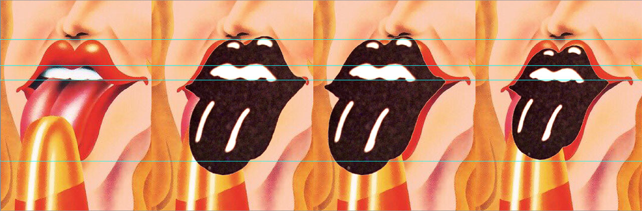
There was nothing other done with the rubber-stamp logo (used by Rolling Stones Records) from above than contrast adjusted, cut-out, slightly rotated and then scaled to fit with Alan Aldridge's illustration.
Edited 3 time(s). Last edit at 2021-03-30 16:50 by Irix.
Interesting - I've laid the 1970 rubber-stamp tongue over Alan Aldridge's 1969 illustration .... and both have nearly the same contour:
There was nothing other done with the rubber-stamp logo (used by Rolling Stones Records) from above than contrast adjusted, cut-out, slightly rotated and then scaled to fit with Alan Aldridge's illustration.
Edited 3 time(s). Last edit at 2021-03-30 16:50 by Irix.
Re: Rolling Stones Tongues
Posted by:
blivet
()
Date: September 24, 2020 23:47
Wow, that is really interesting. Thanks so much for posting this!
You can see how Pasche arrived at his final version by cleaning this one up and simplifying it, and it's clear how Braun ended up with his version starting from this as well.
You can see how Pasche arrived at his final version by cleaning this one up and simplifying it, and it's clear how Braun ended up with his version starting from this as well.
Re: Rolling Stones Tongues
Posted by:
georgie48
()
Date: September 25, 2020 10:22
Sorry guys for giving you a hard time. I thought that once it's send I could delete it from Postimage.
Another thing I should have told is that in the days of simple black&white faxing the colour red turns completely black, so that explains the monotonous image.
Another thing I should have told is that in the days of simple black&white faxing the colour red turns completely black, so that explains the monotonous image.
Re: Rolling Stones Tongues
Posted by:
Irix
()
Date: September 25, 2020 12:20
Quote
georgie48
Sorry guys for giving you a hard time. I thought that once it's send I could delete it from Postimage.
You shouldn't have delete it from Postimage. The Delete-Link I had written about was for the case that Craig Braun faxes you over from New York two rubber stamps - Pic 3: [iorr.org] - with the lines: "Copyright Issue".
Postimage is the "Hard Disk Drive" where the pictures are stored. There're no pictures stored on IORR, except the ones provided by Bjornulf Vik himself.
Re: Rolling Stones Tongues
Posted by:
georgie48
()
Date: September 25, 2020 15:55
Quote
IrixQuote
georgie48
Sorry guys for giving you a hard time. I thought that once it's send I could delete it from Postimage.
You shouldn't have delete it from Postimage. The Delete-Link I had written about was for the case that Craig Braun faxes you over from New York two rubber stamps - Pic 3: [iorr.org] - with the lines: "Copyright Issue".
Postimage is the "Hard Disk Drive" where the pictures are stored. There're no pictures stored on IORR, except the ones provided by Bjornulf Vik himself.
I understand now. I just didn't want to take "risks" with possibly crossing border lines
The only thing in all the previous discussions, but even more so in the research that I did many years ago (you made the link to the thread I once started
), I still hope one day to run into, are copies of correspondence that Marshall Chess made as president of Rolling Stones Records during those early months, where he used his stamp.They will have a similar impact as the copies, that (f.i. GasLightStreet) placed on the thread, of the correspondence between the Rolling Stones and John Pasche in early 1970. Patience ...

Re: Rolling Stones Tongues
Posted by:
Irix
()
Date: September 27, 2020 18:00
Quote
georgie48
The only thing in all the previous discussions, but even more so in the research that I did many years ago, I still hope one day to run into, are copies of correspondence that Marshall Chess made as president of Rolling Stones Records during those early months, where he used his stamp.
That would be interesting: it would clearly show when John Pasche's first logo was done in 1970 and how it looked in detail. Maybe Bill Wyman has some of the correspondence in his RS-Archive?
Here's a letter without date:
"A group of 1970s Rolling Stones stationery pieces including a sheet of Rolling Stones Records letterhead with tongue logo; two nearly identical green envelopes with the London office address for the Rolling Stones, one with slightly larger font treatment; and an off-white envelope reading 'Rolling Stones European Tour 1970.' The pieces date between 1968 and 1971." -- BW #3267 LOT 247 - [www.JuliensLive.com]
Letter & Logo from above straightened:
29-Apr-1970 - "Letter from The Rolling Stones (via their personal assistant, Jo Bergman) to John Pasche confirming that he will design a logo [...]" -- "used on note paper" :
Part of the Victoria and Albert Museum (London, UK).
Edited 4 time(s). Last edit at 2020-09-28 11:35 by Irix.
Re: Rolling Stones Tongues
Posted by:
georgie48
()
Date: September 28, 2020 10:53
Quote
IrixQuote
georgie48
The only thing in all the previous discussions, but even more so in the research that I did many years ago, I still hope one day to run into, are copies of correspondence that Marshall Chess made as president of Rolling Stones Records during those early months, where he used his stamp.
That would be interesting: it would clearly show when John Pasche's first logo was done in 1970 and how it looked in detail. Maybe Bill Wyman has some of the correspondence in his RS-Archive?
Here's a letter without date:
"A group of 1970s Rolling Stones stationery pieces including a sheet of Rolling Stones Records letterhead with tongue logo; two nearly identical green envelopes with the London office address for the Rolling Stones, one with slightly larger font treatment; and an off-white envelope reading 'Rolling Stones European Tour 1970.' The pieces date between 1968 and 1971." -- BW #3267 LOT 247 - [www.JuliensLive.com]
Letter & Logo from above straightened:
Hi Irix,
The young men clear the paths for the "lazy" old man
Since it's part of Bill Wyman's collection there can be no doubt concerning the stamp! It says 1970, so that indeed rules out Craig's influence on the making of the stamp image! (which I knew already). John Pasche was officiallly commissioned for making both a poster and a logo early 1970, so the timing fits nicely.
It's a real shame Aldridge past away, because he, for one, knew about "what happened between 1968 and 1970". Why were his creations (I really like his tiger-guitar creation) not "bought" by the Stones? Was he asked a lot of money (ripping them off?) for them, because he was already THE man for the Beatles? Or was it something else. I don't think we'll ever find out
... or John Pasche one day may ...?Still, I fully dig the influence of Kali on the design. Both Mick and Keith mentioned it from different angles several times. It also perfectly fits with the feeling the band (Mick?) wanted to radiate to the outside world. The "red" Kali stands for "life", the "white" Kali stands for "birth" and the "black" Kali for "death". And "life" it still is 50 years after the creation of the logo!
Thanks for waking me up again, Irix!
Re: Rolling Stones Tongues
Posted by:
Irix
()
Date: September 28, 2020 12:30
Quote
georgie48
It's a real shame Aldridge past away, because he, for one, knew about "what happened between 1968 and 1970". Why were his creations (I really like his tiger-guitar creation) not "bought" by the Stones? Was he asked a lot of money (ripping them off?) for them, because he was already THE man for the Beatles? Or was it something else. I don't think we'll ever find out ... or John Pasche one day may ...?
Yes, it's very pity that Alan Aldridge doesn't live anymore. There would be many questions about his illustrations and what's his opinion about the influence for the Stones-logo. But Alan Aldridge must have had family, friends and business partners - maybe they know still some things?
Quote
georgie48
Still, I fully dig the influence of Kali on the design. Both Mick and Keith mentioned it from different angles several times. It also perfectly fits with the feeling the band (Mick?) wanted to radiate to the outside world. The "red" Kali stands for "life", the "white" Kali stands for "birth" and the "black" Kali for "death". And "life" it still is 50 years after the creation of the logo!
Yes, there's no doubt that the original inspiration for the Stones-logo came from the Hindu goddess Kali.
But - when you look at depictions of Kali - it would have probably looked like this Kali-illustration done by John Pasche in 2020:
[Gramho.com] , [iorr.org]
The description of the V&A Museum about John Pasche's logo says: "Pasche, honing in on the goddess's protruding tongue, was inspired to create his famous logo, which captured perfectly the impudence of the band, and the prominence and sensuality of Jagger's mouth". And to achieve this in the logo, the Day-Tripper-illustration by Alan Aldridge was probably a welcome inspiration too. A 2016 interview with John Pasche:
[www.YouTube.com]
Edited 2 time(s). Last edit at 2020-09-28 14:55 by Irix.
Re: Rolling Stones Tongues
Posted by:
georgie48
()
Date: September 28, 2020 15:02
Quote
IrixQuote
georgie48
It's a real shame Aldridge past away, because he, for one, knew about "what happened between 1968 and 1970". Why were his creations (I really like his tiger-guitar creation) not "bought" by the Stones? Was he asked a lot of money (ripping them off?) for them, because he was already THE man for the Beatles? Or was it something else. I don't think we'll ever find out ... or John Pasche one day may ...?
Yes, it's very pity that Alan Aldridge doesn't live anymore. There would be many questions about his illustrations and what's his opinion about the influence for the Stones-logo. But Alan Aldridge must have had family, friends and business partners - maybe they know still some things?Quote
georgie48
Still, I fully dig the influence of Kali on the design. Both Mick and Keith mentioned it from different angles several times. It also perfectly fits with the feeling the band (Mick?) wanted to radiate to the outside world. The "red" Kali stands for "life", the "white" Kali stands for "birth" and the "black" Kali for "death". And "life" it still is 50 years after the creation of the logo!
Yes, there's no doubt that the original inspiration for the Stones-logo came from the Hindu goddess Kali.
But - when you look at depictions of Kali - it would have probably looked like this Kali-illustration done by John Pasche in 2020:
[Gramho.com] , [iorr.org]
The description of the V&A Museum about John Pasche's logo says: "Pasche, honing in on the goddess's protruding tongue, was inspired to create his famous logo, which captured perfectly the impudence of the band, and the prominence and sensuality of Jagger's mouth". And to achieve this in the logo, the Day-Tripper-illustration by Alan Aldridge was probably a welcome inspiration too. John Pasche was told by Mick Jagger that he could do better.
Right. The Kali images on calanders from f.i. indian restaurants are closer to what the logo became. I collected quite a few from the Internet. So Pasche's "first" sketches must have been very basic.
Also, when I did my "investigation" I collected around 400 mouth/tongue images from the Internet. Quite some were from way before 1968. Alan Aldridge for sure has been inspired by some of them too. I don't think any 60s artist could have claimed uniqueness at the time.
But I am happy that "the circle" is almost closed. It was all hanging in my head ever since I bought the Sticky Fingers album in my Liverpool days in 1971
Re: Rolling Stones Tongues
Posted by:
Irix
()
Date: September 28, 2020 15:35
Quote
georgie48
Also, when I did my "investigation" I collected around 400 mouth/tongue images from the Internet. Quite some were from way before 1968. Alan Aldridge for sure has been inspired by some of them too. I don't think any 60s artist could have claimed uniqueness at the time.
Of course, Alan Aldridge could have been inspired by some of the previous Tongue&Lips depictions too. Two typical examples - already posted on [iorr.org] :
Album-Cover Carmen McRae (1954) ; Tom Wesselmann, 'Mouth' series (1966/67)
Maybe such depictions were also part of the artistic education at that time, who knows? But the similarities between John Pasche's Rubber-Stamp-Logo and Alan Aldridge's illustration are simply too vast - [iorr.org] .
Sorry, only registered users may post in this forum.
Online Users
a bigger nut , daspyknows , EddieByword , exilestones , JMoisica , jumpingjackflash5 , LiveAtHidepark , Mabru , makemeburnthecandle , micha063 , MisterDDDD , MisterO , mosthigh , petewasbristol , Racca1962 , rastakeith , TooTight , TW2019 , usetobesampeg
Guests:
2160
Record Number of Users:
206
on June 1, 2022 23:50
Record Number of Guests:
9627
on January 2, 2024 23:10