Tell Me :
Talk
Agree with the suggestion to migrate to WordPress. It will make things considerably easier to administer for BV amongst a number of other features.
How about public ridicule of the offender, posting a picture, list of crimes and a poll on preferred manner of digital execution?
I think the problem with Wordpress is that it can't store as much information as running this site requires.
Very good one.. The deactived thing reminds me of the Borgs (sorry for the Swedes) in Star Trek
"Your existence is futile".

Enough poking
The most important
BV is a jolly good fellow to ask us for IORR changes - so let's be modest.. He runs the site on his free time with his own money.. So it's better to not ask to much manpower, I guess.
Edited 1 time(s). Last edit at 2015-11-11 17:29 by The Joker.
Perhaps BV could appoint sub-moderators to help him out? Choose them from his most trusted users, or test them with sample posts to see if they reach the right decisions about "to ban or not to ban"? Then he'd have more time to spend on the site itself, rather than worry about stupid posters like me (and I would make a terrible mod)
Just my thoughts.
"I hope you didn't record any of this""No I didn't"
NICOS, you know I love you, but I must disagree. I like to make up my own mind about what threads I think are important, thank you very much. A Stones board ain't no stinking popularity contest.

Edited 1 time(s). Last edit at 2015-11-11 21:23 by latebloomer.
 Great one Boognish..... and also add automatically a line above the signature....................
_________________
This is my signature
Thanks for the tip latebloomer "I like to make up my own mind about what threads I think are important" then BV can leave this field empty so you can add your own favorites..........
__________________________

I hereby motion for NICOS to be named interim web design contractor for IORR.
Provided, of course, said poster offers their services for free out of the goodness of their heart.
--------------------
"I hope you didn't record any of this""No I didn't"
Are you using the green template??? I thought that was just a test which was abandoned many years ago - cool!
PS: And please don't tell me I'm the only one still sticking to the old grey template...
Edited 1 time(s). Last edit at 2015-11-11 23:19 by DandelionPowderman.
Simply click on 'Last Post' in the Last Post column. Scroll upwards from there to see older posts.
.....
Olly.
I think his whole point is that doing so only takes you to the last page, not the latest comments. No worries, imo, last page is close enough for me.
It takes you to the latest post.
.....
Olly.
I forgot how long ago I put my signature there - maybe 11 years ago when everything began from scratch?
I tried to differentiate it from my posts by giving it italics, space between post(by adding two stacked periods), a division line, and it looks to be a smaller font.
I like the signature feature - adds a personal touch, but some of them can be confusing.
_____________________________________________________________
Rip this joint, gonna save your soul, round and round and round we go......
Yes, a visible separation would be helpful. It just happened to me a few days ago, that I read a post (which consisted of several lines with spacings) by someone and tried to make out, what he/she meant by the last line in context of the whole post. Not before I had read the same line at the end of another post by this user, I realized this was his/her signature.
I remember there were some choices a long time ago - maybe 5 or 6 years (?), or was it automatically changed to a new template when things started anew 11 years ago?
Anyways, I ended up reverting back to the simpler grey one as a creature of habit as I think the layout was good as is, and then forgot all about it.
Might be time for a change...is there an easy way to see and change to the other templates? Maybe through my control center?
edit - found where to change the template - control setting > forum settings.
_____________________________________________________________
Rip this joint, gonna save your soul, round and round and round we go......
Edited 1 time(s). Last edit at 2015-11-12 00:42 by Hairball.
DP, I love the green, (the "Emerald" or what I might call the "Irish" template), been using it most of the time since it came out.
~"Love is Strong"~
Talk about your favorite band.
![]()
![]()
![]()
![]()
For information about how to use this forum please check out forum help and policies.
Re: IORR changes - suggestions please!
Posted by:
Shantipole
()
Date: November 11, 2015 16:10
Quote
nankerzrk
Many of the points raised above could be very simply accomplished by migrating to a Wordpress or similar system - I used to work in freelance webdesign and implemented systems like this all the time (in addition to designing custom systems, but I'm afraid I don't have the time for that any more, otherwise would happily volunteer). In reality, you can do this yourself without hiring a coder or anything, the only issue might be migrating exiting accounts and posts.
In terms of suggestions: Would LOVE to be able to get push notifications of news/blog posts to my phone, via email if an iPhone app isn't possible - if I don't have time to check the site, don't want to miss any big Stones news! Would also give us the chance to more easily share if there is a surprise gig or something like that.
If you want, I can put you in touch with some top class webdesigners / coders?
Agree with the suggestion to migrate to WordPress. It will make things considerably easier to administer for BV amongst a number of other features.
Re: IORR changes - suggestions please!
Posted by:
treaclefingers
()
Date: November 11, 2015 16:54
Quote
NaturalustQuote
BreakingBluesQuote
Stoneage
The first page looks like a data sheet from 1985. But I don't know whether that's a bad thing or not?
Well, in a world filled with bright, loud colors, it's nice to have something soothing to look at.
Also, to back up what an earlier poster said, can there be a bit more... openness to the banned? Like maybe set up a trial by jury to decide when someone should be banned.
This user doesn't exist or has been deactivated.
Maybe a log of why they've left the website?
Or at least a kinder sounding message. That one is especially traumatic to the people who have been banned, I speak with some experience on this issue.
Perhaps something like "Posting privileges have been suspended". Of course they still exist!
How about public ridicule of the offender, posting a picture, list of crimes and a poll on preferred manner of digital execution?
Re: IORR changes - suggestions please!
Posted by:
treaclefingers
()
Date: November 11, 2015 16:55
I know you've already stated you're keeping the speed and ease that makes IORR great BV...just wanted to reiterate that is very much appreciated.
Re: IORR changes - suggestions please!
Posted by:
DandelionPowderman
()
Date: November 11, 2015 17:12
Quote
ShantipoleQuote
nankerzrk
Many of the points raised above could be very simply accomplished by migrating to a Wordpress or similar system - I used to work in freelance webdesign and implemented systems like this all the time (in addition to designing custom systems, but I'm afraid I don't have the time for that any more, otherwise would happily volunteer). In reality, you can do this yourself without hiring a coder or anything, the only issue might be migrating exiting accounts and posts.
In terms of suggestions: Would LOVE to be able to get push notifications of news/blog posts to my phone, via email if an iPhone app isn't possible - if I don't have time to check the site, don't want to miss any big Stones news! Would also give us the chance to more easily share if there is a surprise gig or something like that.
If you want, I can put you in touch with some top class webdesigners / coders?
Agree with the suggestion to migrate to WordPress. It will make things considerably easier to administer for BV amongst a number of other features.
I think the problem with Wordpress is that it can't store as much information as running this site requires.
Re: IORR changes - suggestions please!
Posted by:
mickschix
()
Date: November 11, 2015 17:13
I agree with Naturalust about posting photos. I have a ton of concert photos that I would love to share but I find it too cumbersome a process...I know, you all find it simple but I think it could be simplified for us that are not so computer savvy.
Other than that BV, I love the site the way it is. You do an incredible job!! Thank you for all of your hard work on our behalf!
Other than that BV, I love the site the way it is. You do an incredible job!! Thank you for all of your hard work on our behalf!
Re: IORR changes - suggestions please!
Posted by:
The Joker
()
Date: November 11, 2015 17:28
Quote
treaclefingersQuote
NaturalustQuote
BreakingBluesQuote
Stoneage
The first page looks like a data sheet from 1985. But I don't know whether that's a bad thing or not?
Well, in a world filled with bright, loud colors, it's nice to have something soothing to look at.
Also, to back up what an earlier poster said, can there be a bit more... openness to the banned? Like maybe set up a trial by jury to decide when someone should be banned.
This user doesn't exist or has been deactivated.
Maybe a log of why they've left the website?
Or at least a kinder sounding message. That one is especially traumatic to the people who have been banned, I speak with some experience on this issue.
Perhaps something like "Posting privileges have been suspended". Of course they still exist!
How about public ridicule of the offender, posting a picture, list of crimes and a poll on preferred manner of digital execution?
Very good one.. The deactived thing reminds me of the Borgs (sorry for the Swedes) in Star Trek
"Your existence is futile".
Enough poking
The most important
BV is a jolly good fellow to ask us for IORR changes - so let's be modest.. He runs the site on his free time with his own money.. So it's better to not ask to much manpower, I guess.
Edited 1 time(s). Last edit at 2015-11-11 17:29 by The Joker.
Re: IORR changes - suggestions please!
Posted by:
Richard from Canada
()
Date: November 11, 2015 17:44
Love it as is. Great work, Bjornulf. One suggestion may be to somehow limit the endless scrolling of Quotes to get to the newest comment about a particular topic.
Re: IORR changes - suggestions please!
Posted by:
Stoneburst
()
Date: November 11, 2015 18:16
Generally speaking I think the site works well technically. I'm not sure migrating it to Wordpress would achieve much, and frankly there are better CMSs out there. Some way to keep the forum uncluttered without continually merging threads would be good, perhaps? Finally, I agree with Turner et al on the need for more transparent moderation, and an amnesty for the numerous posters banned for no good reason.
Re: IORR changes - suggestions please!
Posted by:
Elmo Lewis
()
Date: November 11, 2015 19:23
I would like to delete my signature - been trying for years! But I get this message:
An error occurred in the application.
The error was logged to the Phorum event log.
Any help?
An error occurred in the application.
The error was logged to the Phorum event log.
Any help?
Re: IORR changes - suggestions please!
Posted by:
NICOS
()
Date: November 11, 2015 20:04
First of all I love the simplicity of IORR...................
My guess is that most of us start IORR with the TelMe and not with the IORR home page.......
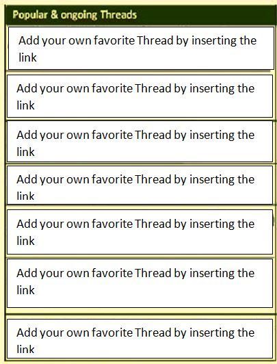
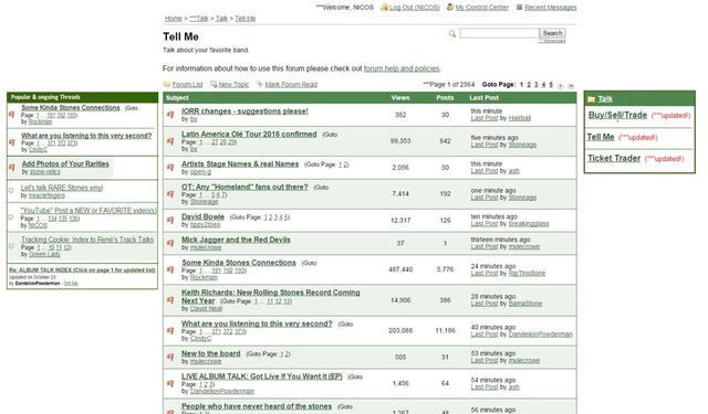
So I Iove to see on te left side the Popular and Ongoing Threads (I just put there some samples) and on the right side other talks :Buy/Sell and Trade and "Ticked Trader" (just to switch easily from the one to the other)
__________________________
My guess is that most of us start IORR with the TelMe and not with the IORR home page.......
So I Iove to see on te left side the Popular and Ongoing Threads (I just put there some samples) and on the right side other talks :Buy/Sell and Trade and "Ticked Trader" (just to switch easily from the one to the other)

__________________________
Re: IORR changes - suggestions please!
Posted by:
BreakingBlues
()
Date: November 11, 2015 21:11
Quote
The JokerQuote
treaclefingersQuote
NaturalustQuote
BreakingBluesQuote
Stoneage
The first page looks like a data sheet from 1985. But I don't know whether that's a bad thing or not?
Well, in a world filled with bright, loud colors, it's nice to have something soothing to look at.
Also, to back up what an earlier poster said, can there be a bit more... openness to the banned? Like maybe set up a trial by jury to decide when someone should be banned.
This user doesn't exist or has been deactivated.
Maybe a log of why they've left the website?
Or at least a kinder sounding message. That one is especially traumatic to the people who have been banned, I speak with some experience on this issue.
Perhaps something like "Posting privileges have been suspended". Of course they still exist!
How about public ridicule of the offender, posting a picture, list of crimes and a poll on preferred manner of digital execution?
Very good one.. The deactived thing reminds me of the Borgs (sorry for the Swedes) in Star Trek
"Your existence is futile".
Enough poking
The most important
BV is a jolly good fellow to ask us for IORR changes - so let's be modest.. He runs the site on his free time with his own money.. So it's better to not ask to much manpower, I guess.
Perhaps BV could appoint sub-moderators to help him out? Choose them from his most trusted users, or test them with sample posts to see if they reach the right decisions about "to ban or not to ban"? Then he'd have more time to spend on the site itself, rather than worry about stupid posters like me (and I would make a terrible mod)
Just my thoughts.
"I hope you didn't record any of this""No I didn't"
Re: IORR changes - suggestions please!
Posted by:
latebloomer
()
Date: November 11, 2015 21:16
Quote
NICOS
First of all I love the simplicity of IORR...................
My guess is that most of us start IORR with the TelMe and not with the IORR home page.......
So I Iove to see on te left side the Popular and Ongoing Threads (I just put there some samples) and on the right side other talks :Buy/Sell and Trade and "Ticked Trader" (just to switch easily from the one to the other)
NICOS, you know I love you, but I must disagree. I like to make up my own mind about what threads I think are important, thank you very much. A Stones board ain't no stinking popularity contest.
Edited 1 time(s). Last edit at 2015-11-11 21:23 by latebloomer.
Re: IORR changes - suggestions please!
Posted by:
Boognish
()
Date: November 11, 2015 21:20
How about making the signatures a different font or colour to make the posts a little less confusing? Or maybe make it so they're automatically italic?
Edited 1 time(s). Last edit at 2015-11-11 21:21 by Boognish.
Edited 1 time(s). Last edit at 2015-11-11 21:21 by Boognish.
Re: IORR changes - suggestions please!
Posted by:
NICOS
()
Date: November 11, 2015 21:58
Quote
Boognish
How about making the signatures a different font or colour to make the posts a little less confusing? Or maybe make it so they're automatically italic?
Great one Boognish..... and also add automatically a line above the signature...................._________________
This is my signature
Re: IORR changes - suggestions please!
Posted by:
More Hot Rocks
()
Date: November 11, 2015 22:01
Keep people that have been banned from coming back.
Re: IORR changes - suggestions please!
Posted by:
Rolling Hansie
()
Date: November 11, 2015 22:15
Call me old fashioned, but I just like it the way it is. No changes needed
-------------------
Keep On Rolling
-------------------
Keep On Rolling
Re: IORR changes - suggestions please!
Posted by:
tornnfrayed
()
Date: November 11, 2015 22:25
I wish there was a separate section for the 1972 tour and perhaps some of the other well known tours so people whose interest was that tour and that tour alone would have a place to to post reviews of new recordings, photos, ask and answer questions etc and share reminiscences.
Re: IORR changes - suggestions please!
Posted by:
buttons67
()
Date: November 11, 2015 22:38
i dont think the site really needs much changing. theres always plenty to talk about and sadly this wont always be the case once the stones are no more.
always good to read other peoples experiences of the band especially older people who were lucky to catch them at the start. i never got into the stones in 1962 for medical reasons, i wasnt born, i didnt venture into this planet till november 1968 about the same time as jumpin jack flash was on the go.
i could say that i was born in a crossfire hurricane.
Re: IORR changes - suggestions please!
Posted by:
NICOS
()
Date: November 11, 2015 23:12
Quote
latebloomerQuote
NICOS
First of all I love the simplicity of IORR...................
My guess is that most of us start IORR with the TelMe and not with the IORR home page.......
So I Iove to see on te left side the Popular and Ongoing Threads (I just put there some samples) and on the right side other talks :Buy/Sell and Trade and "Ticked Trader" (just to switch easily from the one to the other)
NICOS, you know I love you, but I must disagree. I like to make up my own mind about what threads I think are important, thank you very much. A Stones board ain't no stinking popularity contest.
Thanks for the tip latebloomer "I like to make up my own mind about what threads I think are important" then BV can leave this field empty so you can add your own favorites..........

__________________________
Re: IORR changes - suggestions please!
Posted by:
BreakingBlues
()
Date: November 11, 2015 23:15
Quote
NICOSQuote
latebloomerQuote
NICOS
First of all I love the simplicity of IORR...................
My guess is that most of us start IORR with the TelMe and not with the IORR home page.......
So I Iove to see on te left side the Popular and Ongoing Threads (I just put there some samples) and on the right side other talks :Buy/Sell and Trade and "Ticked Trader" (just to switch easily from the one to the other)
NICOS, you know I love you, but I must disagree. I like to make up my own mind about what threads I think are important, thank you very much. A Stones board ain't no stinking popularity contest.
Thanks for the tip latebloomer "I like to make up my own mind about what threads I think are important" then BV can leave this field empty so you can add your own favorites..........
I hereby motion for NICOS to be named interim web design contractor for IORR.
Provided, of course, said poster offers their services for free out of the goodness of their heart.
--------------------
"I hope you didn't record any of this""No I didn't"
Re: IORR changes - suggestions please!
Posted by:
DandelionPowderman
()
Date: November 11, 2015 23:16
Quote
NICOSQuote
latebloomerQuote
NICOS
First of all I love the simplicity of IORR...................
My guess is that most of us start IORR with the TelMe and not with the IORR home page.......
So I Iove to see on te left side the Popular and Ongoing Threads (I just put there some samples) and on the right side other talks :Buy/Sell and Trade and "Ticked Trader" (just to switch easily from the one to the other)
NICOS, you know I love you, but I must disagree. I like to make up my own mind about what threads I think are important, thank you very much. A Stones board ain't no stinking popularity contest.
Thanks for the tip latebloomer "I like to make up my own mind about what threads I think are important" then BV can leave this field empty so you can add your own favorites..........
Are you using the green template??? I thought that was just a test which was abandoned many years ago - cool!
PS: And please don't tell me I'm the only one still sticking to the old grey template...
Edited 1 time(s). Last edit at 2015-11-11 23:19 by DandelionPowderman.
Re: IORR changes - suggestions please!
Posted by:
NICOS
()
Date: November 11, 2015 23:33
IORR Emerald template 1.0 is still in use ...can't stand the older templates......
__________________________
__________________________
Re: IORR changes - suggestions please!
Posted by:
Olly
()
Date: November 11, 2015 23:37
Quote
Richard from Canada
Love it as is. Great work, Bjornulf. One suggestion may be to somehow limit the endless scrolling of Quotes to get to the newest comment about a particular topic.
Simply click on 'Last Post' in the Last Post column. Scroll upwards from there to see older posts.
.....
Olly.
Re: IORR changes - suggestions please!
Posted by:
Naturalust
()
Date: November 12, 2015 00:01
Quote
OllyQuote
Richard from Canada
Love it as is. Great work, Bjornulf. One suggestion may be to somehow limit the endless scrolling of Quotes to get to the newest comment about a particular topic.
Simply click on 'Last Post' in the Last Post column. Scroll upwards from there to see older posts.
I think his whole point is that doing so only takes you to the last page, not the latest comments. No worries, imo, last page is close enough for me.
Re: IORR changes - suggestions please!
Posted by:
Olly
()
Date: November 12, 2015 00:11
Quote
NaturalustQuote
OllyQuote
Richard from Canada
Love it as is. Great work, Bjornulf. One suggestion may be to somehow limit the endless scrolling of Quotes to get to the newest comment about a particular topic.
Simply click on 'Last Post' in the Last Post column. Scroll upwards from there to see older posts.
I think his whole point is that doing so only takes you to the last page, not the latest comments. No worries, imo, last page is close enough for me.
It takes you to the latest post.
.....
Olly.
Re: IORR changes - suggestions please!
Posted by:
Hairball
()
Date: November 12, 2015 00:13
Quote
NICOSQuote
Boognish
How about making the signatures a different font or colour to make the posts a little less confusing? Or maybe make it so they're automatically italic?
_________________
This is my signature
I forgot how long ago I put my signature there - maybe 11 years ago when everything began from scratch?
I tried to differentiate it from my posts by giving it italics, space between post(by adding two stacked periods), a division line, and it looks to be a smaller font.
I like the signature feature - adds a personal touch, but some of them can be confusing.
_____________________________________________________________
Rip this joint, gonna save your soul, round and round and round we go......
Re: IORR changes - suggestions please!
Posted by:
ThroughTheLonelyNights
()
Date: November 12, 2015 00:13
IORR is nearly perfect!
Please keep it easy.
Possible changes:
- a like button for favourite posts
- easy way of posting photos/videos
- style of main site is not quite my taste (but this is a minor matter)
Thanks for your effort. IORR (Tell me) is very appreciated!!
Edited 1 time(s). Last edit at 2015-11-12 00:16 by ThroughTheLonelyNights.
Re: IORR changes - suggestions please!
Posted by:
StrawberriesBlueberries
()
Date: November 12, 2015 00:14
Quote
NICOSQuote
Boognish
How about making the signatures a different font or colour to make the posts a little less confusing? Or maybe make it so they're automatically italic?
_________________
This is my signature
Yes, a visible separation would be helpful. It just happened to me a few days ago, that I read a post (which consisted of several lines with spacings) by someone and tried to make out, what he/she meant by the last line in context of the whole post. Not before I had read the same line at the end of another post by this user, I realized this was his/her signature.Re: IORR changes - suggestions please!
Posted by:
Hairball
()
Date: November 12, 2015 00:23
Quote
NICOS
IORR Emerald template 1.0 is still in use ...can't stand the older templates......
I remember there were some choices a long time ago - maybe 5 or 6 years (?), or was it automatically changed to a new template when things started anew 11 years ago?
Anyways, I ended up reverting back to the simpler grey one as a creature of habit as I think the layout was good as is, and then forgot all about it.
Might be time for a change...is there an easy way to see and change to the other templates? Maybe through my control center?
edit - found where to change the template - control setting > forum settings.
_____________________________________________________________
Rip this joint, gonna save your soul, round and round and round we go......
Edited 1 time(s). Last edit at 2015-11-12 00:42 by Hairball.
Re: IORR changes - suggestions please!
Posted by:
angee
()
Date: November 12, 2015 00:25
Quote
DandelionPowderman
Are you using the green template??? I thought that was just a test which was abandoned many years ago - cool!
PS: And please don't tell me I'm the only one still sticking to the old grey template...
DP, I love the green, (the "Emerald" or what I might call the "Irish" template), been using it most of the time since it came out.
~"Love is Strong"~
Sorry, only registered users may post in this forum.
Online Users
a bigger nut , babyblue , Heartbreaker 69 , JMARKO , mariano , riccardo99 , swimtothemoon , TeddyB1018 , voodoodrew
Guests:
1838
Record Number of Users:
206
on June 1, 2022 23:50
Record Number of Guests:
9627
on January 2, 2024 23:10