Tell Me :
Talk
John Pasche got:
£50 - First payment - [www.iorr.org]
£200 - Payment in 1972 - [www.iorr.org]
£26,000 - sold the 'Tongue&Lips' logo rights to The Rolling Stones in 1984 - [www.nytimes.com]
£50,000 - the Victoria & Albert Museum in London (UK) bought his original artwork in 2008 - [www.nytimes.com]
5x £65,000 - in 2009 Pasche reached an agreement with The Rolling Stones permitting him to produce just five original and unique artworks based on the original design - [www.belgraviagallery.com]
He got total £401,250 for his 'Tongue&Lips' logo. Whether this is sufficient in consideration of the logo's success, is another question ....
Wow that's some nice research there Irix. Possibly a few more payments between 1972 and 1984 when the tongue was used since he owned the copyright, although he may have just given permission for it's use without compensation.
With this kind of money being bantered around for the "original" design it is a bit more understandable why there might be a bit of controversy. I wonder how much Cefalu made for his tongue efforts over the years? As an employee of Braun, I would guess not much. Perhaps he has sold some recreations as well.


"As we say in England, it can get a bit trainspottery"
Comparison:

Edited 1 time(s). Last edit at 2015-09-25 23:20 by Irix.
Black stroke separating tongue from right tooth is different thickness.
Main difference appears to be the black shape at the back of the tongue... rounder in the old one, flattened in the recent version.
I prefer the old one
So... hardly any change. Wonderful.
I don't think Shepherd Fairey is much good, personally. I agree with you that the "5t0nes" thing is amateurish, and the tongue is just an inattentive redrawing.
Check out most of the sports team tongues that have been marketed on the Zip Code tour if you want to see amateurish and done in 5 minutes on photoshop versions. Talk about diluting a great piece of art in order to capitalize on fanatical sports fans.
Yes... THEY'RE AWFUL
Absolutely. Just the worst.
And even more Art from Ernie Cefalu on his [www.Facebook.com] page.
Did he now? Were you there in NYC at the Decca offices when Marshall Chess started this in motion? If you are "that guy" you know how things work in the art world. One guy does an initial design, gives it to the person paying for the effort, they like it and give it to another artist who does a slightly different version. It serves to both improve it and obscure it's true origins.
Why would a guy with over 120 album covers to his name and a trail of successes pick this one thing to associate himself with if it wasn't true?
Anyway, how about a comment on this:
Uh, yeah, Pasche did.
It is sad to notice that the fake "Cefalu" story is still "going on". He did a video interview which was shown on IORR where he showed a black shirt filled with the red "USA" logo. He said, that he didn't know where that version (the most popular one) came from!!! Off course he didn't know. It came from the office where he briefly was employed. It was based on John Pasche's version. And it was already finished at the time Cefalu was there! Cefalu had nothing to do with the design.
Cefalu is among others, like Ruby Mazur, who seek attention via the logo to promote their work with fake stories. Off course Mick (and the other Stones) know the truth and tackle liers in their own way.

The tongue on 'Forty Licks' looks also a bit like the Cefalu's tongue, but it has been restyled by the British graphic designer Tom Hingston - see the Credits in the Forty-Licks-Booklet as well as the 2016 Book: "Rolling Stones: All the Songs - The Story Behind Every Track" (by Philippe Margotin and Jean-Michel Guesdon), from page 648.
Tom Hingston - [en.Wikipedia.org] - [www.Hingston.net] .
Edited 1 time(s). Last edit at 2017-04-22 00:30 by Irix.
Talk about your favorite band.
![]()
![]()
![]()
![]()
For information about how to use this forum please check out forum help and policies.
Re: First designer of Stones Tongue & Lips logo???
Posted by:
exhpart
()
Date: September 13, 2015 13:29
"My take on it is that Mick wanted to not have to pay either of the original artists"
I don't think John Pasche ever claimed he wasn't paid, has he? Just that, with 45 years of hindsight, he should have asked for a whole lot more.
I have made a lot of money on my house, doesn't mean I'm going to find the guy I bought it from and pay him some more
I don't think John Pasche ever claimed he wasn't paid, has he? Just that, with 45 years of hindsight, he should have asked for a whole lot more.
I have made a lot of money on my house, doesn't mean I'm going to find the guy I bought it from and pay him some more
Re: First designer of Stones Tongue & Lips logo???
Posted by:
Irix
()
Date: September 13, 2015 19:45
Quote
exhpart
Just that, with 45 years of hindsight, he should have asked for a whole lot more.
John Pasche got:
£50 - First payment - [www.iorr.org]
£200 - Payment in 1972 - [www.iorr.org]
£26,000 - sold the 'Tongue&Lips' logo rights to The Rolling Stones in 1984 - [www.nytimes.com]
£50,000 - the Victoria & Albert Museum in London (UK) bought his original artwork in 2008 - [www.nytimes.com]
5x £65,000 - in 2009 Pasche reached an agreement with The Rolling Stones permitting him to produce just five original and unique artworks based on the original design - [www.belgraviagallery.com]
He got total £401,250 for his 'Tongue&Lips' logo. Whether this is sufficient in consideration of the logo's success, is another question ....
Re: First designer of Stones Tongue & Lips logo???
Posted by:
Naturalust
()
Date: September 13, 2015 20:01
Quote
IrixQuote
exhpart
Just that, with 45 years of hindsight, he should have asked for a whole lot more.
John Pasche got:
£50 - First payment - [www.iorr.org]
£200 - Payment in 1972 - [www.iorr.org]
£26,000 - sold the 'Tongue&Lips' logo rights to The Rolling Stones in 1984 - [www.nytimes.com]
£50,000 - the Victoria & Albert Museum in London (UK) bought his original artwork in 2008 - [www.nytimes.com]
5x £65,000 - in 2009 Pasche reached an agreement with The Rolling Stones permitting him to produce just five original and unique artworks based on the original design - [www.belgraviagallery.com]
He got total £401,250 for his 'Tongue&Lips' logo. Whether this is sufficient in consideration of the logo's success, is another question ....
Wow that's some nice research there Irix. Possibly a few more payments between 1972 and 1984 when the tongue was used since he owned the copyright, although he may have just given permission for it's use without compensation.
With this kind of money being bantered around for the "original" design it is a bit more understandable why there might be a bit of controversy. I wonder how much Cefalu made for his tongue efforts over the years? As an employee of Braun, I would guess not much. Perhaps he has sold some recreations as well.
Re: First designer of Stones Tongue & Lips logo???
Posted by:
schillid
()
Date: September 25, 2015 19:36
Re: First designer of Stones Tongue & Lips logo???
Posted by:
GasLightStreet
()
Date: September 25, 2015 20:32
Goddamn, schillid! You couldn't find any smaller pics????

or...
or...
Re: First designer of Stones Tongue & Lips logo???
Posted by:
Deltics
()
Date: September 25, 2015 20:36

"As we say in England, it can get a bit trainspottery"
Re: First designer of Stones Tongue & Lips logo???
Posted by:
GasLightStreet
()
Date: September 25, 2015 20:36
Or...

or...
or...
Re: First designer of Stones Tongue & Lips logo???
Posted by:
GasLightStreet
()
Date: September 25, 2015 20:40
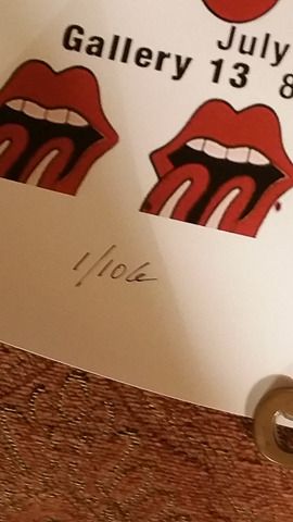
The 50 year anniversary tongue was changed slightly from the new tongue.
Has anyone been able to figure out what's different about it?
Has anyone been able to figure out what's different about it?
Re: First designer of Stones Tongue & Lips logo???
Posted by:
Naturalust
()
Date: September 25, 2015 20:51
An interesting quote from the SabotageTimes Marshall chess interview about the tongue. He basically admits auditioning a variety of artists for the job, perhaps there is even more than Pasche and Cefalu out there?
JW: Wasn’t one of your first moves to come up with the idea of the famous lips-and-tongue logo for the band?
MC: The Stones were in Amsterdam. I landed at Rotterdam airport. I was driving along to meet the band and saw a Shell petrol station with the classic yellow logo. It was so beautifully simplistic. I mention this later when I’m sitting around with The Stones, saying that we should come up with a design that is totally recognisable without having the band’s name on it. Out of that conversation came the idea of having the tongue and lips. As label manager it was my job to audition a variety of artists who came up with an extraordinary variety of tongues. As soon as we saw John Pasche’s now famous design, there was no doubt that was the one and we bought it outright.
Re: First designer of Stones Tongue & Lips logo???
Posted by:
Irix
()
Date: September 25, 2015 23:00
Quote
GasLightStreet
The 50 year anniversary tongue was changed slightly from the new tongue.
Has anyone been able to figure out what's different about it?
Comparison:
Edited 1 time(s). Last edit at 2015-09-25 23:20 by Irix.
Re: First designer of Stones Tongue & Lips logo???
Posted by:
GasLightStreet
()
Date: September 26, 2015 01:50
But the tongue has had that much blackness before, in the mouth as well as under the tongue. Perhaps they meant as an official 'here it is now' thing even though it's not that much different...
The ABB tongue sucked. Horrible.
The ABB tongue sucked. Horrible.
Re: First designer of Stones Tongue & Lips logo???
Posted by:
schillid
()
Date: September 26, 2015 02:26
Quote
GasLightStreet
Has anyone been able to figure out what's different about it?
Black stroke separating tongue from right tooth is different thickness.
Main difference appears to be the black shape at the back of the tongue... rounder in the old one, flattened in the recent version.
I prefer the old one
Re: First designer of Stones Tongue & Lips logo???
Posted by:
GasLightStreet
()
Date: September 26, 2015 02:52
Quote
schillidQuote
GasLightStreet
Has anyone been able to figure out what's different about it?
Black stroke separating tongue from right tooth is different thickness.
Main difference appears to be the black shape at the back of the tongue... rounder in the old one, flattened in the recent version.
I prefer the old one
So... hardly any change. Wonderful.
Re: First designer of Stones Tongue & Lips logo???
Posted by:
schillid
()
Date: September 26, 2015 03:11
Duplicate post
Edited 1 time(s). Last edit at 2015-09-26 03:37 by schillid.
Edited 1 time(s). Last edit at 2015-09-26 03:37 by schillid.
Re: First designer of Stones Tongue & Lips logo???
Posted by:
schillid
()
Date: September 26, 2015 03:36
I hate
ROLLING 5T0NES
very forced looking and amateurish, imo
ROLLING 5T0NES
very forced looking and amateurish, imo
Re: First designer of Stones Tongue & Lips logo???
Posted by:
blivet
()
Date: September 26, 2015 04:54
Quote
schillid
I hate
ROLLING 5T0NES
very forced looking and amateurish, imo
I don't think Shepherd Fairey is much good, personally. I agree with you that the "5t0nes" thing is amateurish, and the tongue is just an inattentive redrawing.
Re: First designer of Stones Tongue & Lips logo???
Posted by:
Naturalust
()
Date: September 26, 2015 05:08
Quote
blivetQuote
schillid
I hate
ROLLING 5T0NES
very forced looking and amateurish, imo
I don't think Shepherd Fairey is much good, personally. I agree with you that the "5t0nes" thing is amateurish, and the tongue is just an inattentive redrawing.
Check out most of the sports team tongues that have been marketed on the Zip Code tour if you want to see amateurish and done in 5 minutes on photoshop versions. Talk about diluting a great piece of art in order to capitalize on fanatical sports fans.
Re: First designer of Stones Tongue & Lips logo???
Posted by:
schillid
()
Date: September 26, 2015 05:26
Quote
Naturalust
Check out most of the sports team tongues that have been marketed on the Zip Code tour if you want to see amateurish and done in 5 minutes on photoshop versions. Talk about diluting a great piece of art in order to capitalize on fanatical sports fans.
Yes... THEY'RE AWFUL
Re: First designer of Stones Tongue & Lips logo???
Posted by:
blivet
()
Date: September 26, 2015 07:58
Quote
schillidQuote
Naturalust
Check out most of the sports team tongues that have been marketed on the Zip Code tour if you want to see amateurish and done in 5 minutes on photoshop versions. Talk about diluting a great piece of art in order to capitalize on fanatical sports fans.
Yes... THEY'RE AWFUL
Absolutely. Just the worst.
Re: First designer of Stones Tongue & Lips logo???
Posted by:
roller99
()
Date: October 25, 2015 03:37
More art from Ernie!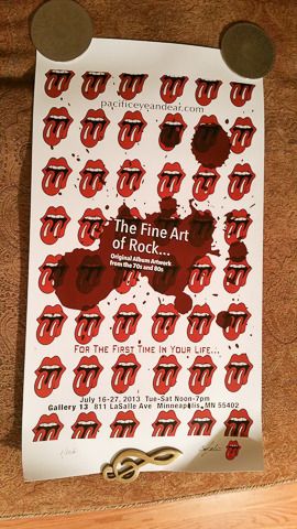
Re: First designer of Stones Tongue & Lips logo???
Posted by:
Irix
()
Date: October 25, 2015 13:00
Quote
roller99
More art from Ernie!
And even more Art from Ernie Cefalu on his [www.Facebook.com] page.
Re: First designer of Stones Tongue & Lips logo???
Posted by:
GasLightStreet
()
Date: November 15, 2015 19:49
I listened to the Spotify STICKY FINGERS edition and Mick talks about the logo. Never mentions Ernie, just John Pasche.
Don't you think Mick would say something about Ernie if it was true?
Don't you think Mick would say something about Ernie if it was true?
Re: John Pasche, Not Ernie Cefalu
Posted by:
roller99
()
Date: April 18, 2017 21:01
Quote
PTownshend
John Pasche came up with the logo. period
Did he now? Were you there in NYC at the Decca offices when Marshall Chess started this in motion? If you are "that guy" you know how things work in the art world. One guy does an initial design, gives it to the person paying for the effort, they like it and give it to another artist who does a slightly different version. It serves to both improve it and obscure it's true origins.
Why would a guy with over 120 album covers to his name and a trail of successes pick this one thing to associate himself with if it wasn't true?
Anyway, how about a comment on this:
Re: John Pasche, Not Ernie Cefalu
Posted by:
GasLightStreet
()
Date: April 19, 2017 15:20
Quote
roller99Quote
PTownshend
John Pasche came up with the logo. period
Did he now? Were you there in NYC at the Decca offices when Marshall Chess started this in motion? If you are "that guy" you know how things work in the art world. One guy does an initial design, gives it to the person paying for the effort, they like it and give it to another artist who does a slightly different version. It serves to both improve it and obscure it's true origins.
Why would a guy with over 120 album covers to his name and a trail of successes pick this one thing to associate himself with if it wasn't true?
Uh, yeah, Pasche did.
Re: John Pasche, Not Ernie Cefalu
Posted by:
Doc
()
Date: April 19, 2017 18:36
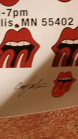
Talking about tongue designs.
We all know the Pasche versions as the Cefalu's tongue.
In 1995, there were posters sold with the "spicky tongue" and another design, which looked a bit the the Cefalu's tongue :

Anybody knows who created them ?
We all know the Pasche versions as the Cefalu's tongue.
In 1995, there were posters sold with the "spicky tongue" and another design, which looked a bit the the Cefalu's tongue :
Anybody knows who created them ?

Re: First designer of Stones Tongue & Lips logo???
Posted by:
georgie48
()
Date: April 21, 2017 21:43
Quote
GasLightStreet
I listened to the Spotify STICKY FINGERS edition and Mick talks about the logo. Never mentions Ernie, just John Pasche.
Don't you think Mick would say something about Ernie if it was true?
It is sad to notice that the fake "Cefalu" story is still "going on". He did a video interview which was shown on IORR where he showed a black shirt filled with the red "USA" logo. He said, that he didn't know where that version (the most popular one) came from!!! Off course he didn't know. It came from the office where he briefly was employed. It was based on John Pasche's version. And it was already finished at the time Cefalu was there! Cefalu had nothing to do with the design.
Cefalu is among others, like Ruby Mazur, who seek attention via the logo to promote their work with fake stories. Off course Mick (and the other Stones) know the truth and tackle liers in their own way.
Re: John Pasche, Not Ernie Cefalu
Posted by:
Irix
()
Date: April 22, 2017 00:00
Quote
Doc
In 1995, there were posters sold with the "spicky tongue" and another design, which looked a bit like the Cefalu's tongue
The tongue on 'Forty Licks' looks also a bit like the Cefalu's tongue, but it has been restyled by the British graphic designer Tom Hingston - see the Credits in the Forty-Licks-Booklet as well as the 2016 Book: "Rolling Stones: All the Songs - The Story Behind Every Track" (by Philippe Margotin and Jean-Michel Guesdon), from page 648.
Tom Hingston - [en.Wikipedia.org] - [www.Hingston.net] .
Edited 1 time(s). Last edit at 2017-04-22 00:30 by Irix.
Re: First designer of Stones Tongue & Lips logo???
Posted by:
Nate
()
Date: April 22, 2017 01:00
My father who was an art director used to work with John Pasche at the time that John was commissioned to do the design.
John Pasche designed the logo.
Nate
John Pasche designed the logo.
Nate
Re: First designer of Stones Tongue & Lips logo???
Posted by:
mattleeuk
()
Date: April 22, 2017 03:28
The V&A got a crazy cheap for something so iconic.
Sorry, only registered users may post in this forum.
Online Users
charlystone , Colonel Dan , FoolToCry , ghs73 , gotdablouse , Paddy , Pvk2 , Slop , stargroover , TooTight , TumblinDice76 , TW2019 , vibrolux
Guests:
2211
Record Number of Users:
206
on June 1, 2022 23:50
Record Number of Guests:
9627
on January 2, 2024 23:10