Tell Me :
Talk
I agree, but I meant the final one for Sticky Fingers.
This Illustration is contained in the Book 'The Beatles Illustrated Lyrics' by Alan Aldridge, according to this Post already in the 1st Edition from 1969. The Illustration seems to belong to the Song 'Day Tripper' and is to find in the Book around on Page 110/111. Compared to the classic Stones Lips & Tongue logo it has a striking resemblance ....

 Cool man and thanks for all the cool tongues you posted above, they are totally cool and always will be cool.
It is always cool to see someone, somewhere, doing something and they have the tongue on and it is cool, especially when it is someone I would not expect to have it on. The cool Stones tongue is always fun and cool to see. The Stones tongue will never lose its cool.
Edited 1 time(s). Last edit at 2015-07-16 18:40 by relms.
Except that the Stones website acknowledges the original design was by Cefalu, I'd say that would qualify as something to do with it.
That's what some people are not understanding - that Pasche came up with the logo. Cefalu did not come up with the logo. Jagger has made that as clear as clear can be. And if people want to say 'well on the website it says blah blah blah' it's the website of a band that can't get their own credits correct on the original album releases yet alone reissues. Or with that trivia thing, that's not the Stones anyway.
Edited 1 time(s). Last edit at 2015-07-17 03:07 by GasLightStreet.
No worries GLS. I'm sure Pasche came up with the logo used on the record. It's also pretty clear that Cefalu came up with his own version. They are different enough that it's fair to give each one credit for their work. I don't think either artist is lying, here is a link to a detailed Cefalu interview...clearly the guy was involved. Not sure why you don't believe him and dislike him so much.
[rockpopgallery.typepad.com]
There's no being sure Pasche came up with the logo, it's a fact. Cefalu's design was after the fact, the fact of Pasche's logo being done before his. Cefalu's a crybaby.
That's utterly extraordinary. That tongue really is there as described (I have a first edition), and throws a whole new light on who first came up with the design!
Alan Aldridge should sue someone!
--
Captain Corella
60 Years a Fan
Indeed the similarities are pretty obvious! I wonder if Pasche or Cefalu would even admit to having ever seen it?
You nailed it Naturalust. The dates and who did what when may have been obfuscated. Marshall Chess won't talk, his wife is playing cat-and-mouse on FB. I can tell you that Ernie's "Dolls Alive" design was from 1969 and it pre-dates work by Pasche. But you are completely correct.
Talk about your favorite band.
![]()
![]()
![]()
![]()
For information about how to use this forum please check out forum help and policies.
Re: First designer of Stones Tongue & Lips logo???
Posted by:
BBrew
()
Date: February 15, 2015 20:58
Quote
NaturalustQuote
Bitches Brew
The fact is that more than one design was made, and that the Pasche's one was the final one, but not his idea. And there is also that design from Alan Aldridge from 1969...
Considering it is still being modified and (over)used I'm not sure "final one" has much meaning here.peace
I agree, but I meant the final one for Sticky Fingers.
Re: First designer of Stones Tongue & Lips logo???
Posted by:
Irix
()
Date: February 15, 2015 22:00
Quote
Bitches Brew
[...] And there is also that design from Alan Aldridge from 1969...
This Illustration is contained in the Book 'The Beatles Illustrated Lyrics' by Alan Aldridge, according to this Post already in the 1st Edition from 1969. The Illustration seems to belong to the Song 'Day Tripper' and is to find in the Book around on Page 110/111. Compared to the classic Stones Lips & Tongue logo it has a striking resemblance ....
Re: First designer of Stones Tongue & Lips logo???
Posted by:
GasLightStreet
()
Date: February 15, 2015 22:40
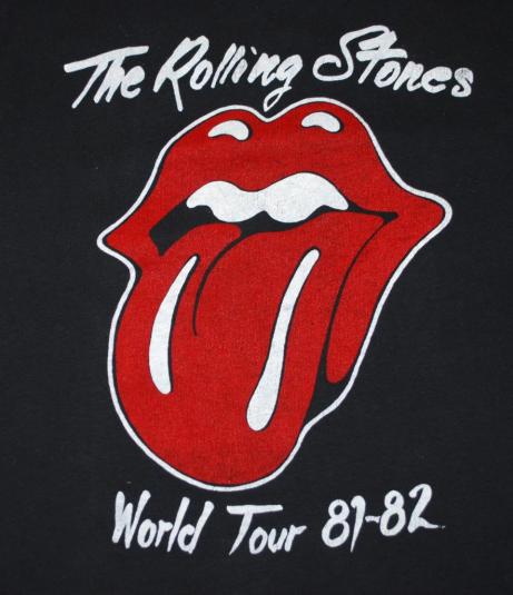
Well, one fact remains: the John Pasche logo has been used in variations since 1971 on every album release, single cover and whatever posters that use the original logo in some way.


.jpg)
Re: John Pasche, Not Ernie Cefalu
Posted by:
FineArtOfRock
()
Date: July 16, 2015 17:46
Been following this for a while. If I could upload a screenshot, I would be happy to share what the Stones have to say about it...answer to a trivia quiz on their website..."question 10 of 10...Who hasn't officially been named a contributor to the making of the Sticky Fingers album cover?"
Answer: "The Sticky Fingers album art, named best record cover by VH1, was "conceived" by Warhol, photographed by Billy Name, and features the lips logo by John Pasche on the back (originally designed by Ernie Cefalu). Joe Dallesandro claims to have been the one who wears the jeans in the relationship, but the model's name has never been truly unzipped."
To me, it's clear that both Pasche and Cefalu were involved in the logo's creation, as were probably dozens of other illustrators. From what I've read, Marshall Chess was going all around NY and London during that period and soliciting design ideas from anyone perceived as "good." Jagger was doing the same, it seems.
Cefalu doesn't own the rights to the logo because he never claimed them, apparently. Pasche did, evidently, which he later sold. I am told that Cefalu does own the rights to his own creation (i.e. his own version), but not for licensing purposes.
Hats off to both of these guys!
One view
Re: First designer of Stones Tongue & Lips logo???
Posted by:
Naturalust
()
Date: July 16, 2015 18:12
Nice analysis of this issue, sounds right to me and a good first post here FineArtOfRock.
I never get tired of what the tongue stands for but it has been so overused it has lost it's coolness for me.
I never get tired of what the tongue stands for but it has been so overused it has lost it's coolness for me.
Re: First designer of Stones Tongue & Lips logo???
Posted by:
GasLightStreet
()
Date: July 16, 2015 18:22
In one of the audio tracks with Spotify about STICKY FINGERS Mick talks about John Pasche and how Mick had seen the tongue of Kali. Cefalu had zero to do with the logo that is known as their logo.
Re: First designer of Stones Tongue & Lips logo???
Posted by:
relms
()
Date: July 16, 2015 18:36
Quote
GasLightStreet
In one of the audio tracks with Spotify about STICKY FINGERS Mick talks about John Pasche and how Mick had seen the tongue of Kali. Cefalu had zero to do with the logo that is known as their logo.
Cool man and thanks for all the cool tongues you posted above, they are totally cool and always will be cool.It is always cool to see someone, somewhere, doing something and they have the tongue on and it is cool, especially when it is someone I would not expect to have it on. The cool Stones tongue is always fun and cool to see. The Stones tongue will never lose its cool.
Edited 1 time(s). Last edit at 2015-07-16 18:40 by relms.
Re: First designer of Stones Tongue & Lips logo???
Posted by:
Naturalust
()
Date: July 16, 2015 18:51
Quote
GasLightStreet
In one of the audio tracks with Spotify about STICKY FINGERS Mick talks about John Pasche and how Mick had seen the tongue of Kali. Cefalu had zero to do with the logo that is known as their logo.
Except that the Stones website acknowledges the original design was by Cefalu, I'd say that would qualify as something to do with it.
Re: First designer of Stones Tongue & Lips logo???
Posted by:
Irix
()
Date: July 16, 2015 19:00
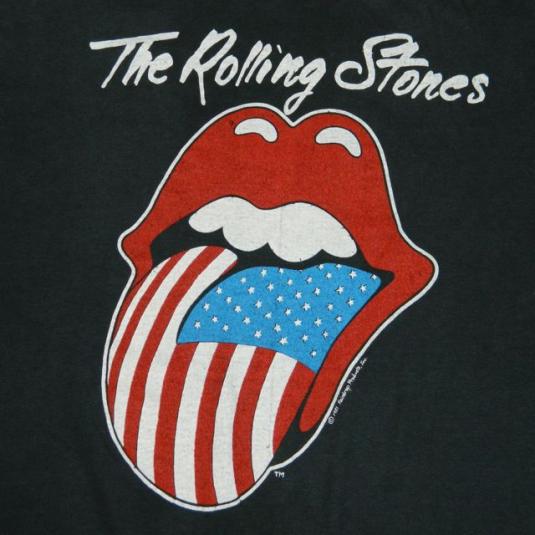
Not to forget how it came to the US-Version of the Tongue, which is now the most widely used one - [www.iorr.org] · [www.nytimes.com] :
Art of the Rolling Stones: Behind That Zipper and That Tongue
By JOE COSCARELLI · JUNE 7, 2015

Large versions: Picture-1 · Picture-2 · Picture-3 · Picture-4 · Picture-5 · Picture-6
As the Rolling Stones prepared recently to rerelease “Sticky Fingers,” their classic 1971 album featuring hits like “Wild Horses” and “Brown Sugar,” the manufacturing process hit a snag: The functional zipper from Andy Warhol’s bulging blue jean album cover, recreated for some new deluxe editions, was taking longer than expected to produce, Universal Music announced, pushing back the release to Tuesday.
They might have asked Craig Braun for help.
As the owner and creative director of the Sound Packaging Corporation, Mr. Braun became known in the ’60s and ’70s as the go-to inventor of elaborate album covers, making his name with projects like the peelable banana on the cover of 1967’s “The Velvet Underground & Nico,” another over-the-top phallic concept by Mr. Warhol.
Now, with the Stones’ revisiting “Sticky Fingers” on the aptly named “ZIP Code” tour, which takes them across North America through July 15, Mr. Braun is eager to share the story behind what VH1 called the best album cover ever. “Sticky Fingers” also included the debut of the Stones’ iconic lips and tongue logo, another piece of rock history with a tangled origin story — once again involving Mr. Braun.
“This album heralded an age of really imaginative and provocative packaging,” said the rock critic Richard Harrington, who is working on a book about controversial album art. “It also introduced the greatest band logo of all time.”
After “Let It Bleed” in 1969, the Stones split with their original label, Decca Records, and started their own, Rolling Stones Records. For the label’s first release, the band planned to pair edgy songs like “Can’t You Hear Me Knocking” and “Sister Morphine” with an alluring visual statement. “They were the bad boys of rock ’n’ roll, expressing anger, lust and sex,” said Mr. Braun, now 75 and working as an actor.
While Mr. Braun and his team experimented with other playful concepts — including the oversize Bambu rolling paper cover later used by Cheech & Chong — Mick Jagger was set on Mr. Warhol’s zipper idea. And not only did the zipper have to work — it had to have something behind it.
“They knew if they put jeans and a working zipper that people were going to want to see what was back there,” Mr. Braun said. The reveal also served a practical purpose. “I knew the back of the zippers, which had to be glued down by hand, could damage the record,” he said. “So I decided to fold in a third panel.”
Mr. Braun called Warhol’s Factory looking for extra art. It came in the form of Polaroids from Warhol of a model in his tighty whities — photos that Mr. Braun still has, in their original envelope, at his Manhattan apartment today. (Commonly mistaken for Mr. Jagger, the “Sticky Fingers” underwear model as well as the cover star have remained a mystery; suspects include the Warhol Factory kids Joe Dallesandro, Jay Johnson and Corey Tippin.)
The zipper and underwear in place, Mr. Braun hit still more bumps. Even with a piece of protective cardboard separating each album, the first shipment of records arrived at retailers with some damage. Because of the weight of the stacked albums during transport, the zipper pull from one record was denting the vinyl on top of it, right on the grooves for “Sister Morphine,” the third track on the B-side.
Here, too, Mr. Braun finagled a solution. In the middle of a panicked night, “I got this idea that maybe, if the glue was dry enough, we could have the little old ladies at the end of the assembly line pull the zipper down far enough so that the round part would hit the center disc label,” he said. “It worked, and it was even better to see the zipper pulled halfway down.”
That wasn’t the only makeshift fix that would stick with the Stones. Back in London, John Pasche, a student at the Royal College of Art, worked on a logo for the band and its new label. Mr. Jagger had been inspired by the tongue of the Hindu goddess Kali, Mr. Pasche recalled, “but I didn’t want to do anything Indian, because I thought it would be very dated quickly, as everyone was going through that phase at the time.” Still, Kali’s mouth and lips “triggered something,” he said. (It didn’t hurt that Mr. Jagger had a recognizable mouth himself.)
In New York, Mr. Braun had a deadline and needed the logo. As the tongue design was still unfinished, he settled for a rough one-inch version, faxed over from London by Marshall Chess, the founding president of Rolling Stones Records. “I didn’t tell him what I was going to do with it,” Mr. Braun said.
His in-house illustrators finished the mouth — narrowing the tongue, adding more white accents and a black void for the throat — before blowing it up to cover the entire inside sleeve of the American release (Mr. Pasche’s version was used internationally).
“I thought it was going to get me into trouble,” Mr. Braun said. Instead, his touches on the logo, which still shifts slightly in size and color for different events, often persist to this day, including on the official ads for the “ZIP Code” tour and countless pieces of Stones memorabilia.
Mr. Pasche barely noticed. “It was a relaxed affair,” he said. “I just think things were happening fast and needed to be done, so it was redrawn.”
Mr. Chess, meanwhile, only found out about Mr. Braun’s revisions 45 years later. “He was so nervous about it!” said Mr. Chess, 73.
Both Mr. Braun and Mr. Pasche are pleased with the results of their overlapping contributions to rock mythology. Initially paid just 50 pounds ($76 at current rates) for the design, Mr. Pasche sold his copyright to the band for £26,000 (about $40,000 at the time) in 1984. In 2008, the Victoria and Albert Museum in London bought his original artwork for £50,000 ($92,500).
Mr. Braun estimates that he made six figures creating the “Sticky Fingers” packaging. For a few years in the ’70s, he also licensed and designed an alternate version of the Stones logo for a memorabilia line called Licks, which included jewelry, belt buckles and pins, paying the band only a small royalty.
Licks was a modest success, but probably ahead of its time. “The merchandising for the Rolling Stones is in the billions now,” Mr. Braun said. “I should have stayed in the business.”
(A version of this article appears in print on June 8, 2015, on page C1 of the New York edition with the headline: Behind That Zipper and That Tongue.)
PS - Caption of the pictures (Credit Benjamin Norman for The New York Times):
Picture 1: "Craig Braun was the go-to designer of innovative album covers in the 1960s and ’70s. His work includes the original concept art of the working Andy Warhol zipper on the Rolling Stones’ album 'Sticky Fingers'.”
Picture 2: "The original sketch of the Rolling Stones’ logo for the Licks memorabilia line, created by Mr. Braun, and a piece of merchandize attached, top right."
Picture 3: "The two stamps used to create the text on the album cover."
Picture 4: "For a few years in the 1970s, Mr. Braun also licensed and designed a version of the Stones logo for a memorabilia line called Licks, which included jewelry and belt buckles. A cutout of Mr. Braun, which was used to advertise the line. Major chain stores wouldn't carry the then-controversial apparel and jewelry, so they were mostly featured in headshops."
Picture 5: "Jewelry and other memorabilia."
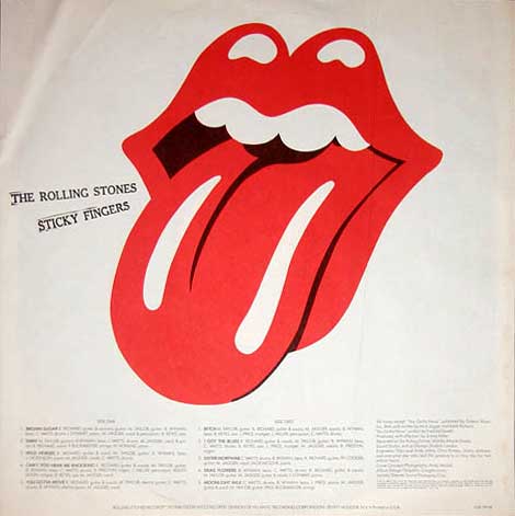
Picture 6: "Mr. Braun with the 'Sticky Fingers' album, which will be reissued Tuesday. The Rolling Stones are revisiting this 1971 album featuring hits like 'Wild Horses' and 'Brown Sugar' on their 'ZIP Code' tour."
Edited 4 time(s). Last edit at 2015-07-17 21:35 by Irix.
Art of the Rolling Stones: Behind That Zipper and That Tongue
By JOE COSCARELLI · JUNE 7, 2015
Large versions: Picture-1 · Picture-2 · Picture-3 · Picture-4 · Picture-5 · Picture-6
As the Rolling Stones prepared recently to rerelease “Sticky Fingers,” their classic 1971 album featuring hits like “Wild Horses” and “Brown Sugar,” the manufacturing process hit a snag: The functional zipper from Andy Warhol’s bulging blue jean album cover, recreated for some new deluxe editions, was taking longer than expected to produce, Universal Music announced, pushing back the release to Tuesday.
They might have asked Craig Braun for help.
As the owner and creative director of the Sound Packaging Corporation, Mr. Braun became known in the ’60s and ’70s as the go-to inventor of elaborate album covers, making his name with projects like the peelable banana on the cover of 1967’s “The Velvet Underground & Nico,” another over-the-top phallic concept by Mr. Warhol.
Now, with the Stones’ revisiting “Sticky Fingers” on the aptly named “ZIP Code” tour, which takes them across North America through July 15, Mr. Braun is eager to share the story behind what VH1 called the best album cover ever. “Sticky Fingers” also included the debut of the Stones’ iconic lips and tongue logo, another piece of rock history with a tangled origin story — once again involving Mr. Braun.
“This album heralded an age of really imaginative and provocative packaging,” said the rock critic Richard Harrington, who is working on a book about controversial album art. “It also introduced the greatest band logo of all time.”
After “Let It Bleed” in 1969, the Stones split with their original label, Decca Records, and started their own, Rolling Stones Records. For the label’s first release, the band planned to pair edgy songs like “Can’t You Hear Me Knocking” and “Sister Morphine” with an alluring visual statement. “They were the bad boys of rock ’n’ roll, expressing anger, lust and sex,” said Mr. Braun, now 75 and working as an actor.
While Mr. Braun and his team experimented with other playful concepts — including the oversize Bambu rolling paper cover later used by Cheech & Chong — Mick Jagger was set on Mr. Warhol’s zipper idea. And not only did the zipper have to work — it had to have something behind it.
“They knew if they put jeans and a working zipper that people were going to want to see what was back there,” Mr. Braun said. The reveal also served a practical purpose. “I knew the back of the zippers, which had to be glued down by hand, could damage the record,” he said. “So I decided to fold in a third panel.”
Mr. Braun called Warhol’s Factory looking for extra art. It came in the form of Polaroids from Warhol of a model in his tighty whities — photos that Mr. Braun still has, in their original envelope, at his Manhattan apartment today. (Commonly mistaken for Mr. Jagger, the “Sticky Fingers” underwear model as well as the cover star have remained a mystery; suspects include the Warhol Factory kids Joe Dallesandro, Jay Johnson and Corey Tippin.)
The zipper and underwear in place, Mr. Braun hit still more bumps. Even with a piece of protective cardboard separating each album, the first shipment of records arrived at retailers with some damage. Because of the weight of the stacked albums during transport, the zipper pull from one record was denting the vinyl on top of it, right on the grooves for “Sister Morphine,” the third track on the B-side.
Here, too, Mr. Braun finagled a solution. In the middle of a panicked night, “I got this idea that maybe, if the glue was dry enough, we could have the little old ladies at the end of the assembly line pull the zipper down far enough so that the round part would hit the center disc label,” he said. “It worked, and it was even better to see the zipper pulled halfway down.”
That wasn’t the only makeshift fix that would stick with the Stones. Back in London, John Pasche, a student at the Royal College of Art, worked on a logo for the band and its new label. Mr. Jagger had been inspired by the tongue of the Hindu goddess Kali, Mr. Pasche recalled, “but I didn’t want to do anything Indian, because I thought it would be very dated quickly, as everyone was going through that phase at the time.” Still, Kali’s mouth and lips “triggered something,” he said. (It didn’t hurt that Mr. Jagger had a recognizable mouth himself.)
In New York, Mr. Braun had a deadline and needed the logo. As the tongue design was still unfinished, he settled for a rough one-inch version, faxed over from London by Marshall Chess, the founding president of Rolling Stones Records. “I didn’t tell him what I was going to do with it,” Mr. Braun said.
His in-house illustrators finished the mouth — narrowing the tongue, adding more white accents and a black void for the throat — before blowing it up to cover the entire inside sleeve of the American release (Mr. Pasche’s version was used internationally).
“I thought it was going to get me into trouble,” Mr. Braun said. Instead, his touches on the logo, which still shifts slightly in size and color for different events, often persist to this day, including on the official ads for the “ZIP Code” tour and countless pieces of Stones memorabilia.
Mr. Pasche barely noticed. “It was a relaxed affair,” he said. “I just think things were happening fast and needed to be done, so it was redrawn.”
Mr. Chess, meanwhile, only found out about Mr. Braun’s revisions 45 years later. “He was so nervous about it!” said Mr. Chess, 73.
Both Mr. Braun and Mr. Pasche are pleased with the results of their overlapping contributions to rock mythology. Initially paid just 50 pounds ($76 at current rates) for the design, Mr. Pasche sold his copyright to the band for £26,000 (about $40,000 at the time) in 1984. In 2008, the Victoria and Albert Museum in London bought his original artwork for £50,000 ($92,500).
Mr. Braun estimates that he made six figures creating the “Sticky Fingers” packaging. For a few years in the ’70s, he also licensed and designed an alternate version of the Stones logo for a memorabilia line called Licks, which included jewelry, belt buckles and pins, paying the band only a small royalty.
Licks was a modest success, but probably ahead of its time. “The merchandising for the Rolling Stones is in the billions now,” Mr. Braun said. “I should have stayed in the business.”
(A version of this article appears in print on June 8, 2015, on page C1 of the New York edition with the headline: Behind That Zipper and That Tongue.)
PS - Caption of the pictures (Credit Benjamin Norman for The New York Times):
Picture 1: "Craig Braun was the go-to designer of innovative album covers in the 1960s and ’70s. His work includes the original concept art of the working Andy Warhol zipper on the Rolling Stones’ album 'Sticky Fingers'.”
Picture 2: "The original sketch of the Rolling Stones’ logo for the Licks memorabilia line, created by Mr. Braun, and a piece of merchandize attached, top right."
Picture 3: "The two stamps used to create the text on the album cover."
Picture 4: "For a few years in the 1970s, Mr. Braun also licensed and designed a version of the Stones logo for a memorabilia line called Licks, which included jewelry and belt buckles. A cutout of Mr. Braun, which was used to advertise the line. Major chain stores wouldn't carry the then-controversial apparel and jewelry, so they were mostly featured in headshops."
Picture 5: "Jewelry and other memorabilia."
Picture 6: "Mr. Braun with the 'Sticky Fingers' album, which will be reissued Tuesday. The Rolling Stones are revisiting this 1971 album featuring hits like 'Wild Horses' and 'Brown Sugar' on their 'ZIP Code' tour."
Edited 4 time(s). Last edit at 2015-07-17 21:35 by Irix.
Re: First designer of Stones Tongue & Lips logo???
Posted by:
Irix
()
Date: July 16, 2015 19:35
From the [www.nytimes.com] article:

"The original sketch of the Rolling Stones’ logo for the Licks memorabilia line, created by Mr. Braun, and a piece of merchandize attached, top right.
Credit Benjamin Norman for The New York Times" · (Click on the picture for a large version)
Craig Braun was (in the US) the owner and creative director of the 'Sound Packaging Corporation' (NYTimes), Ernie Cefalu has worked for him: UnCovered Interview.

Ernie Cefalu, 1971
US-Credits: Album Design/Graphics: Craigbrauninc. Jackets/Sleeves: Sound Packaging Corp.
Inner sleeve of the 1st US-pressing of 'Sticky Fingers' (1971).
Edited 4 time(s). Last edit at 2015-07-28 18:30 by Irix.

"The original sketch of the Rolling Stones’ logo for the Licks memorabilia line, created by Mr. Braun, and a piece of merchandize attached, top right.
Credit Benjamin Norman for The New York Times" · (Click on the picture for a large version)
Craig Braun was (in the US) the owner and creative director of the 'Sound Packaging Corporation' (NYTimes), Ernie Cefalu has worked for him: UnCovered Interview.
Ernie Cefalu, 1971
US-Credits: Album Design/Graphics: Craigbrauninc. Jackets/Sleeves: Sound Packaging Corp.
Inner sleeve of the 1st US-pressing of 'Sticky Fingers' (1971).
Edited 4 time(s). Last edit at 2015-07-28 18:30 by Irix.
Re: John Pasche, Not Ernie Cefalu
Posted by:
Irix
()
Date: July 16, 2015 21:35
The Quiz mentioned in this Post was from the Minnesota Public Radio in 2013: [minnesota.publicradio.org] .
It's therefore no official statement from The Rolling Stones about the first designer of the Lips&Tongue logo.
Edited 5 time(s). Last edit at 2015-07-28 18:25 by Irix.
It's therefore no official statement from The Rolling Stones about the first designer of the Lips&Tongue logo.
Edited 5 time(s). Last edit at 2015-07-28 18:25 by Irix.
Re: First designer of Stones Tongue & Lips logo???
Posted by:
Irix
()
Date: July 16, 2015 22:25
From Cover Story:
"In the words of designer, John Pasche -
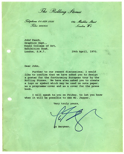
In 1969, Mick Jagger’s office rang the Royal College of Art in London and asked if there was a suitable design student to come up with designs for their 1970 European Tour poster. I was recommended and on 29 April 1970 Jo Bergman, who was running the Stone's office at the time, wrote to me to confirm that they had commissioned me to design a poster for their forthcoming tour. At this time, I was in my final year of a graduate design course. I was very honored when Mick Jagger turned up at the College to see my final degree show as the artwork that would ultimately be used for the poster was on display in one of the exhibits.
A short time later, I met with Mick again, who then asked me to design a logo or symbol for The Rolling Stone's new record label. Mick showed me an image of the Goddess Kali which became the starting point to our discussion regarding the design of the logo. I was paid £50 for the design, which took me about a week to complete. In 1972 I was paid an additional £200 in recognition of the logo's success."
From the UnCovered Interview with Ernie Cefalu:
"I remember it was a really cold rainy Friday at the beginning of February 1971, and Jack had set up a 2:00pm meeting for me at the Concept Packaging offices at 53rd and Madison. As I headed uptown, I felt like a kid that was on his way to the first day at a new school, ready to encounter new people and surroundings. All I was told by Jack was that Craig knew who I was, what I had done with Superstar and that they were excited about meeting with me."
If John Pasche has conceived the first sketch of the Lips&Tongue logo already in 1970 then John Pasche is the first designer, because Ernie Cefalu started to work for Craig Braun earliest in February 1971.
Perhaps someone dares to ask John Pasche himself: www.johnpasche.com .
Edited 2 time(s). Last edit at 2015-07-16 22:50 by Irix.
"In the words of designer, John Pasche -
In 1969, Mick Jagger’s office rang the Royal College of Art in London and asked if there was a suitable design student to come up with designs for their 1970 European Tour poster. I was recommended and on 29 April 1970 Jo Bergman, who was running the Stone's office at the time, wrote to me to confirm that they had commissioned me to design a poster for their forthcoming tour. At this time, I was in my final year of a graduate design course. I was very honored when Mick Jagger turned up at the College to see my final degree show as the artwork that would ultimately be used for the poster was on display in one of the exhibits.
A short time later, I met with Mick again, who then asked me to design a logo or symbol for The Rolling Stone's new record label. Mick showed me an image of the Goddess Kali which became the starting point to our discussion regarding the design of the logo. I was paid £50 for the design, which took me about a week to complete. In 1972 I was paid an additional £200 in recognition of the logo's success."
From the UnCovered Interview with Ernie Cefalu:
"I remember it was a really cold rainy Friday at the beginning of February 1971, and Jack had set up a 2:00pm meeting for me at the Concept Packaging offices at 53rd and Madison. As I headed uptown, I felt like a kid that was on his way to the first day at a new school, ready to encounter new people and surroundings. All I was told by Jack was that Craig knew who I was, what I had done with Superstar and that they were excited about meeting with me."
If John Pasche has conceived the first sketch of the Lips&Tongue logo already in 1970 then John Pasche is the first designer, because Ernie Cefalu started to work for Craig Braun earliest in February 1971.
Perhaps someone dares to ask John Pasche himself: www.johnpasche.com .
Edited 2 time(s). Last edit at 2015-07-16 22:50 by Irix.
Re: First designer of Stones Tongue & Lips logo???
Posted by:
GasLightStreet
()
Date: July 16, 2015 23:25
Quote
Irix
From Cover Story:
"In the words of designer, John Pasche -
In 1969, Mick Jagger’s office rang the Royal College of Art in London and asked if there was a suitable design student to come up with designs for their 1970 European Tour poster. I was recommended and on 29 April 1970 Jo Bergman, who was running the Stone's office at the time, wrote to me to confirm that they had commissioned me to design a poster for their forthcoming tour. At this time, I was in my final year of a graduate design course. I was very honored when Mick Jagger turned up at the College to see my final degree show as the artwork that would ultimately be used for the poster was on display in one of the exhibits.
A short time later, I met with Mick again, who then asked me to design a logo or symbol for The Rolling Stone's new record label. Mick showed me an image of the Goddess Kali which became the starting point to our discussion regarding the design of the logo. I was paid £50 for the design, which took me about a week to complete. In 1972 I was paid an additional £200 in recognition of the logo's success."
From the UnCovered Interview with Ernie Cefalu:
"I remember it was a really cold rainy Friday at the beginning of February 1971, and Jack had set up a 2:00pm meeting for me at the Concept Packaging offices at 53rd and Madison. As I headed uptown, I felt like a kid that was on his way to the first day at a new school, ready to encounter new people and surroundings. All I was told by Jack was that Craig knew who I was, what I had done with Superstar and that they were excited about meeting with me."
If John Pasche has conceived the first sketch of the Lips&Tongue logo already in 1970 then John Pasche is the first designer, because Ernie Cefalu started to work for Craig Braun earliest in February 1971.
Perhaps someone dares to ask John Pasche himself: www.johnpasche.com .
That's what some people are not understanding - that Pasche came up with the logo. Cefalu did not come up with the logo. Jagger has made that as clear as clear can be. And if people want to say 'well on the website it says blah blah blah' it's the website of a band that can't get their own credits correct on the original album releases yet alone reissues. Or with that trivia thing, that's not the Stones anyway.
Edited 1 time(s). Last edit at 2015-07-17 03:07 by GasLightStreet.
Re: First designer of Stones Tongue & Lips logo???
Posted by:
mitch
()
Date: July 24, 2015 14:38
Nice alternate:
Re: First designer of Stones Tongue & Lips logo???
Posted by:
GasLightStreet
()
Date: July 28, 2015 03:50
Not long ago a thread about the logo was started. It includes this. Perhaps these two threads should be combined?
[www.iorr.org]
[www.iorr.org]
Re: First designer of Stones Tongue & Lips logo???
Posted by:
Naturalust
()
Date: July 28, 2015 04:22
Quote
GasLightStreet
That's what some people are not understanding - that Pasche came up with the logo. Cefalu did not come up with the logo. Jagger has made that as clear as clear can be. And if people want to say 'well on the website it says blah blah blah' it's the website of a band that can't get their own credits correct on the original album releases yet alone reissues. Or with that trivia thing, that's not the Stones anyway.
No worries GLS. I'm sure Pasche came up with the logo used on the record. It's also pretty clear that Cefalu came up with his own version. They are different enough that it's fair to give each one credit for their work. I don't think either artist is lying, here is a link to a detailed Cefalu interview...clearly the guy was involved. Not sure why you don't believe him and dislike him so much.
[rockpopgallery.typepad.com]
Re: First designer of Stones Tongue & Lips logo???
Posted by:
Irix
()
Date: July 28, 2015 11:30
The letter from Jo Bergman to John Pasche is now part of the collection in the 'Victoria and Albert Museum' (London, UK). Detailed object description: Victoria & Albert Museum.
Edited 1 time(s). Last edit at 2015-07-28 18:20 by Irix.
Edited 1 time(s). Last edit at 2015-07-28 18:20 by Irix.
Re: First designer of Stones Tongue & Lips logo???
Posted by:
Irix
()
Date: July 28, 2015 13:35
From [www.vam.ac.uk] :
Victoria and Albert Museum - Object Pitch Day 5 – Friday 10 October 2014
Published: February 24, 2015 · Author: Elaine Tierney
OP5/06
Victoria Broackes, Head of Exhibitions for Theatre & Performance, chose an “object that means a lot to a lot of people and a lot of different types of people”: the Rolling Stones lips and tongue logo.

John Pasche, Artwork for the Rolling Stones lips and tongue logo, 1970.
Museum no.S.6121-2009 © Musidor BV.
An object, in the form of its original design drawing by John Pasche, that also has a special place in the V&A. Although the Theatre & Performance Department “has collected rock and pop since the 70s”, the logo matters because it brings “together many different aspects in a single object: it’s design history, it’s music history, but it also has very strong links to the V&A and the RCA”.
Victoria told us how the logo was originally designed in 1970, when the Rolling Stones approached a Royal College of Art MA student, John Pasche. Where he studied matters: as a student at the RCA, Pasche was actually based in a building on the same site as the museum and “was an almost daily visitor to our collections”, giving this object a special link to the V&A.
The Rolling Stones “famously paid £50 for the logo at the time, and then they paid Pasche £200 a bit later in recognition of its success”. A letter, also in the V&A’s collection, reveals the modest scale of early plans for the design as “notepaper and possibly as an insert for an album”.

Letter from Jo Bergman of Rolling Stones management commissioning John Pasche to undertake work for a logo for their 1971 European Tour.
Museum no.S.6122-2009 © Musidor BV.
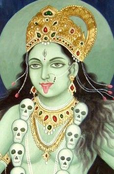
Pasche was initially approached by Mick Jagger after the latter visited, and been very impressed by, his degree show. Invited to Jagger’s house, Pasche was “shown this picture of the Hindu goddess Kali, who’s always depicted with her tongue sticking out”, as a reference, with Kali’s “red lolling tongue” signifying “her omnivorous nature and her indiscriminate enjoyment of all the world’s flavours”.
Picture of the Hindu goddess Kali.
Victoria told us how Pasche returned a week later with “a simple, striking image of a pair of voluptuous red lips with the red tongue sticking out in anti-establishment defiance”. When interviewed about the logo, Pasche told the V&A that it was designed “to represent the band’s anti-authoritarian attitude, Mick’s mouth and obvious sexual connotations”, but that it was also intended to be “easily reproduced and in a style which I thought could stand the test of time”.
Perfectly summing up the Rolling Stones’ image, it was first used as an insert in the Sticky Fingers album (1971), which “was, of course, designed by Andy Warhol, so a lot of people think he designed this logo as well”.
Jumping forward to July 2008, Victoria explained how the original drawing for the logo had ended up in the V&A’s collection. The Guardian newspaper had suggested it had already “been sold at auction for £250k, so we rang John Pasche and asked him where it had gone, and he said it hadn’t gone anywhere – he still had it, and was about to sell it in a Chicago auction, within a month”. She then described the “huge flurry of activity at the V&A” in the weeks before the auction, getting “independent valuations, gathering all kinds of information”, and securing the generous support of The Art Fund.
We were amazed to hear that Victoria actually bought the logo drawing “online on a Saturday night”: an “absolutely terrifying” experience that happily ended with the V&A as the successful bidder.
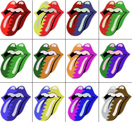
The Rolling Stones logo, an undeniable icon of the early 70s, “represents not only the Rolling Stones but for many people it’s an element of post-war British identity”. And, as “an instantly recognisable brand”, it’s synonymous with the Rolling Stones, featuring on record covers, posters, t-shirts and all sorts of other merchandise, including “earrings, ties and cufflinks, cups, coasters, ice-cube trays, wine bottles and even dog coats”.

Three-dimensional application.

Gigantic proportions.
Highlighting the logo’s versatility and “potential for fun”, she showed us some of the logo’s more unusual applications to demonstrate its “ability to be used at all sizes and also three-dimensionally”, describing how it’s been “blown up to gigantic proportions, emblazoned with flags, covered with rainbow colours, pattern and glitter”. It is also incredibly enduring, with its most recent incarnation for the Rolling Stones’ 50th anniversary in 2012 by the designer Shepard Fairey barely deviating from Pasche’s original concept.

Rolling Stones’ 50th anniversary logo in 2012 by Shepard Fairey.
Victoria then revealed how the logo provides a hub for different stories and voices. These include the Rolling Stones; the logo’s designer, Pasche, as well as the voices of the “pretenders” who have attempted to take credit for its design over the years; the late stage designer Mark Fisher, “who did so many of the Stones’ shows from the Steel Wheels tour onwards”; and record executives, including Marshall Chess, the first head of Rolling Stones Records.
As an object created in the heart of South Kensington, the logo also says something about the V&A and the RCA – “taking us right back to the origins of the museum”, and providing a platform for teasing out “the relationship today’s RCA students have with the V&A”.
An icon of graphic design, the logo provides vital evidence regarding changes in the design process. Victoria told us that people “are really fascinated” by the colour of the original drawing, which is grey, underlining differences in the printing techniques of the 1970s – “a logo like this would be designed on a computer today”.
And, then, quite simply, “There are so many fans to which this means a great deal”.
Victoria concluded her pitch by reiterating that the Rolling Stones logo isn’t just “the world’s most famous symbol of rock – it’s also one of the most famous examples of graphic design. It’s a star object of art, design, music and performance, with the story of how it was commissioned taking us right back to how the V&A and RCA work”.
© [www.vam.ac.uk]
Edited 2 time(s). Last edit at 2015-07-28 18:45 by Irix.
Victoria and Albert Museum - Object Pitch Day 5 – Friday 10 October 2014
Published: February 24, 2015 · Author: Elaine Tierney
OP5/06
Victoria Broackes, Head of Exhibitions for Theatre & Performance, chose an “object that means a lot to a lot of people and a lot of different types of people”: the Rolling Stones lips and tongue logo.
John Pasche, Artwork for the Rolling Stones lips and tongue logo, 1970.
Museum no.S.6121-2009 © Musidor BV.
An object, in the form of its original design drawing by John Pasche, that also has a special place in the V&A. Although the Theatre & Performance Department “has collected rock and pop since the 70s”, the logo matters because it brings “together many different aspects in a single object: it’s design history, it’s music history, but it also has very strong links to the V&A and the RCA”.
Victoria told us how the logo was originally designed in 1970, when the Rolling Stones approached a Royal College of Art MA student, John Pasche. Where he studied matters: as a student at the RCA, Pasche was actually based in a building on the same site as the museum and “was an almost daily visitor to our collections”, giving this object a special link to the V&A.
The Rolling Stones “famously paid £50 for the logo at the time, and then they paid Pasche £200 a bit later in recognition of its success”. A letter, also in the V&A’s collection, reveals the modest scale of early plans for the design as “notepaper and possibly as an insert for an album”.
Letter from Jo Bergman of Rolling Stones management commissioning John Pasche to undertake work for a logo for their 1971 European Tour.
Museum no.S.6122-2009 © Musidor BV.
Pasche was initially approached by Mick Jagger after the latter visited, and been very impressed by, his degree show. Invited to Jagger’s house, Pasche was “shown this picture of the Hindu goddess Kali, who’s always depicted with her tongue sticking out”, as a reference, with Kali’s “red lolling tongue” signifying “her omnivorous nature and her indiscriminate enjoyment of all the world’s flavours”.
Picture of the Hindu goddess Kali.
Victoria told us how Pasche returned a week later with “a simple, striking image of a pair of voluptuous red lips with the red tongue sticking out in anti-establishment defiance”. When interviewed about the logo, Pasche told the V&A that it was designed “to represent the band’s anti-authoritarian attitude, Mick’s mouth and obvious sexual connotations”, but that it was also intended to be “easily reproduced and in a style which I thought could stand the test of time”.
Perfectly summing up the Rolling Stones’ image, it was first used as an insert in the Sticky Fingers album (1971), which “was, of course, designed by Andy Warhol, so a lot of people think he designed this logo as well”.
Jumping forward to July 2008, Victoria explained how the original drawing for the logo had ended up in the V&A’s collection. The Guardian newspaper had suggested it had already “been sold at auction for £250k, so we rang John Pasche and asked him where it had gone, and he said it hadn’t gone anywhere – he still had it, and was about to sell it in a Chicago auction, within a month”. She then described the “huge flurry of activity at the V&A” in the weeks before the auction, getting “independent valuations, gathering all kinds of information”, and securing the generous support of The Art Fund.
We were amazed to hear that Victoria actually bought the logo drawing “online on a Saturday night”: an “absolutely terrifying” experience that happily ended with the V&A as the successful bidder.
The Rolling Stones logo, an undeniable icon of the early 70s, “represents not only the Rolling Stones but for many people it’s an element of post-war British identity”. And, as “an instantly recognisable brand”, it’s synonymous with the Rolling Stones, featuring on record covers, posters, t-shirts and all sorts of other merchandise, including “earrings, ties and cufflinks, cups, coasters, ice-cube trays, wine bottles and even dog coats”.
Three-dimensional application.
Gigantic proportions.
Highlighting the logo’s versatility and “potential for fun”, she showed us some of the logo’s more unusual applications to demonstrate its “ability to be used at all sizes and also three-dimensionally”, describing how it’s been “blown up to gigantic proportions, emblazoned with flags, covered with rainbow colours, pattern and glitter”. It is also incredibly enduring, with its most recent incarnation for the Rolling Stones’ 50th anniversary in 2012 by the designer Shepard Fairey barely deviating from Pasche’s original concept.
Rolling Stones’ 50th anniversary logo in 2012 by Shepard Fairey.
Victoria then revealed how the logo provides a hub for different stories and voices. These include the Rolling Stones; the logo’s designer, Pasche, as well as the voices of the “pretenders” who have attempted to take credit for its design over the years; the late stage designer Mark Fisher, “who did so many of the Stones’ shows from the Steel Wheels tour onwards”; and record executives, including Marshall Chess, the first head of Rolling Stones Records.
As an object created in the heart of South Kensington, the logo also says something about the V&A and the RCA – “taking us right back to the origins of the museum”, and providing a platform for teasing out “the relationship today’s RCA students have with the V&A”.
An icon of graphic design, the logo provides vital evidence regarding changes in the design process. Victoria told us that people “are really fascinated” by the colour of the original drawing, which is grey, underlining differences in the printing techniques of the 1970s – “a logo like this would be designed on a computer today”.
And, then, quite simply, “There are so many fans to which this means a great deal”.
Victoria concluded her pitch by reiterating that the Rolling Stones logo isn’t just “the world’s most famous symbol of rock – it’s also one of the most famous examples of graphic design. It’s a star object of art, design, music and performance, with the story of how it was commissioned taking us right back to how the V&A and RCA work”.
© [www.vam.ac.uk]
Edited 2 time(s). Last edit at 2015-07-28 18:45 by Irix.
Re: First designer of Stones Tongue & Lips logo???
Posted by:
Irix
()
Date: July 28, 2015 18:15
Object description of John Pasche's Tongue&Lips artwork by the V&A Museum London, UK [collections.vam.ac.uk] :
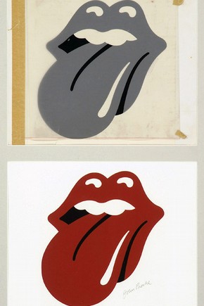
The Tongue
This is the original artwork for the Rolling Stones famous “Tongue” logo. An iconic symbol recognizable across the globe, it represents the Rolling Stones as anti-establishment, sticking their tongue out to the world, while giving them a corporate identity. This artwork is painted on art-board, overlaid with a semi-opaque drawing cell carrying the detail and causing the background to appear grey. The red colour would be added during the production process, as can be seen in the digital print produced from this artwork in 2007, S.6121-2009.
Mick Jagger, singer with The Rolling Stones, had seen Pasche's designs at the 1970 Royal College of Art final degree show. After later meeting to discuss ideas, Jagger showed Pasche an image of the Hindu goddess Kali. Pasche, honing in on the goddess's protruding tongue, was inspired to create his famous logo (S.6120 & 6121-2009), which captured perfectly the impudence of the band, and the prominence and sensuality of Jagger's mouth.
Physical description:
Original artwork for The Rolling Stones "Tongue" logo. A cartoonish mouth with protruding tongue, painted in black gouache on artboard, overlaid with semi-opaque drawing cell, making the black appear grey. The cell has detail painted in black, and is taped to the artboard with brown vintage tape.
Object: Artwork
Place of Origin: London, England (designed)
Date: 1970 (designed)
Artist/maker: Pasche, John, born 1945 (designer)
Materials and Techniques: Goauche on light-gauge artboard, with drawing cell and brown tape
Descriptive line: The Rolling Stones "The Tongue" logo original art work, designed by John Pasche, 1970.
Credit Line: Purchased with support from The Arts Fund, the Mavis Alexander bequest and the American Friends of the V&A through the generosity of Chris and Nicky Thom
Associated names: The Rolling Stones
Materials: Acetate film; Water-base paint; Pressure-sensitive tape
Techniques: Painting
Categories: Advertising; Entertainment & Leisure
Production Type: Unique
Collection: T&P - Theatre and Performance Collection
Museum number: S.6120-2009
Gallery location: In Storage
URL: [collections.vam.ac.uk]
Edited 1 time(s). Last edit at 2015-07-28 21:45 by Irix.
Re: First designer of Stones Tongue & Lips logo???
Posted by:
Irix
()
Date: July 28, 2015 20:30
The Beatles Songbook by Alan Aldridge - these are the pages 110-111 of the First Edition from 1969:
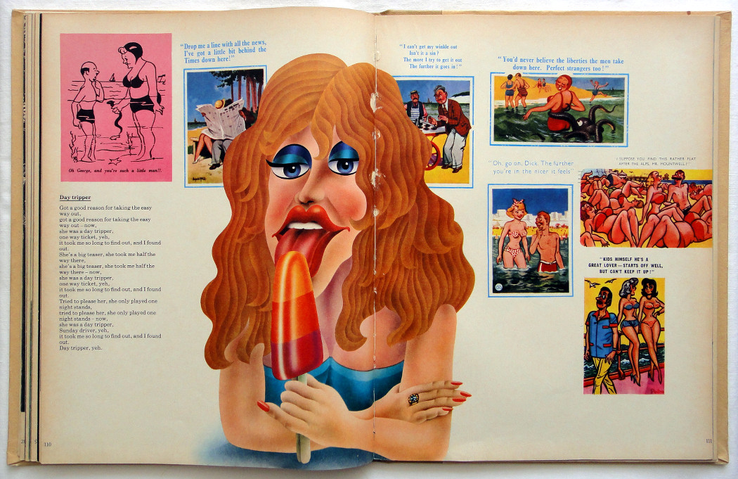
It's a question of the perspective, whether the similarity of the Stones' Tongue&Lips logo is a coincidence or not ....
Edited 1 time(s). Last edit at 2015-07-28 21:45 by Irix.
It's a question of the perspective, whether the similarity of the Stones' Tongue&Lips logo is a coincidence or not ....
Edited 1 time(s). Last edit at 2015-07-28 21:45 by Irix.
Re: First designer of Stones Tongue & Lips logo???
Posted by:
GasLightStreet
()
Date: July 30, 2015 04:40
Quote
NaturalustQuote
GasLightStreet
That's what some people are not understanding - that Pasche came up with the logo. Cefalu did not come up with the logo. Jagger has made that as clear as clear can be. And if people want to say 'well on the website it says blah blah blah' it's the website of a band that can't get their own credits correct on the original album releases yet alone reissues. Or with that trivia thing, that's not the Stones anyway.
No worries GLS. I'm sure Pasche came up with the logo used on the record. It's also pretty clear that Cefalu came up with his own version. They are different enough that it's fair to give each one credit for their work. I don't think either artist is lying, here is a link to a detailed Cefalu interview...clearly the guy was involved. Not sure why you don't believe him and dislike him so much.
[rockpopgallery.typepad.com]
There's no being sure Pasche came up with the logo, it's a fact. Cefalu's design was after the fact, the fact of Pasche's logo being done before his. Cefalu's a crybaby.
Re: First designer of Stones Tongue & Lips logo???
Posted by:
CaptainCorella
()
Date: September 8, 2015 09:10
Quote
IrixQuote
Bitches Brew
[...] And there is also that design from Alan Aldridge from 1969...
This Illustration is contained in the Book 'The Beatles Illustrated Lyrics' by Alan Aldridge, according to this Post already in the 1st Edition from 1969. The Illustration seems to belong to the Song 'Day Tripper' and is to find in the Book around on Page 110/111. Compared to the classic Stones Lips & Tongue logo it has a striking resemblance ....

That's utterly extraordinary. That tongue really is there as described (I have a first edition), and throws a whole new light on who first came up with the design!
Alan Aldridge should sue someone!
--
Captain Corella
60 Years a Fan
Re: First designer of Stones Tongue & Lips logo???
Posted by:
Irix
()
Date: September 8, 2015 10:35
Direct comparison:
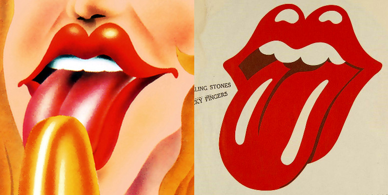
Left: Alan Aldridge Illustration 1969 - Right: Tongue&Lips logo, Sticky Fingers 1st US-Edition 1971
Left: Alan Aldridge Illustration 1969 - Right: Tongue&Lips logo, Sticky Fingers 1st US-Edition 1971
Re: First designer of Stones Tongue & Lips logo???
Posted by:
Hairball
()
Date: September 8, 2015 11:00
After seeing the above it seems obvious the tongue design originated with Alan Aldridge.
_____________________________________________________________
Rip this joint, gonna save your soul, round and round and round we go......
_____________________________________________________________
Rip this joint, gonna save your soul, round and round and round we go......
Re: First designer of Stones Tongue & Lips logo???
Posted by:
mitch
()
Date: September 8, 2015 12:21
Good artists copy , great artists steal.
Re: First designer of Stones Tongue & Lips logo???
Posted by:
Naturalust
()
Date: September 8, 2015 17:50
Quote
Hairball
After seeing the above it seems obvious the tongue design originated with Alan Aldridge.
Indeed the similarities are pretty obvious! I wonder if Pasche or Cefalu would even admit to having ever seen it?
Re: First designer of Stones Tongue & Lips logo???
Posted by:
roller99
()
Date: September 8, 2015 18:46
I don't think I could have said this better Naturalust. I will be posting my story here as soon as it's polished, but to sum it up, Ernie Cefaulu had a was in an office with Marshall Chess was asked to design a logo. He took his own logo off of a record he did that was the album label for "Dolls Alive" and did it on the spot and handed it to them. Chess took the design and in turn passed it over to John Pasche, who changed it into what we now know. There's no controversy over this. It's an accepted practice for one artist to create a mock-up, and then hand it to his boss who takes credit or has someone else change it again.
Steve Jobs takes credit for the iPod and iPhone, but he didn't design them. He assembled the teams that did.
I've met numerous times with Ernie Cefalu, seen the originals. There's no doubt he did what he said. The man has over 200 album covers to his name. When you're sitting in his living room and the original art work for "Welcome To My Nightmare" and "Toys In The Attic" are sitting there along with hundreds of other works, it's impossible to believe Ernie faked just one design. It's only the haters and "historians" here that think they have a leg up on history because they crave attention. And for the record, Drew Stuzan did "Welcome", but he worked for Ernie and Ernie owned Pacific Eye And Ear. But Ernie owns the art.
Ernie has even spoken to John Pasche, and there is no discord between them. I ran a story on the website I report for The man behind the art! and in it, I barely reference the tongue logo. Not 24 hours after this story was published, Craig Braun pops up with the most angry and offensive comment I've ever heard. When challenged on this, he went silent and has never responded.
The only person with controversy who is negative (as you pointed out) is Craig Braun and Gaslightstreet. Mr. Braun is still pissed because Ernie left his firm to start Pacific Eye and Ear, and in doing so, he was fully aware that he would lose all the rights to every creation he did while working for Craig Braun. It's a common story.
So to summarize, there were two people responsible for actually drawing this thing. Ernie Cefalu, and John Pasche. And the funny thing is, they both are in agreement and there is no debate.
I'll be running my story soon, along with some of the original artwork (which I've seen first-hand).
Re: First designer of Stones Tongue & Lips logo???
Posted by:
Naturalust
()
Date: September 8, 2015 19:30
Thanks roller, we will look forward to your more detailed story.
I'm not sure the details without reviewing more info here but I thought Pasche's copyright date might have preceded a potential meeting with Marshall Chess and I always suspected that date might have been altered to protect his interests in the whole affair in light of the controversy...I may be wrong.
But I agree, it's pretty obvious they both worked on it. Is it confirmed that Pasche actually received a copy of Cefalu's art before he started working on it? I recall him only mentioned the Kail tongue as a early reference.
Re: First designer of Stones Tongue & Lips logo???
Posted by:
roller99
()
Date: September 8, 2015 19:57
Quote
Naturalust
Thanks roller, we will look forward to your more detailed story.
I'm not sure the details without reviewing more info here but I thought Pasche's copyright date might have preceded a potential meeting with Marshall Chess and I always suspected that date might have been altered to protect his interests in the whole affair in light of the controversy...I may be wrong.
But I agree, it's pretty obvious they both worked on it. Is it confirmed that Pasche actually received a copy of Cefalu's art before he started working on it? I recall him only mentioned the Kail tongue as a early reference.
You nailed it Naturalust. The dates and who did what when may have been obfuscated. Marshall Chess won't talk, his wife is playing cat-and-mouse on FB. I can tell you that Ernie's "Dolls Alive" design was from 1969 and it pre-dates work by Pasche. But you are completely correct.
Re: First designer of Stones Tongue & Lips logo???
Posted by:
blivet
()
Date: September 8, 2015 20:07
It's Craig Braun's redrawing of Pasche's design that looks so much like the girl's mouth in Alan Aldridge's illustration. Pasche's design is similar, and he may have been influenced by Aldridge's drawing, but Braun's version looks like he deliberately decided to make a copy of Aldridge's work in Pasche's style.
Sorry, only registered users may post in this forum.