Tell Me :
Talk

This is...hm,fascinating.
For christmas eve recommended.

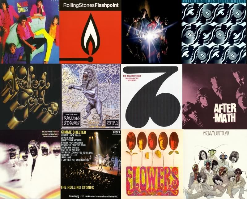
I like both Love You Live and Still Life, artwork-wise - especially Love You Live
Something about the pastel paintings and the colours.....I find them great - even though those kinds of artwork can only be judged subjective.
What's poor about "Still Life", artwork-wise, is the photos of the band inside. It looks like a "teenage-clipping" of the Rolling Stones - hanged upon the refrigerator. The front and back is very nice, IMO.
Love You Live....as well as Black And Blue are among my favourite covers; together with the obvious 1967-1973 covers of course.
No that's not correct in this case, I find Love You Live to be VERY weak, apart from side 3 (and a few other numbers). I haven't listened to "Love You Live" in ages - I used to love it, way back then, before getting familiar with bootlegs. I'm speaking about the artwork itself.
But the artwork IS also connected to the music on the album; that's true - but one doesn't necessary have to like the music to like the artwork
Artwork is supposed to say something about the mood or life of the record
And Love You Live is of course.....an end of an area - very decadent and out on a limb - without Jagger or the band even knowing they were on it - and so is the artwork.....brushed up in beautiful colours.
Black & Blue's artwork perfectly captures the mood of the album; it pictures a band completely lost in "daylight" (as the photo)...living in a cocoon.....they obviously were more productive in their locked up studio - allthough they weren't going into any specific direction; unlike they early 70s, were they seemed to hit every target they aimed at. I do like the album Black & Blue though; but it's mighty different from all their previous albums, as they seem to not knowing which direction to head.
Edited 2 time(s). Last edit at 2010-07-13 16:44 by Erik_Snow.
YOU'VE GOT TO BE JOKING !!! A COVER DONE BY ONE OF THE WORLD'S GREATEST PHOTOGRAPHERs - ROBERT FRANK - WHO PUBLISHED ONE OF THE TOP 3 MOST FAMOUS PHOTO BOOKS IN HISTORY "THE AMERICANS" IN THE 50'S. WTF, where are all thees clueless new comers coming from, 13 yrs old and texting garbage 24/7.......
Edited 1 time(s). Last edit at 2010-07-13 18:54 by HelterSkelter.

Not sure where the Stripped shot was taken...I'll look into it. Was it in a recording studio??
When i say "in the studio"..I mean (even if it's not one shot)...I wanna see them
recording IN the studio. Stripped would've been the perfect opportunity as they were
all there together in a confined space.

IORR............but I like it!
Edited 1 time(s). Last edit at 2010-07-14 02:10 by sweet neo con.
I for one, think there should be more animal covers. How about a Tiger this time, or a Cheetah?!
Photo's were taken in Paradiso, Amsterdam (Netherlands). Front cover was taken in the basement of Paradiso.
Edited 1 time(s). Last edit at 2010-07-14 10:13 by Muddyw.
Talk about your favorite band.
![]()
![]()
![]()
![]()
For information about how to use this forum please check out forum help and policies.

Re: Worst Stones Record/Cd Cover art!
Posted by:
susannewortmann
()
Date: July 13, 2010 12:50
A BIGGER BANG is a DISASTER!!!
Re: Worst Stones Record/Cd Cover art!
Posted by:
ghostryder13
()
Date: July 13, 2010 13:00
worst stones album covers
the best
of course it's just a matter of opinion
Edited 2 time(s). Last edit at 2010-07-13 18:02 by ghostryder13.
the best
of course it's just a matter of opinion
Edited 2 time(s). Last edit at 2010-07-13 18:02 by ghostryder13.
Re: Worst Stones Record/Cd Cover art!
Posted by:
shortfatfanny
()
Date: July 13, 2010 13:07
This is...hm,fascinating.
For christmas eve recommended.
Re: Worst Stones Record/Cd Cover art!
Posted by:
sweet neo con
()
Date: July 13, 2010 14:54
yes...they have made some interesting choices over the years.
unlike the management for Spinal Tap, I do think that the album
art is important to record sales and band image etc...
the ones that make me scratch my head tend to be from recent history (20 yrs)...
B2B, ABB, No Security are the ones that come to mind... (thought SW was boring but not BAD)
I sort of liked Flashpoint and the way that they were consistent with the cd-singles
from the Flashpoint era. I didn't hate DW but it wasn't Annie Liebovitz's best.\
In ABB interviews, Mick seemed to make a big deal out of the fact that this
was the first in a long time that featured a portrait of the band. But they blew it with
a lame concept...and artwork that didn't translate well on a small cd cover.
I'd love to see shots of them in the studio for a studio album....and live shots for a live album.
seems simple enough.
IORR............but I like it!
Re: Worst Stones Record/Cd Cover art!
Posted by:
bolexman
()
Date: July 13, 2010 14:56
"I'd love to see shots of them in the studio for a studio album....and live shots for a live album." sweetneocon
Yes, you have a good point, but would you believe they have actually done this in recent years ("Stripped" album) and still managed to stuff it up
Yes, you have a good point, but would you believe they have actually done this in recent years ("Stripped" album) and still managed to stuff it up
Re: Worst Stones Record/Cd Cover art!
Posted by:
jjflash73
()
Date: July 13, 2010 15:57
B2B and Dirty Work. DW reminded me of the Jackson 5 album 'ABC'.
Re: Worst Stones Record/Cd Cover art!
Posted by:
john nicholls
()
Date: July 13, 2010 16:06
Dirty Work. No contest!!!
John Nicholls
John Nicholls
Re: Worst Stones Record/Cd Cover art!
Posted by:
Pelle
()
Date: July 13, 2010 16:10
Flashpoint, No Security, Stripped, Still Life, well, the livealbums hehe 
Re: Worst Stones Record/Cd Cover art!
Posted by:
Erik_Snow
()
Date: July 13, 2010 16:15
Quote
Pelle
Flashpoint, No Security, Stripped, Still Life, well, the livealbums hehe
I like both Love You Live and Still Life, artwork-wise - especially Love You Live
Something about the pastel paintings and the colours.....I find them great - even though those kinds of artwork can only be judged subjective.
What's poor about "Still Life", artwork-wise, is the photos of the band inside. It looks like a "teenage-clipping" of the Rolling Stones - hanged upon the refrigerator. The front and back is very nice, IMO.
Love You Live....as well as Black And Blue are among my favourite covers; together with the obvious 1967-1973 covers of course.
Re: Worst Stones Record/Cd Cover art!
Posted by:
bolexman
()
Date: July 13, 2010 16:21
"Love You Live....as well as Black And Blue are among my favourite covers" Erik_Snow
Really?? Hahaha, well I always appreciate the different perspectives I read on this board from seasoned Stones fans. And this is a good example of a surprising perspective, because I have never liked the "Black and Blue" artwork, ditto Love You Live. Mind you, I like the "Black and Blue" songs, and the El Macombowhatever side of "Love You Live"... Here is a suggestion: could it be that if we like the songs, we like the album covers, because we are making a strong association between enoyable performance and hence enjoyable 'album'? I notice that most people's list of crappy album covers are for LPs that contain weak performances.
Really?? Hahaha, well I always appreciate the different perspectives I read on this board from seasoned Stones fans. And this is a good example of a surprising perspective, because I have never liked the "Black and Blue" artwork, ditto Love You Live. Mind you, I like the "Black and Blue" songs, and the El Macombowhatever side of "Love You Live"... Here is a suggestion: could it be that if we like the songs, we like the album covers, because we are making a strong association between enoyable performance and hence enjoyable 'album'? I notice that most people's list of crappy album covers are for LPs that contain weak performances.
Re: Worst Stones Record/Cd Cover art!
Posted by:
Erik_Snow
()
Date: July 13, 2010 16:39
Quote
bolexman
"Love You Live....as well as Black And Blue are among my favourite covers" Erik_Snow
Really?? Hahaha, well I always appreciate the different perspectives I read on this board from seasoned Stones fans. And this is a good example of a surprising perspective, because I have never liked the "Black and Blue" artwork, ditto Love You Live. Mind you, I like the "Black and Blue" songs, and the El Macombowhatever side of "Love You Live"... Here is a suggestion: could it be that if we like the songs, we like the album covers, because we are making a strong association between enoyable performance and hence enjoyable 'album'? I notice that most people's list of crappy album covers are for LPs that contain weak performances.
No that's not correct in this case, I find Love You Live to be VERY weak, apart from side 3 (and a few other numbers). I haven't listened to "Love You Live" in ages - I used to love it, way back then, before getting familiar with bootlegs. I'm speaking about the artwork itself.
But the artwork IS also connected to the music on the album; that's true - but one doesn't necessary have to like the music to like the artwork
Artwork is supposed to say something about the mood or life of the record
And Love You Live is of course.....an end of an area - very decadent and out on a limb - without Jagger or the band even knowing they were on it - and so is the artwork.....brushed up in beautiful colours.
Black & Blue's artwork perfectly captures the mood of the album; it pictures a band completely lost in "daylight" (as the photo)...living in a cocoon.....they obviously were more productive in their locked up studio - allthough they weren't going into any specific direction; unlike they early 70s, were they seemed to hit every target they aimed at. I do like the album Black & Blue though; but it's mighty different from all their previous albums, as they seem to not knowing which direction to head.
Edited 2 time(s). Last edit at 2010-07-13 16:44 by Erik_Snow.
Re: Worst Stones Record/Cd Cover art!
Posted by:
Erik_Snow
()
Date: July 13, 2010 17:01
Let It Bleed on the other hand, is far supriour to B&B and LYL, musicwise - but I don't think the artwork says anything about the music. The reason I like Let It Bleed artwork is simply because I relate the cover to "putting on the album"....I don't find the artwork to be suitmade to the music at all. IORR and Tattoo You....likewise; doesn't say ANYthing about what's on the album.
But they're not *ugly* like for instance Live Licks and No Security - but still....it's not "art" as they don't have a relation to the music; IMO.
But they're not *ugly* like for instance Live Licks and No Security - but still....it's not "art" as they don't have a relation to the music; IMO.
Re: Worst Stones Record/Cd Cover art!
Posted by:
bolexman
()
Date: July 13, 2010 17:03
Thats a very interesting interpretation of both album covers Erik, cheers.
Maybe I am too cynical sometimes. But when I see what I consider their failed album covers, often I feel that I am seeing a failed attempt to be 'hip' to artistic trends, by using acclaimed artists because that worked in the past (Warhol, Frank, Bailey). But the photographic style of Black and Blue (I think it was a Japanese fashion photographer?) leaves me cold, as does the Warhol pics on Love You Live, and the poor photo by Liebowitz for Dirty Work (I think Liebowitz is a highly overrated photographer, by thats for another thread...). It seems to me that from IORR onwards the Stones were trying to "connect" with the zietgeist by using acclaimed artists for their album covers, but the Stones secluded lifestyles had caught up with them and they no longer were in touch with the zeitgeist in a rock'n'roll sense (only in a Good Morning America/1980s/Jovan Perfume/Calvin Klein sense). No street cred anymore, and it was reflected in their inability to CONNECT their visual presentation with any cultural mojo... hence they lost the imagery and intuition that made previous efforts not just album covers but artistic statements, statements that endured...
Maybe this explains why the quality of their album covers deteriorated together with the musical quality of their albums? Or maybe, alternatively, we make an emotional connection between good music and album cover that is heard to resist (ie: would we really love the "Let It Bleed" cake so much if it had actually been used to package the "Dirty Work" songs?)... Erik_Snow I think your point about album artwork reflecting the spirit of the music is important here, and is helpful in understanding why we love some artwork and hate others.
Edited 1 time(s). Last edit at 2010-07-13 17:10 by bolexman.
Re: Worst Stones Record/Cd Cover art!
Posted by:
F.U.C. the Captain
()
Date: July 13, 2010 17:50
* Flowers - they look like the flowers of evil
* Beggars banquet - the Decca cover (the original toliet cover would have been * marvellous, it just came 20 years too late)
* Steel wheels - plain boring
* Bridges to Babylon - what is this male lion without a cock?
* A bigger bang - s*it title, s*it photograph
* Beggars banquet - the Decca cover (the original toliet cover would have been * marvellous, it just came 20 years too late)
* Steel wheels - plain boring
* Bridges to Babylon - what is this male lion without a cock?
* A bigger bang - s*it title, s*it photograph
Re: Worst Stones Record/Cd Cover art!
Posted by:
Erik_Snow
()
Date: July 13, 2010 17:52
Hey Bolexman - thanks yourself, interesting perpective you have as well
Edited 3 time(s). Last edit at 2010-07-14 13:53 by Erik_Snow.
Edited 3 time(s). Last edit at 2010-07-14 13:53 by Erik_Snow.
Re: Worst Stones Record/Cd Cover art!
Posted by:
HelterSkelter
()
Date: July 13, 2010 18:52
Quote
mrfancyman
YOU'VE GOT TO BE JOKING !!! A COVER DONE BY ONE OF THE WORLD'S GREATEST PHOTOGRAPHERs - ROBERT FRANK - WHO PUBLISHED ONE OF THE TOP 3 MOST FAMOUS PHOTO BOOKS IN HISTORY "THE AMERICANS" IN THE 50'S. WTF, where are all thees clueless new comers coming from, 13 yrs old and texting garbage 24/7.......
Edited 1 time(s). Last edit at 2010-07-13 18:54 by HelterSkelter.
Re: Worst Stones Record/Cd Cover art!
Posted by:
Muddyw
()
Date: July 13, 2010 22:42
I do not dislike any of the albumcovers of The Stones.
But if I have to choose one, I'd say No Security, allthough it's funny but it's the least iconic of them all.
But if I have to choose one, I'd say No Security, allthough it's funny but it's the least iconic of them all.
Re: Worst Stones Record/Cd Cover art!
Posted by:
crumbling_mice
()
Date: July 13, 2010 23:08
I like the idea of a good recording musically may effect how we judge cover art and equally, bad songs = bad cover art; I really think there is some mileage in this, in my case Get Yer Ya Yas Out, is a fine fine record and I love the cover art, but when I imagine it full of awful songs that same covert art doesnt look as good! I tried doing this with Let It Bleed but it didnt work, I love that cover - it's my favourite stones covert art and I ust can't imagine it any other way what ever horrific song lists i imagine on it.
One thing for sure - the likes of Flash Point, No Security and Dirty Work are deffo in the bin...which makes me think, if so many of us think they are sooooo bad how come some graphic designer got paid shit loads to create them and then why did record company execs give it the go ahead? As someone also said, why not put a few quality photos of the band in a studio, or on stage or back stage or anywhere for that matter - anything would be a million times better than those covers. I'm in the wrong job

One thing for sure - the likes of Flash Point, No Security and Dirty Work are deffo in the bin...which makes me think, if so many of us think they are sooooo bad how come some graphic designer got paid shit loads to create them and then why did record company execs give it the go ahead? As someone also said, why not put a few quality photos of the band in a studio, or on stage or back stage or anywhere for that matter - anything would be a million times better than those covers. I'm in the wrong job

Re: Worst Stones Record/Cd Cover art!
Posted by:
Turning To Gold
()
Date: July 14, 2010 00:38
I think Sucking In the Seventies has got to be some of the worst album artwork ever foisted off on the public by a major artist. It looks cheap, and like they just didn't care about the album at all. I was a little kid back then but I actually remember being kind of put off by it, like where are the pictures, the credits, who played what, no pictures, etc. So I didn't buy it!
The cover for Emotional Rescue is a great IDEA, with the colorful poster folded around, heat images etc., it's a nice concept but the actual cover or should I say the images, the actual heat photos of the Stones themselves and the poster itself, it's really not that great. But at the time it was kind of cool and sort of "oooohh groundbreaking."
Black and Blue, to me that cover is all about that photo of them with the sparklers. I've always felt like, there's some kind of cosmic mystical thing in that photo, where what twirls each Stone is doing with their sparklers reflects each dude's personality....Mick's looks very pretty and "look at me"...Charlie's is very methodical and precise...Ron wood is too busy holding a drink in his other hand to even swirl it around much....and Keith is a total crazy @#$%& up squiggle...it's kinda cool
Re: Worst Stones Record/Cd Cover art!
Posted by:
shortfatfanny
()
Date: July 14, 2010 01:38
This one for kicking Bill out of the picture...and bizarre title.

Re: Worst Stones Record/Cd Cover art!
Posted by:
sweet neo con
()
Date: July 14, 2010 01:52
Quote
bolexman
"I'd love to see shots of them in the studio for a studio album....and live shots for a live album." sweetneocon
Yes, you have a good point, but would you believe they have actually done this in recent years ("Stripped" album) and still managed to stuff it up
Not sure where the Stripped shot was taken...I'll look into it. Was it in a recording studio??
When i say "in the studio"..I mean (even if it's not one shot)...I wanna see them
recording IN the studio. Stripped would've been the perfect opportunity as they were
all there together in a confined space.
IORR............but I like it!
Edited 1 time(s). Last edit at 2010-07-14 02:10 by sweet neo con.
Re: Worst Stones Record/Cd Cover art!
Posted by:
treaclefingers
()
Date: July 14, 2010 01:59
Quote
bolexman
I like to acknowledge that all things are relative... The Stones' cover artwork from mid-1980s has sucked giant elephant b*lls, but so too has their music, lets face it. I mean really.. For album artwork to truly de-value an album (and hence be "bad" cover art), surely this can only happen if the music inside is particularly good? Yes? Hence, "Dirty Work" & "No Security" & "Bridges To Babylon" are instantly ruled insubmissable as evidence, your honour.
Instead, I would like to submit Exhibit A- "Black and Blue".
and Exhibit B- "Love You Live".
I for one, think there should be more animal covers. How about a Tiger this time, or a Cheetah?!
Re: Worst Stones Record/Cd Cover art!
Posted by:
stickydion
()
Date: July 14, 2010 02:27
Steel Wheels, by far!
Re: Worst Stones Record/Cd Cover art!
Posted by:
bolexman
()
Date: July 14, 2010 05:24
Oops... Sorry sweetneocon, I meant the inner artwork for stripped (re: live photos). Although, I think the cover photo is meant to imply they are waiting to play a live gig? The wall behind them & the lighting looks like it is in a club. And yet- they look kinda silly.
Re: Worst Stones Record/Cd Cover art!
Posted by:
mandu
()
Date: July 14, 2010 07:36
Dirty Work
Feel The Fear
And Do It Anyway
Feel The Fear
And Do It Anyway
Re: Worst Stones Record/Cd Cover art!
Posted by:
Marhsall
()
Date: July 14, 2010 08:22
Beggars Banquet - The original release!! by far the wost! An invitation card? really?
Now the toilet/seat cover is amazing!!!!!!!!!!!!!!!!!!!!!!!
So that's my worst and fav. and it's the same album!
Odd.
"Well my heavy throbbers itchin' just to lay a solid rhythm down"
Now the toilet/seat cover is amazing!!!!!!!!!!!!!!!!!!!!!!!
So that's my worst and fav. and it's the same album!
Odd.
"Well my heavy throbbers itchin' just to lay a solid rhythm down"
Re: Worst Stones Record/Cd Cover art!
Posted by:
Muddyw
()
Date: July 14, 2010 10:13
Quote
sweet neo conQuote
bolexman
"I'd love to see shots of them in the studio for a studio album....and live shots for a live album." sweetneocon
Yes, you have a good point, but would you believe they have actually done this in recent years ("Stripped" album) and still managed to stuff it up
Not sure where the Stripped shot was taken...I'll look into it. Was it in a recording studio??
When i say "in the studio"..I mean (even if it's not one shot)...I wanna see them
recording IN the studio. Stripped would've been the perfect opportunity as they were
all there together in a confined space.
Photo's were taken in Paradiso, Amsterdam (Netherlands). Front cover was taken in the basement of Paradiso.
Edited 1 time(s). Last edit at 2010-07-14 10:13 by Muddyw.
Re: Worst Stones Record/Cd Cover art!
Posted by:
jamesjagger
()
Date: July 14, 2010 10:54
DW was good and right for the time, colorful 80s taste.
There are a couple of Covers like Stone Age or Rolled Gold, Metamorphosis the stones weren't involved at all.
Cover Artwork in general was very good for most of the albums they did.Some covers are masterpieces though they didn't meet general taste like Love you Live, Flashpoint etc
I must confess, though I like the album A Bigger Bang was a lame concept and a bad artwork.
Re: Worst Stones Record/Cd Cover art!
Posted by:
gerhard
()
Date: July 14, 2010 12:33
Stripped is one of the BEST covers
Sorry, only registered users may post in this forum.
Online Users
1963luca0 , ab , frankotero , Jalfstra , Mick2014 , novica , Rik , sonnystitt , soundboard , Spud , terukun
Guests:
1718
Record Number of Users:
206
on June 1, 2022 23:50
Record Number of Guests:
9627
on January 2, 2024 23:10