Tell Me :
Talk
where's #24? (oh wait..for some reason the oversized image is bleeding off my page...i wonder
why it didn't conform to the page size...hmm)

IORR............but I like it!
Edited 1 time(s). Last edit at 2009-11-21 14:15 by sweet neo con.
 Thanks for the link !
@Batcave
For # 10 one probably never knows who ?
For # 24 never thought at Houdini, think it was an execution???
HMN
Thanks for the link .
Honestman ,the # 24 can't be an execution because it seems the man is tied by the feet and not the head ,don't he ?

I am a Frenchie ,as Mick affectionately called them in the Old Grey Whistle Test in 1977 .
Not sure... remember the Mussolini's execution and the pictures that followed.
HMN
Edited 1 time(s). Last edit at 2009-11-21 11:45 by Honestman.
I think this might answer your question:
[www.custermen.com]
Warning! It's a bit gruesome!
Although I would say that these pictures are not the same as no.24, where an American football goal post seems to be in the background, so I would guess at Houdini (or another escapologist) being more plausible.

"As we say in England, it can get a bit trainspottery"
Edited 1 time(s). Last edit at 2009-11-21 13:29 by Deltics.
I am a Frenchie ,as Mick affectionately called them in the Old Grey Whistle Test in 1977 .

"As we say in England, it can get a bit trainspottery"
Maybe that's what Mick did to make his lips so huge?
You got the Sun, You got the Moon,
and you've got
The Rolling Stones
"As we say in England, it can get a bit trainspottery"
My pleasure, Honestman. I'd give you mine but, you know........
"As we say in England, it can get a bit trainspottery"
Talk about your favorite band.
![]()
![]()
![]()
![]()
For information about how to use this forum please check out forum help and policies.
The "Exile on Main Street " cover story
Posted by:
SwayStones
()
Date: November 20, 2009 18:21
Some weeks (months ??) ago ,Honestman has asked informations on the cover of the record Exile On Main Street and mainly about the photos .
As I am not able to find the thread anymore ,I'll post it here .Hope it will help .
Cover Story – The Rolling Stones’ “Exile on Main Street”, with artwork by John Van Hamersveld
Copyright ©1972 and 2008 by John Van Hamersveld – All rights reserved.Subject: Exile on Main Street, a 1972 release (on Atlantic Records) by The Rolling Stones, with cover artwork & design by John Van Hamersveld
When the Rolling Stones released Exile on Main Street in 1972 – a double album of songs representing the many different genres of music that shaped Stones music at the time – fans and critics found themselves having to spend a lot of time trying to “get it”. It required a number of listens to gain an appreciation of what, on the surface, often seemed to be a collection of studio out-takes and Richards/Taylor/Watts jams than a freshly-recorded musical offering.
Many critics of the era failed to appreciate the Stones’ explorations of R&B, Soul, Country and roots Rock that were spread over the 4 album sides. In fact, the record was comprised of a series of recordings done during the previous four years and, as such, they featured a variety of mixes (some better than others) and showed the band building on top of these influences in their own inimitable style to the point that, now over 35 years later, the package is considered by many to be the band’s most-authentic offering. It is always listed near the top of most of the “Best Of” and “Greatest” lists (#7 on the Rolling Stone Magazine 2003 list of the “500 Greatest Albums of All Time”, #22 on VH-1’s survey, and even impressed the younger generation enough to be ranked #11 on Pitchfork’s 2003 list of Best Albums of the 1970s).
In a similar fashion, when the buying public took their first look at the design and imagery of the sprawling record cover, most people admitted that they didn’t “get it”. Having just soaked in Warhol’s ultimately-iconic banana cover for Sticky Fingers, fans should have been ready for anything, but John Van Hamersveld’s designs seemed to confound them, asking them to digest a rough, anti-establishment, punk-before-there-was-punk collage of images that may have, initially, combined with the unfamiliar musical stylings to impact sales (don’t worry, as the record was supported by the now-famous 1972 American concert tour and songs such as “Happy” and “Tumbling Dice” got some significant radio play, the record went on to top the charts in the U.S. and the U.K.).
And so when Van Hamersveld, who’d established his industry cred via his poster and package designs for Hendrix, The Beatles (Magical Mystery Tour), Jefferson Airplane (Crown of Creation) and others, was approached by the Rolling Stones (who were in a studio in LA putting the finishing touches on this new album) to work on the graphics and packaging for a songbook project the band wanted to release, he joined in on an interesting series of events on the day of their initial meeting had a profound impact on the course of album art history. And so, Ladies and Gentlemen, on center stage, here’s today’s Cover Story…
In the words of the artist, John Van Hamersveld (interviewed in March 2008, with additional text provided* and used with his permission) -
I had been a multimedia artist and rock promoter during my Pinnacle Rock Concerts in the 60’s and I was returning from the Kings Road Scene in London to LAX in 1971 in an effort to use my music business promotions experience to connect with Hollywood again. One day, from the new Chapman Park Studio Building on 6th Street in Los Angeles, I left to meet with a friend who would introduce me to Norman Seeff, the art director and photographer for United Artists and Blue Note Records.
Norman was an art director and photographer of personalities and had worked as the photographer for Bob Dylan’s The Band package with Bob Cato, the famous art director for Columbia Records. I had skills that I had developed in art school and I could apply them to this medium. I could draw, do typography, illustrations and could combine design with photography. I also had printing and publishing experience from my famous rock posters of the 60’s. After the meeting, Norman and I started a creative relationship built around packaging albums.
Norman had 65 projects to package over the first year, so he and I created an artistic design process for the packaging of music and band identities. We became a design team that worked hard to lead the industry by creating a professional style that was envied by all the major labels. After each release of record packages to retail, other companies began to follow our UA style.
One day Norman and I met the Rolling Stones here in Hollywood. A beautiful girlfriend I had met earlier on “the scene” in London – Chris Odell – was now Mick Jagger’s personal assistant, and so in early 1972, The Rolling Stones approached Norman and I to work on the design of a songbook with photographs for Warner Brothers. At this stage, I don’t know that I will be packaging Exile On Main Street. The Stones are in Los Angeles at Sunset Sound studios, finishing the record. Our first meeting was set to be in Bel Air, where they were staying.
As I drive to the meeting, I think about the times I am a captive to Jagger’s enigmatic voice on the car radio, clarifying themes of the day with his lyrics, as if they were an advertising slogan for today’s lifestyle. His words strike like an axe to my forehead. The Bel Air mansion where the Stones are living is a sumptuous Mediterranean-style villa, surrounded by lush foliage, and soon I am standing on a Persian rug, looking into the eyes of Jagger. He extends his pale, soft hand – limp from a life of wealth, decadence, and privilege.
The rest are talking at the large dining table. We greet each other and sit down in a seating plan orchestrated by Jagger. I am directed to sit next to Mick, and Marshall Chess (son of Leonard Chess of Chess Records and President of Rolling Stones Records) stands on the left. Norman is taking pictures of the band, and Keith is sitting on the couch across from me. He is looking at me in his mirrored sunglasses while smoking a joint. He looks so healthy, handsome and rested.
Then, to my surprise, Robert Frank (the photographer and film-maker well known for his late 1950’s book The Americans, with a foreword by Jack Kerouac) walks into the room with a small Super 8mm Canon camera. Jagger and I smile. “This is a very hip day,” I say to myself. I knew Robert from a meeting in New York in 1968. He takes Jagger to downtown Los Angeles to film him on the seedy parts of Main Street later in the day. Norman and I leave after the shooting to edit his photographs.
At the request of Marshall Chess, Norman and I arrive for a second day of meetings. We walk through the living room of the villa down to the far wall into the dining room where Mick and Keith are waiting with Marshall. As Marshall starts the meeting, Norman hands another album cover by another designer to him. The cover is passed to Jagger for approval. He rejects it. Marshall then hands me a Robert Frank front photo collage across to me. The tattoo-parlor-wall cover image is from Robert’s photo documentary “The Americans”. Mick, on my right, looks on for both of us to agree, so I nod. This then becomes the famous photo-composition for the Exile On Main St. album cover. As the meeting progresses, the other pieces of the package are handed to me.
During the meeting, Marshall asks me what we will do with Norman’s photos, given that Frank’s are the agreed ones for the cover. Marshall has Norman’s images from the late night photo shoot. They are the sequences where Keith arrives at the very last minute for the shoot. Everyone had been waiting for him to show, and then he arrives with his pants hanging off his butt. With Keith’s arrival, the group is now ready to go on with Norman’s session (”This is a one-time shot!” someone says). Lights, smoke, and confetti is readied, it all begins and a sequence is attempted but then, by accident, Keith began to fall all over the set, creating a disaster. All else fails and our budget has now been used up.
Suddenly Keith says from across the edge of the table, “Make some postcards,” showing us with his hands an accordion-folded-style collection of postcards. He then proceeds to almost lose his balance and fall over onto the rug. I say to Mick, “Let’s take that as an idea and do it.” He agrees and Marshall says, “Done”. Marshall and Jagger hand me a stack of photos made by Frank over the weekend. I leave with the visual “ingredients” and arrive back my place at the Chapman Park Studio Building.
In my studio, I play the song ‘Sympathy For The Devil’ and I think about how to design, in a “Beat style”, the concept of a “pop art” package. I have to make it so it will work as an image in a competitive market place. I envisage the package as a painter’s fine art print. I had been using various kinds of mediums like brushed inks, crayons, markers, paint and airbrush tools with complicated layered stripping and printing tricks to gain the effects I needed, but in this case I need just the basics – drafting tape and ripped paper.
I select the pictures from the ones Frank took. After our meeting, I organize the images as per Jagger’s instructions while Marshall looks on. I am able to step back as an artist and see the opportunity in front of me. Jagger is really a pop artist, too. With all the images in place, I’m satisfied with my work. Upon the label’s approval, Exile will soon hit the streets.
The last step of the approval process stopped at Ahmet Ertegun’s office at Atlantic Records. He was the label’s ultimate authority and so when this kind of art and esthetic made it past his eyes, I knew that all would be okay. In the eyes of the many in the industry, they were all shocked by the ugly, rough, tuff, beat look of the package and that it was not funny or real humorous (to anyone but a Johnny Rotten).
So, as the result of Jagger and I sitting side by side in 1972 at our meeting, my arrangement of materials that would go beyond Frank’s photo style, creating an identity that would becomes the basis of the PUNK FASHION MOVEMENT. To the spectators, critics, and others in the Establishment, I had made a package that was not glamorous. It was not a friendly image to put on display in the record stores, but it was THAT image that established the anti-establishment look of PUNK. It took years to recover from the cover’s graphic statement, with new generations of punks exploiting the graphic concept to this day – still ripping and tearing and drawing all over things with their own graffiti.
The album cover art images from the past, as part of our culture, were styled for fashion and archetype. In 1984, my friend John Lydon said to me “The Stones’ Exile package set the image of punk in 1975 – we used that graphic feel to communicate our message graphically”.
In the 70’s, I do feel that 12×12 album covers were an all-inclusive image of cultural style in the visual fashion of the sixties and the seventies. I was, therefore, a well-known designer of cultural images which were created as reflections of that culture. These were then watched closely by other design teams and designers who copied me their pursuit to find new images. Today more than 100,000 artists are using a “Ripping and Tearing” style and graffiti in their work.
At least Johnny was nice enough to explain what his intention was then…JVH
[rockandrollreport.com]
I am a Frenchie ,as Mick affectionately called them in the Old Grey Whistle Test in 1977 .
As I am not able to find the thread anymore ,I'll post it here .Hope it will help .
Cover Story – The Rolling Stones’ “Exile on Main Street”, with artwork by John Van Hamersveld
Copyright ©1972 and 2008 by John Van Hamersveld – All rights reserved.Subject: Exile on Main Street, a 1972 release (on Atlantic Records) by The Rolling Stones, with cover artwork & design by John Van Hamersveld
When the Rolling Stones released Exile on Main Street in 1972 – a double album of songs representing the many different genres of music that shaped Stones music at the time – fans and critics found themselves having to spend a lot of time trying to “get it”. It required a number of listens to gain an appreciation of what, on the surface, often seemed to be a collection of studio out-takes and Richards/Taylor/Watts jams than a freshly-recorded musical offering.
Many critics of the era failed to appreciate the Stones’ explorations of R&B, Soul, Country and roots Rock that were spread over the 4 album sides. In fact, the record was comprised of a series of recordings done during the previous four years and, as such, they featured a variety of mixes (some better than others) and showed the band building on top of these influences in their own inimitable style to the point that, now over 35 years later, the package is considered by many to be the band’s most-authentic offering. It is always listed near the top of most of the “Best Of” and “Greatest” lists (#7 on the Rolling Stone Magazine 2003 list of the “500 Greatest Albums of All Time”, #22 on VH-1’s survey, and even impressed the younger generation enough to be ranked #11 on Pitchfork’s 2003 list of Best Albums of the 1970s).
In a similar fashion, when the buying public took their first look at the design and imagery of the sprawling record cover, most people admitted that they didn’t “get it”. Having just soaked in Warhol’s ultimately-iconic banana cover for Sticky Fingers, fans should have been ready for anything, but John Van Hamersveld’s designs seemed to confound them, asking them to digest a rough, anti-establishment, punk-before-there-was-punk collage of images that may have, initially, combined with the unfamiliar musical stylings to impact sales (don’t worry, as the record was supported by the now-famous 1972 American concert tour and songs such as “Happy” and “Tumbling Dice” got some significant radio play, the record went on to top the charts in the U.S. and the U.K.).
And so when Van Hamersveld, who’d established his industry cred via his poster and package designs for Hendrix, The Beatles (Magical Mystery Tour), Jefferson Airplane (Crown of Creation) and others, was approached by the Rolling Stones (who were in a studio in LA putting the finishing touches on this new album) to work on the graphics and packaging for a songbook project the band wanted to release, he joined in on an interesting series of events on the day of their initial meeting had a profound impact on the course of album art history. And so, Ladies and Gentlemen, on center stage, here’s today’s Cover Story…
In the words of the artist, John Van Hamersveld (interviewed in March 2008, with additional text provided* and used with his permission) -
I had been a multimedia artist and rock promoter during my Pinnacle Rock Concerts in the 60’s and I was returning from the Kings Road Scene in London to LAX in 1971 in an effort to use my music business promotions experience to connect with Hollywood again. One day, from the new Chapman Park Studio Building on 6th Street in Los Angeles, I left to meet with a friend who would introduce me to Norman Seeff, the art director and photographer for United Artists and Blue Note Records.
Norman was an art director and photographer of personalities and had worked as the photographer for Bob Dylan’s The Band package with Bob Cato, the famous art director for Columbia Records. I had skills that I had developed in art school and I could apply them to this medium. I could draw, do typography, illustrations and could combine design with photography. I also had printing and publishing experience from my famous rock posters of the 60’s. After the meeting, Norman and I started a creative relationship built around packaging albums.
Norman had 65 projects to package over the first year, so he and I created an artistic design process for the packaging of music and band identities. We became a design team that worked hard to lead the industry by creating a professional style that was envied by all the major labels. After each release of record packages to retail, other companies began to follow our UA style.
One day Norman and I met the Rolling Stones here in Hollywood. A beautiful girlfriend I had met earlier on “the scene” in London – Chris Odell – was now Mick Jagger’s personal assistant, and so in early 1972, The Rolling Stones approached Norman and I to work on the design of a songbook with photographs for Warner Brothers. At this stage, I don’t know that I will be packaging Exile On Main Street. The Stones are in Los Angeles at Sunset Sound studios, finishing the record. Our first meeting was set to be in Bel Air, where they were staying.
As I drive to the meeting, I think about the times I am a captive to Jagger’s enigmatic voice on the car radio, clarifying themes of the day with his lyrics, as if they were an advertising slogan for today’s lifestyle. His words strike like an axe to my forehead. The Bel Air mansion where the Stones are living is a sumptuous Mediterranean-style villa, surrounded by lush foliage, and soon I am standing on a Persian rug, looking into the eyes of Jagger. He extends his pale, soft hand – limp from a life of wealth, decadence, and privilege.
The rest are talking at the large dining table. We greet each other and sit down in a seating plan orchestrated by Jagger. I am directed to sit next to Mick, and Marshall Chess (son of Leonard Chess of Chess Records and President of Rolling Stones Records) stands on the left. Norman is taking pictures of the band, and Keith is sitting on the couch across from me. He is looking at me in his mirrored sunglasses while smoking a joint. He looks so healthy, handsome and rested.
Then, to my surprise, Robert Frank (the photographer and film-maker well known for his late 1950’s book The Americans, with a foreword by Jack Kerouac) walks into the room with a small Super 8mm Canon camera. Jagger and I smile. “This is a very hip day,” I say to myself. I knew Robert from a meeting in New York in 1968. He takes Jagger to downtown Los Angeles to film him on the seedy parts of Main Street later in the day. Norman and I leave after the shooting to edit his photographs.
At the request of Marshall Chess, Norman and I arrive for a second day of meetings. We walk through the living room of the villa down to the far wall into the dining room where Mick and Keith are waiting with Marshall. As Marshall starts the meeting, Norman hands another album cover by another designer to him. The cover is passed to Jagger for approval. He rejects it. Marshall then hands me a Robert Frank front photo collage across to me. The tattoo-parlor-wall cover image is from Robert’s photo documentary “The Americans”. Mick, on my right, looks on for both of us to agree, so I nod. This then becomes the famous photo-composition for the Exile On Main St. album cover. As the meeting progresses, the other pieces of the package are handed to me.
During the meeting, Marshall asks me what we will do with Norman’s photos, given that Frank’s are the agreed ones for the cover. Marshall has Norman’s images from the late night photo shoot. They are the sequences where Keith arrives at the very last minute for the shoot. Everyone had been waiting for him to show, and then he arrives with his pants hanging off his butt. With Keith’s arrival, the group is now ready to go on with Norman’s session (”This is a one-time shot!” someone says). Lights, smoke, and confetti is readied, it all begins and a sequence is attempted but then, by accident, Keith began to fall all over the set, creating a disaster. All else fails and our budget has now been used up.
Suddenly Keith says from across the edge of the table, “Make some postcards,” showing us with his hands an accordion-folded-style collection of postcards. He then proceeds to almost lose his balance and fall over onto the rug. I say to Mick, “Let’s take that as an idea and do it.” He agrees and Marshall says, “Done”. Marshall and Jagger hand me a stack of photos made by Frank over the weekend. I leave with the visual “ingredients” and arrive back my place at the Chapman Park Studio Building.
In my studio, I play the song ‘Sympathy For The Devil’ and I think about how to design, in a “Beat style”, the concept of a “pop art” package. I have to make it so it will work as an image in a competitive market place. I envisage the package as a painter’s fine art print. I had been using various kinds of mediums like brushed inks, crayons, markers, paint and airbrush tools with complicated layered stripping and printing tricks to gain the effects I needed, but in this case I need just the basics – drafting tape and ripped paper.
I select the pictures from the ones Frank took. After our meeting, I organize the images as per Jagger’s instructions while Marshall looks on. I am able to step back as an artist and see the opportunity in front of me. Jagger is really a pop artist, too. With all the images in place, I’m satisfied with my work. Upon the label’s approval, Exile will soon hit the streets.
The last step of the approval process stopped at Ahmet Ertegun’s office at Atlantic Records. He was the label’s ultimate authority and so when this kind of art and esthetic made it past his eyes, I knew that all would be okay. In the eyes of the many in the industry, they were all shocked by the ugly, rough, tuff, beat look of the package and that it was not funny or real humorous (to anyone but a Johnny Rotten).
So, as the result of Jagger and I sitting side by side in 1972 at our meeting, my arrangement of materials that would go beyond Frank’s photo style, creating an identity that would becomes the basis of the PUNK FASHION MOVEMENT. To the spectators, critics, and others in the Establishment, I had made a package that was not glamorous. It was not a friendly image to put on display in the record stores, but it was THAT image that established the anti-establishment look of PUNK. It took years to recover from the cover’s graphic statement, with new generations of punks exploiting the graphic concept to this day – still ripping and tearing and drawing all over things with their own graffiti.
The album cover art images from the past, as part of our culture, were styled for fashion and archetype. In 1984, my friend John Lydon said to me “The Stones’ Exile package set the image of punk in 1975 – we used that graphic feel to communicate our message graphically”.
In the 70’s, I do feel that 12×12 album covers were an all-inclusive image of cultural style in the visual fashion of the sixties and the seventies. I was, therefore, a well-known designer of cultural images which were created as reflections of that culture. These were then watched closely by other design teams and designers who copied me their pursuit to find new images. Today more than 100,000 artists are using a “Ripping and Tearing” style and graffiti in their work.
At least Johnny was nice enough to explain what his intention was then…JVH
[rockandrollreport.com]

I am a Frenchie ,as Mick affectionately called them in the Old Grey Whistle Test in 1977 .
Re: The "Exile on Main Street " cover story
Posted by:
sweet neo con
()
Date: November 20, 2009 18:36
Thanks "Frenchie" (aka Sway)!
IORR............but I like it!
IORR............but I like it!
Re: The "Exile on Main Street " cover story
Posted by:
Honestman
()
Date: November 20, 2009 19:16
Yes Sway , i wanted to know where some pictures from the cover came from,
but there's not so much contribution so ...
Anyway thanks for the review
HMN
but there's not so much contribution so ...
Anyway thanks for the review
HMN
Re: The "Exile on Main Street " cover story
Posted by:
skipstone
()
Date: November 20, 2009 23:46
Never saw a banana on the cover of Sticky Fingers. Did I miss something?
Re: The "Exile on Main Street " cover story
Posted by:
sweet neo con
()
Date: November 21, 2009 00:01
RE: "....Having just soaked in Warhol’s ultimately-iconic banana cover for Sticky Fingers, fans should have been ready for anything..."
Skip..i thought the same thing. Do you think he mixed it up
with this Warhol cover....or was he talking about that other "banana"?

IORR............but I like it!
Edited 1 time(s). Last edit at 2009-11-21 14:11 by sweet neo con.
Skip..i thought the same thing. Do you think he mixed it up
with this Warhol cover....or was he talking about that other "banana"?
IORR............but I like it!
Edited 1 time(s). Last edit at 2009-11-21 14:11 by sweet neo con.
Re: The "Exile on Main Street " cover story
Posted by:
Honestman
()
Date: November 21, 2009 01:51
I couldn't find my old thread too Sway
Anyway,let's try again !
Here's the front cover with some # i've added on each pics.
If someone could tell us more it should be great.
I always thought that most of the pics are freaks from Circus but the others???
I know it's really a hard question but if one could answer to some of them...
Anybody knows about # 10 and # 24 ???

HMN
Anyway,let's try again !
Here's the front cover with some # i've added on each pics.
If someone could tell us more it should be great.
I always thought that most of the pics are freaks from Circus but the others???
I know it's really a hard question but if one could answer to some of them...
Anybody knows about # 10 and # 24 ???
HMN
Re: The "Exile on Main Street " cover story
Posted by:
sweet neo con
()
Date: November 21, 2009 02:27
Quote
Honestman
Anybody knows about # 10 and # 24 ???
where's #24? (oh wait..for some reason the oversized image is bleeding off my page...i wonder
why it didn't conform to the page size...hmm)
IORR............but I like it!
Edited 1 time(s). Last edit at 2009-11-21 14:15 by sweet neo con.
Re: The "Exile on Main Street " cover story
Posted by:
Rochdale3
()
Date: November 21, 2009 03:05
There's a partial list at the bottom of this web page:
[www.sideshowworld.com]
"Note the folks and acts on the cover: Alzoria Green, 3 Ball Charlie, Frieda Pushnik and baby, Frances OConnor, Johnny Eck, Jerry Austin, Ward Hall & Harry Leonard, Prof. Heckler Flea Circus, Congo the Jungle Creep, Sword Ladder, Worlds Smallest Woman, Electric Chair, Hula Girl, Vent, Amok, John Allen, Magician, Suzie the Elephant Skin Girl, Fat Lady, Wee Wee, Headless Woman, Pony Boy, Conjoined Twins......"
Edited 1 time(s). Last edit at 2009-11-21 03:06 by Rochdale3.
Re: The "Exile on Main Street " cover story
Posted by:
batcave
()
Date: November 21, 2009 03:06
#10 is a woman being executed in the electric chair. #24 could be Houdini.
Re: The "Exile on Main Street " cover story
Posted by:
Honestman
()
Date: November 21, 2009 03:27
Thanks for the link !@Batcave
For # 10 one probably never knows who ?
For # 24 never thought at Houdini, think it was an execution???
HMN
Re: The "Exile on Main Street " cover story
Posted by:
SwayStones
()
Date: November 21, 2009 11:24
Quote
Rochdale3
There's a partial list at the bottom of this web page:
[www.sideshowworld.com]
"Note the folks and acts on the cover: Alzoria Green, 3 Ball Charlie, Frieda Pushnik and baby, Frances OConnor, Johnny Eck, Jerry Austin, Ward Hall & Harry Leonard, Prof. Heckler Flea Circus, Congo the Jungle Creep, Sword Ladder, Worlds Smallest Woman, Electric Chair, Hula Girl, Vent, Amok, John Allen, Magician, Suzie the Elephant Skin Girl, Fat Lady, Wee Wee, Headless Woman, Pony Boy, Conjoined Twins......"
Thanks for the link .
Honestman ,the # 24 can't be an execution because it seems the man is tied by the feet and not the head ,don't he ?
I am a Frenchie ,as Mick affectionately called them in the Old Grey Whistle Test in 1977 .
Re: The "Exile on Main Street " cover story
Posted by:
Honestman
()
Date: November 21, 2009 11:29
Quote
SwayStones
Honestman ,the # 24 can't be an execution because it seems the man is tied by the feet and not the head ,don't he ?
Not sure...
remember the Mussolini's execution and the pictures that followed.HMN
Edited 1 time(s). Last edit at 2009-11-21 11:45 by Honestman.
Re: The "Exile on Main Street " cover story
Posted by:
Deltics
()
Date: November 21, 2009 13:11
Quote
SwayStones
Honestman ,the # 24 can't be an execution because it seems the man is tied by the feet and not the head ,don't he ?
I think this might answer your question:
[www.custermen.com]
Warning! It's a bit gruesome!
Although I would say that these pictures are not the same as no.24, where an American football goal post seems to be in the background, so I would guess at Houdini (or another escapologist) being more plausible.
"As we say in England, it can get a bit trainspottery"
Edited 1 time(s). Last edit at 2009-11-21 13:29 by Deltics.
Re: The "Exile on Main Street " cover story
Posted by:
Green Lady
()
Date: November 21, 2009 15:36
Could well be Houdini - this (similar stunt) is definitely him

Re: The "Exile on Main Street " cover story
Posted by:
Honestman
()
Date: November 21, 2009 20:25
@Green Lady
Awesome picture ! And yes now i think so, thanks!!!
HMN
Awesome picture ! And yes now i think so, thanks!!!
HMN
Re: The "Exile on Main Street " cover story
Posted by:
SwayStones
()
Date: November 23, 2009 16:21
yes,it looks defintitely as the same photo.Quote
Green Lady
Could well be Houdini - this (similar stunt) is definitely him
I am a Frenchie ,as Mick affectionately called them in the Old Grey Whistle Test in 1977 .
Re: The "Exile on Main Street " cover story
Posted by:
Chris Fountain
()
Date: November 23, 2009 16:35
Very Interesting.
"The Country Cousin with Alexandra Carlisle " indicates a theater playhouse inbetween photo shop and cigar shop adjacent to a pool hall. And the spacing....It's an incredible pic.
"The Country Cousin with Alexandra Carlisle " indicates a theater playhouse inbetween photo shop and cigar shop adjacent to a pool hall. And the spacing....It's an incredible pic.
Re: The "Exile on Main Street " cover story
Posted by:
Honestman
()
Date: November 23, 2009 19:54
I know it's shockingly brutal but does someone knows the name of the woman (Pic # 10 ) on the electric chair. Who was she, what could had she done, it wasn't so common to see a woman sentenced to death in those 40's or 50's decade.
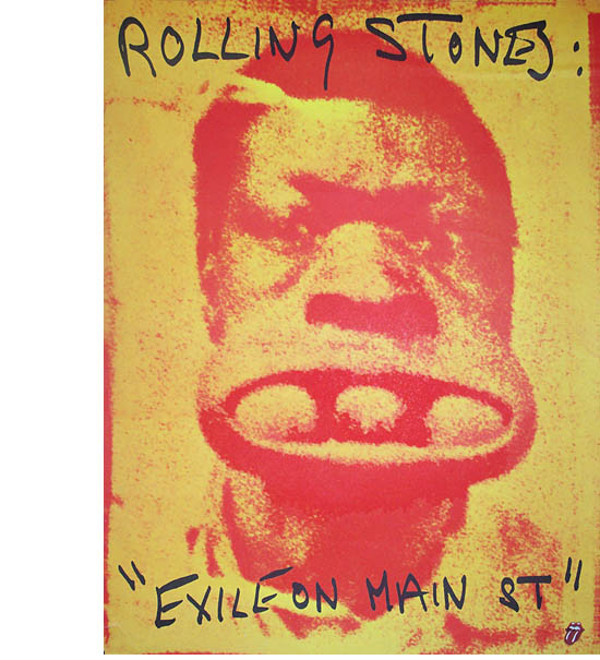
Another weird thing, is the famous black guy (Pic #2), when i was young i always thought it was three potatoes > <, what's the truth ?
HMN
Edited 1 time(s). Last edit at 2009-11-23 19:55 by Honestman.
Another weird thing, is the famous black guy (Pic #2), when i was young i always thought it was three potatoes >
<, what's the truth ?HMN
Edited 1 time(s). Last edit at 2009-11-23 19:55 by Honestman.
Re: The "Exile on Main Street " cover story
Posted by:
Deltics
()
Date: November 23, 2009 20:01
Looks like a tennis ball, a golf ball and a pool ball to me.Quote
Honestman
Another weird thing, is the famous black guy (Pic #2), when i was young i always thought it was three potatoes , what's the truth ?
"As we say in England, it can get a bit trainspottery"
Re: The "Exile on Main Street " cover story
Posted by:
NICOS
()
Date: November 23, 2009 20:06
Wander what will happen if he got some pepper in his nose
__________________________

__________________________
Re: The "Exile on Main Street " cover story
Posted by:
Honestman
()
Date: November 23, 2009 20:13
Yes Deltics it should be that for sure
what a big mouth !!!
@Nicos
...or two golf balls more ><
HMN
what a big mouth !!!
@Nicos
...or two golf balls more >
<HMN
Re: The "Exile on Main Street " cover story
Posted by:
Deltics
()
Date: November 23, 2009 20:20
I've posted these before, but here they are again.
The Exile post cards:


"As we say in England, it can get a bit trainspottery"
The Exile post cards:
"As we say in England, it can get a bit trainspottery"
Re: The "Exile on Main Street " cover story
Posted by:
yorkey
()
Date: November 23, 2009 20:28
Quote
DelticsLooks like a tennis ball, a golf ball and a pool ball to me.Quote
Honestman
Another weird thing, is the famous black guy (Pic #2), when i was young i always thought it was three potatoes , what's the truth ?
Maybe that's what Mick did to make his lips so huge?
You got the Sun, You got the Moon,
and you've got
The Rolling Stones
Re: The "Exile on Main Street " cover story
Posted by:
Zack
()
Date: November 23, 2009 20:45
EXILE ON MAIN STREET
The Rolling Stones
Rolling Stones, 1972
Designer: John Van Hamersveld
Photographer: Robert Frank
The general tone of the time was one of anarchy -- drug dealers and freaks and crazy people left over from the Sixties, all defiant and distorted," says John Van Hamersveld, designer of the cover of the Rolling Stones' Exile on Main Street. The album's chaotic, slipshod look captures the time perfectly.
Van Hamersveld was working on a songbook with the Stones at a Los Angeles mansion where they were staying when legendary photographer Robert Frank walked in the room; he was quickly recruited for the cover of the band's upcoming album.
The cover shot, assorted pictures of circus freaks, is not a collage but a photo Frank took in 1950 of the wall of a tattoo parlor somewhere on Route 66. The comparison to the notorious Stones -- jet-setting tax exiles, cocaine-fueled satyrs and perpetual outsiders -- is clear. To drive the point home, an identical layout on the back cover features Frank's photos of the Stones themselves, shot on L.A.'s seedy Main Street. (Frank's 1972 film documentary of the Stones, the unreleased @#$%& Blues, would explicitly portray them as freaks.) The inner sleeves were even more casually slapped together, with titles and credits hand-lettered by Jagger himself. The layout perfectly complements the sprawling, ramshackle sound of Exile itself.
Perhaps the most memorable photograph on the cover is one of a guy holding three balls in his mouth. Marshall Chess, who was then the Stones' manager, needed an image for billboards and other advertising; Van Hamersveld had a great idea. "Lookit," he said, "why don't we take the guy with the balls in his mouth. That is the most amazing photograph I've ever seen. And doesn't it look like Charlie!"
[www.superseventies.com]
Re: The "Exile on Main Street " cover story
Posted by:
Deltics
()
Date: November 23, 2009 20:51
"As we say in England, it can get a bit trainspottery"
Re: The "Exile on Main Street " cover story
Posted by:
Honestman
()
Date: November 23, 2009 20:57
@Deltics
I've lost my original Exile postcards, part of my STONES collection plus other mainly things because of a fire in my house 3 years ago.
Really great post , cos' i've never seen the whole set only to buy on EBAY since... if someone has spare PM me
HMN
I've lost my original Exile postcards, part of my STONES collection plus other mainly things because of a fire in my house 3 years ago.
Really great post , cos' i've never seen the whole set only to buy on EBAY since...
if someone has spare PM meHMN
Re: The "Exile on Main Street " cover story
Posted by:
pablorkcz
()
Date: November 23, 2009 21:40
I wonder if the postcards are where Hipgnosis' Storm Thorgerson got the idea for the "In Through The Out Door" album cover series.
Re: The "Exile on Main Street " cover story
Posted by:
Deltics
()
Date: November 23, 2009 21:55
Quote
Honestman
@Deltics
I've lost my original Exile postcards, part of my STONES collection plus other mainly things because of a fire in my house 3 years ago.
Really great post , cos' i've never seen the whole set only to buy on EBAY since...
My pleasure, Honestman. I'd give you mine but, you know........
"As we say in England, it can get a bit trainspottery"
Re: The "Exile on Main Street " cover story
Posted by:
Lotus-Max
()
Date: December 9, 2009 17:05
US and UK Postcards were different.
The UK Ones were shiny and smaller and the writing was colored.
These were the cards they used in tyhe mid 90s Mini Virgin Releases of the CD.
The US ones were larger and Matt and totally Black and White.
I can send a picture if interested.

M.
The UK Ones were shiny and smaller and the writing was colored.
These were the cards they used in tyhe mid 90s Mini Virgin Releases of the CD.
The US ones were larger and Matt and totally Black and White.
I can send a picture if interested.
M.
Sorry, only registered users may post in this forum.
Online Users
filoca , ghs73 , hockenheim95 , Justjon , novica , Rik , RisingStone , rollingloc , spunky , syrel , Topi , TumblinDice76 , wiredallnight
Guests:
2016
Record Number of Users:
206
on June 1, 2022 23:50
Record Number of Guests:
9627
on January 2, 2024 23:10